
Rules to Better Access UI - 6 Rules
When designing their UI, Access developers often make these common mistakes:
- Non-standard fonts - for example, making fonts bold or using different fonts on the same form
- Different background colors for labels and controls - this will confuse users because it's not standard with Windows, and the colors are distracting
- No standard OK/Cancel button pair - it's always a good idea to do as Windows does because users are familiar with Windows dialogs. "Save" and "Cancel" are non-standard, for example.
- Lots of different forms - having a separate form for every block of data that needs to be entered can become a confusing and tedious process.
With the new breed of icons, themes and form layouts, you will try and steer away from the old Access look. Aim for a cleaner, less cluttered, and quicker to navigate look. With just a little time you can fix up your Access forms. Try these tips and see how you can transform even an Access Application!
Having a separate form for every block of data that needs to be entered can become a confusing and tedious process. A common example is having one form to add/edit Contact details, another to add/edit that Contact's Address details, and a third to add/edit that contact's Qualifications. This is not user-friendly...
The best and most organized way to do this is by using tabs - see the examples.
You will target your application towards resolutions that your customers can use comfortably. It is no good to just tell the customer to increase their resolution on their 15-inch LCD because your application and others can become unreadable on smaller screens.
See this rule for a guide as to which resolutions you will be targeting.
All through main Microsoft software, you will see a variety of icons used to represent the information they are related to, and to make the interface more interesting and appealing. When are developing forms in Access, you should aim to make it look and feel consistent and user-friendly, just like Microsoft does.
Find a library you like from one of the links at Do you know where you can find some nice icons? and use it consistently over your forms. See some examples of how we used these icons to vastly improve an old and stuffy Access UI.
As we know, an image is worth a thousand words. So here are some examples of how to make cleaner forms:
Bad Example
A fairly standard Access 97 application that needs some love (Before a makeover)
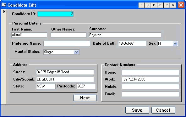
Figure: Avoid using background colors for your form controls - they can be confusing 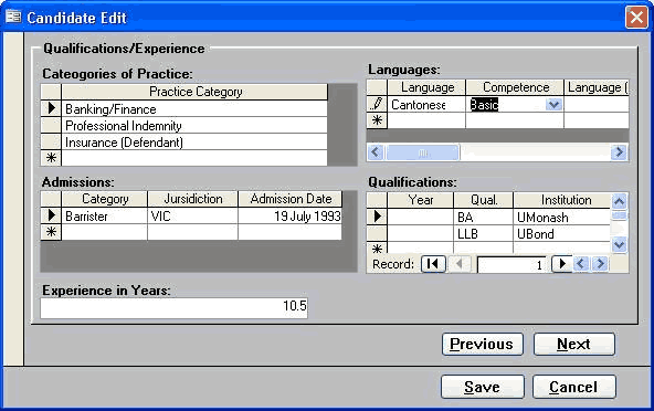
Figure: Avoid using non-standard fonts on your forms - keep them as close to Windows XP forms as possible 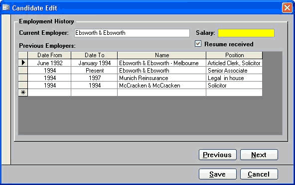
Figure: All these forms will be grouped into a tabbed form 
Figure: The colors on this form are very distracting and add no value to the user - keep it clean Good Example
Screenshots of the existing Application in Access 97 after an SSW makeover (Good)
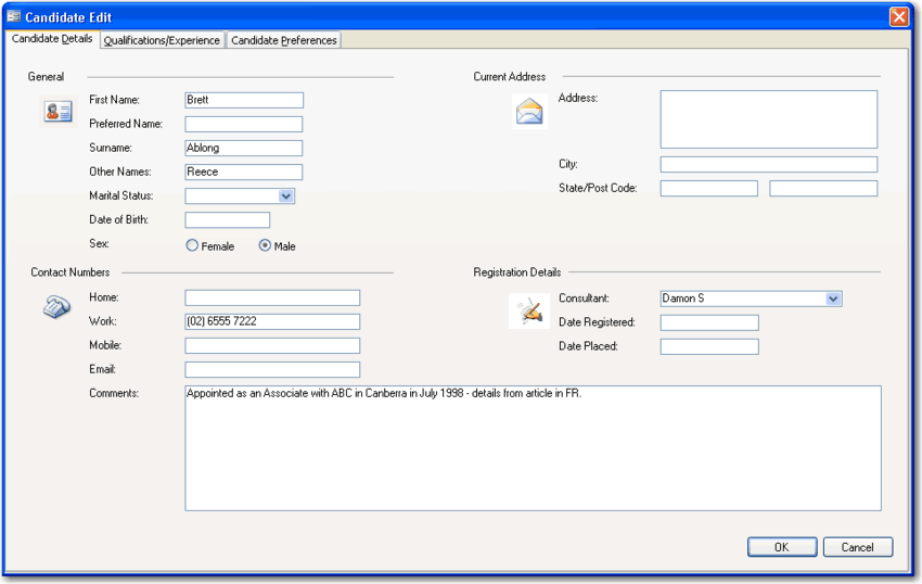
Figure: This is the same application above - can you believe it? We grouped the forms into tabs 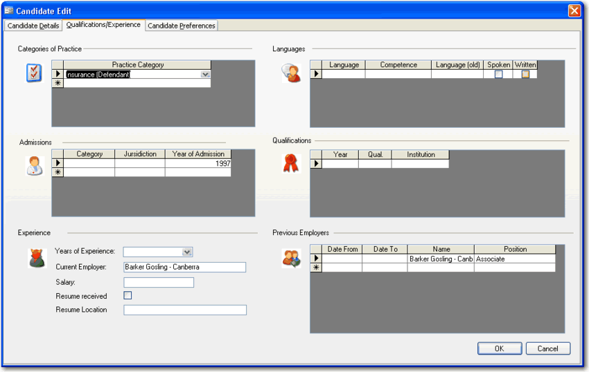
Figure: The icons give the form visual appeal and help to break up the plain colors 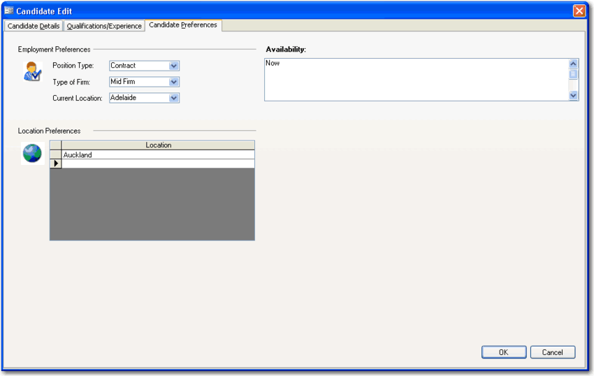
Figure: It's easy to present your form more cleanly and with a Windows XP feel 
Figure: Even tricky forms with lots of logic can be tidied up. We used XP-styled controls and careful alignment to make this form more usable Better Example
Access 2007 is an Easy Way to Give Your Old Access Application a new look (Best)
These samples are from a Property Purchase and Negotiation Tracking application created for Queensland Water Infrastructure.
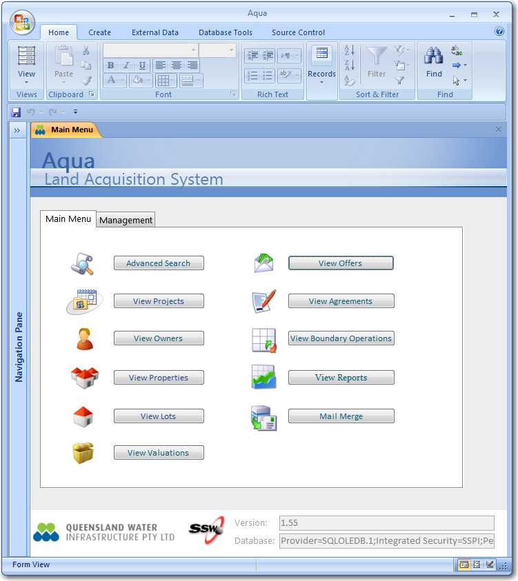
Figure: The main menu of one of our first Access 2007 UIs. It looks even better than the revamped Access 97 application 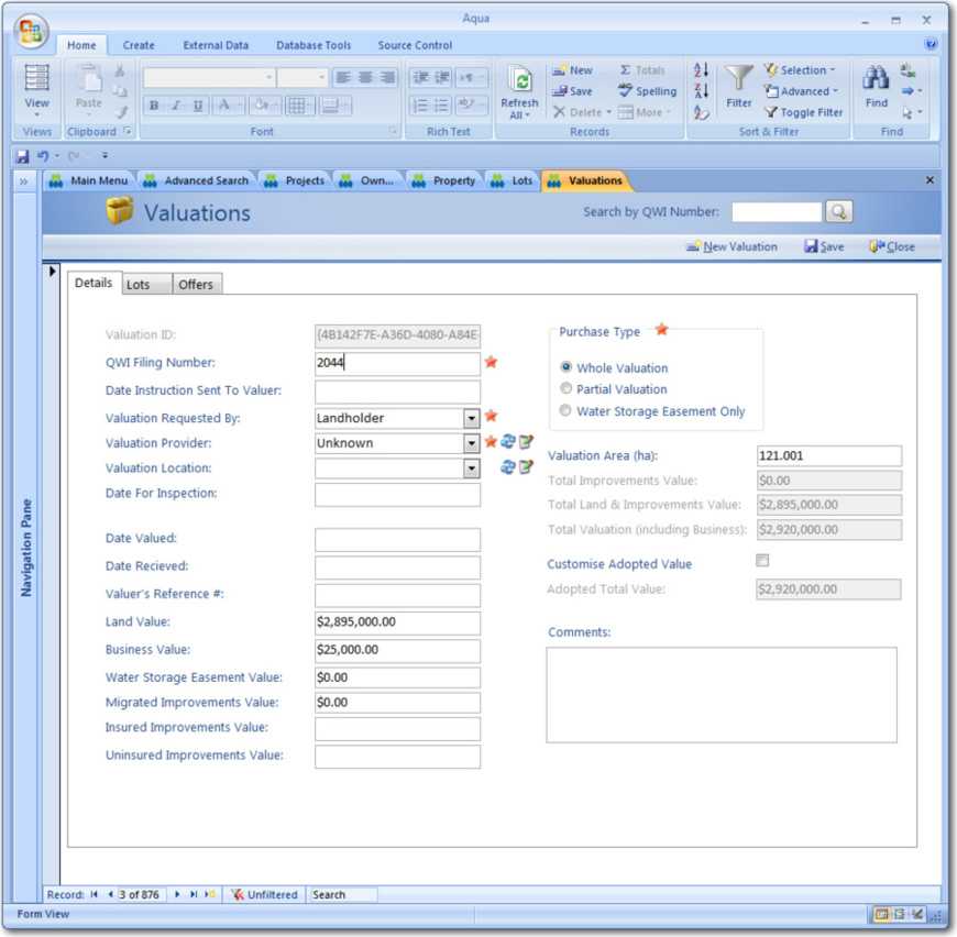
Figure: Note the Action buttons in the top right hand corner - they are based on the Access 2007 templates 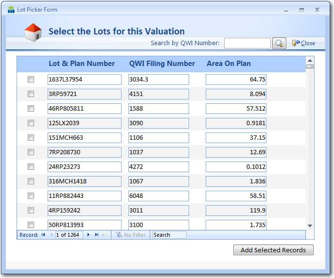
Figure: This picker form is based on a web-style picker UI such as Hotmail so users have a familiar UI 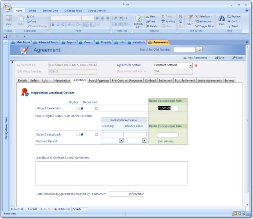
Figure: With the use of frames with background colours, we have visually grouped controls It's always a good idea to follow how Windows does as users are familiar with Windows dialogs. "Save" and "Back" are non-standard, for example.
For more information read Do your forms have 'Accept' and 'Cancel' buttons?
See the examples for how to do this on your form.
One of the more common complaints about Microsoft Access databases is that some screens are slow to respond. This is often misinterpreted as poor performance on the part of the database engine but the real culprit is usually the screen design.
Here are a few techniques that developers can use to improve screen responsiveness.
1) Fetch fewer records
It is far too easy to create a screen that fetches all the records in a table. Such a time consuming exercise is seldom necessary and serves only to make screens appear sluggish. Users are usually interested in a few or perhaps only one specific record. They may simply wish to add a new record. In either case, it is a waste of time to fetch enormous quantities of data. If you are on a local area network, you will not only slow down your own application but probably annoy most of your cohorts by greatly increasing network traffic.
The solution is to open screens, or forms as they are called in Microsoft Access, with queries that contain 'where clauses' that use specific criteria to limit the number of records retrieved.
Tip: Open forms with criteria that return no records at all. Allow the user to enter criteria in the form header. It is quicker to refresh an existing form after the user enters criteria than it is to load a new form while fetching data.
Example:
You have a table named "Client" with 10,000 records. The poor way to retreive records from is:
Form.RecordSource = "SELECT * FROM Client"

Form.RecordSource = "SELECT * FROM Client"
Called by

Docmd.OpenForm "frmClient","ClientID='SSW'"
The problem with this method, is that all records are returned to the client, and then the client filters them to 1. A filter does not stop the records from returning. Fetching 10,000 records to view 1 is a large waste of resources, and leads to performance problems.
A better way to New Scenario he wants Big Forms to change to:
Form.RecordSource = "SELECT * FROM Client WHERE 1<>1"The solution Called via a wrapper function for OpenForm:
Function aOpenForm("frmClient","ClientID='SSW')...So they open instantly with no records - Need a function to parse the where clause and then replace with passed in where clause - reruns query to get 1 record - much faster Note Some little form you don't want this behaviour So keep a table 'zsOneRecordForm' with the forms you want as a one record form So when you call aOpenForm it can look up this table 'zsOneRecordForm' and determine if it should change the RecordSource OR apply a filter.
2) Fill those drop-down lists when you need them
Entering criteria almost always requires drop-down lists to avoid mistakes and tedious guessing. Unfortunately, drop-down lists are notoriously slow. A few drop-down lists can cause the opening of a form to become intolerably glacial. The reason is that drop-down lists always fetch as much data as they possibly can even if you limit the number of records they display.
Every drop-down list takes its time to fetch data and delays the loading of the form even if the user has no need to use the list. The obvious solution is to populate the drop-down lists when the user activates them.
Tip: Use an event procedure or a button to set the row source for the drop-down list. For example:
Me!myDrop List.Row Source = Q...where Q is, once again, either the name of a query or an SQL string.
Tip: Drop-down lists themselves will be more responsive if they return fewer records. Try cascading criteria so that successive lists are limited by the selection in a previous list. The row source query for a list could depend on the item selected in a previous list as in this example:
Q = " SELECT Field1, Field2 FROM Table1 WHERE Field3 = " & Me!DropList1