Rules to Better Websites - Branding and Marketing - 14 Rules
People don't go to your Twitter profile as often as they visit your website. It's a good idea to have your Twitter timeline on your website. The Embeddable timelines are interactive and also enable your visitors to reply, Retweet, and favorite Tweets directly from your website pages. The best place to put it is on the sidebar.
Visit https://dev.twitter.com/web/embedded-timelines to view instructions on creating your embedded Twitter timeline.
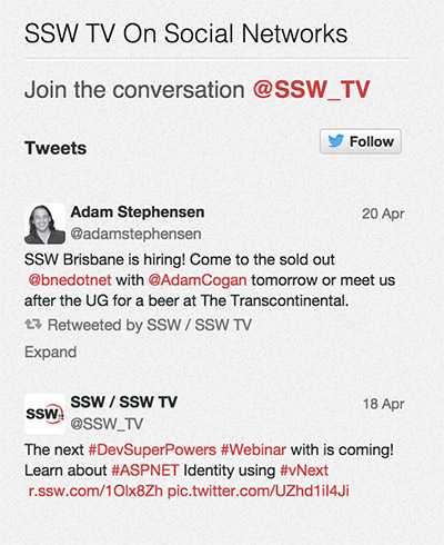
Figure: SSW TV Twitter timeline on SSW TV website sidebar Note: Visit Facebook's Page Plugin to also integrate a Facebook Like Box to your website
If all you have time to ftp up is a couple of simple html pages with few contact details and a brief "About Us", then leave it as that. Writing "Under Construction" says "We have a few ideas, but we really just don't have the resources to get our website together at the moment." Bad idea.

Figure: "We just can't get our act together on our website" In the past, Web people thought it would be useful to tell people how many visitors the site has had. The idea behind it was that each visitor would see a figure and think "oh, this site must be good, it has had X number of visitors" and elect to stay with the site. It was basically a gimmick. So counters were born in various shapes and sizes and more and more sites used them until someone realised it wasn't actually adding anything useful to the site: the numbers meant nothing to the visitor especially if they were really high. And if the numbers were low or perceived to be low, depending on how long the site had been up, then visitors often left before going any further. Plus the counters were virtually useless for website owners. They didn't provide any useful information other than the fact that there were a certain amount of visitors. There was no way of knowing how many of these visitors were "unique" i.e. new to the site.
Behind-the-scenes Web tracking software now makes it possible to get rid of the counters and most professional sites have. Google Analytics allows them to track their visitors much more comprehensively and use the statistics to guide their marketing efforts.
Here are my thoughts on a couple of product sites critiqued against our criteria. The following are the first 3 things I look on a product site:
- Screenshots
- Testimonials
- Product Box
 The good points about the website:
- They have a user friendly left navigation bar allowing quick access to product specific information.
- There is heaps of information to be read if you choose to.
- I really like the "Convince Your Boss" section.
- I think the "Quick Tour" is good with heaps of detailed information.
 The bad points about the website:
- Seems busy
- Took a while to find the screen shots - should be more obvious.
- A significant amount of reading is required to understand what the product will do for you.
- No links to product support or knowledge base.
- No screen shots.
 The good points about the website:
- Aesthetically pleasant with a simple easy to read layout.
- Links are provided to more detailed information.
- Access to evaluation copy and help files.
 The bad points about the website:
- Screen shots are given but what is the purpose of making them so small I have to click every single image.
- When you open up the first page you should see a quick summary of what the product will do for you. Such as the key features and benefits.
- No description of system requirements.
- No description of how it works.
 The good points about the website:
- They have a user friendly tool bar allowing quick access to product specific information.
- Testimonials standout.
- Feature section is good - Where appropriate information has been summarised or put into a table.
- Compact design all in one screen full with links for more detailed information and a good menu bar at the top.
- Links are used frequently for access to more detailed information.
- There is a screen shot with a really good online demo.
- A lot of effort has been taken to make this site look aesthetically very pleasing.
 The bad points about the website:
- There are buttons in the top header which do nothing. I know now that is the intention but I think confusion should be avoided.
- A lot of advertising clutter leaving web surfers confused as to where to go next.
 Good points:
- Outlines the problems that the program solves well
- Good feature overview
- Has box shot, giving the product some identity.
- Has links to further information about related technologies (e.g. regular expressions).
 Bad points:
- Testimonial is meaningless
- Screenshot doesn't illustrate purpose of application
- Too much content on one page, with no easy way to get to a specific area. Much of the content doesn't need its own section, and could be condensed to simply enhance the feel of the site.
- No clear links to product knowledge base until the bottom of the page
- Section about FxCop could be put on a separate page, with a feature comparison table, which is then linked to with a navigation item. This content won't be of interest to many surfers. Those who do know FxCop will see the link and click through.
- Report demo should be made clearer. People want to see this.
It's crucial that contact details are placed exactly where the user expects to find them - preferably on every page. People will often come to your site just to find a phone number or an email address, so make sure they're search isn't harder than it needs to be.
SSW has its contact details in the top navigation, which is found on all pages across the site.

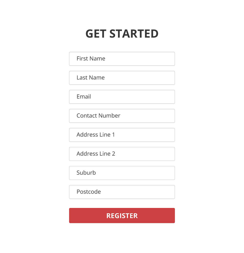
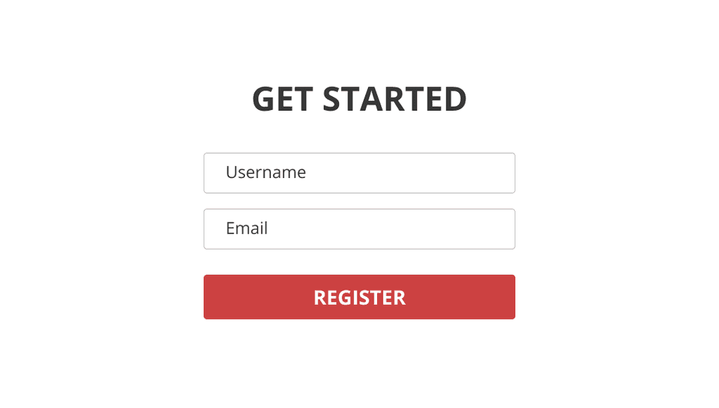
Figure: SSW's contact details on the website Most people are reluctant to share personal information and may provide false data, especially when asked to disclose a lot of information at once. Collecting personal information in intervals, rather than in a single session, may lead to more accurate and thoughtful answers.
Imagine a scenario where a user visits a website to download software and is requested to provide comprehensive details like their name, email, phone number, and address. In such cases, the likelihood of receiving accurate information tends to decrease. This reluctance usually stems from the user's concerns about the company's intentions for using their data and their unfamiliarity with the company itself. In contrast, if the company initially asks for just a username and email address, users generally feel more comfortable sharing this information.
This approach, being less invasive, is perceived as more user-friendly, increasing the probability of users returning to the site for additional downloads. At this stage, the company can progressively request more information, such as the user's real name and phone number.
Once the user has shared some basic information, he or she often develops a stronger sense of trust towards the company. Therefore, during their third visit for another download, they are more inclined to disclose further personal details. Over a series of interactions, the user eventually provides all the necessary personal information to the company.
This incremental approach to data collection significantly fosters user trust. However, it should be noted that while this strategy reduces the chances of receiving false information, it does not entirely eliminate the possibility.
Not only do we try to keep our designs clean and simple without too many images, we also try to minimise the number of words. If something can be revised to make it cleaner and simpler, we will always do it. A lack of superfluous words means your readers don't get bored and will stick around longer.
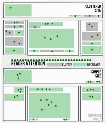
Figure: Testimonials as displayed on SSW's About Us page Web minimalism and simplicity means emphasizing what is essential and important to your readers. Remove every non-essential or unimportant element. Readers only have so much attention to give, if you present them with less they will have more attention to give to each element.
Benefits of Simple Design
- Pages load faster
- Clearer and easier to scan
- Easy to navigate
- Quicker to design (more profitable)
- Quicker to build
- Quicker to redesign
- Easier to maintain
- Easier to make work on different browsers
How come there are so many pages that don't have an contact on the page? Every page on your site should have an email hyperlink.
Even better make it easy for visitors to report the actual page they are referring to. A simple link will give users an easy way to report bugs or give feedback (check out the bottom of this page). By putting this code in your footer template, users will see this link on every page.
Every phone number should include the country code (with the + sign) so people in another country can call/text without having to look for the special numbers to go international. Make sure you always set your mobile number in the correct format.
4XXXXXXXXX
Bad example - Hard to read
(4XX) XXX-XXXX
Bad example - Readable but missing international format
+61 (4XX) XXX-XXX
OK example - International format and readable but brackets/dashes aren't necessary
+61 4XX XXX XXXX
Good example - Nice and clean with spaces
Note:
In Australia, mobile numbers are in the format +61 4XX XXX XXX
In China, mobile numbers are in the format +86 1XX XXXX XXXX
The way you present information to prospective clients determines its effectiveness. In a cluttered environment we skilfully organize information for the greatest impact. When advertising software we like to use the following standard.
- First Sentence (aka Tag Line) This is a one line sentence that explains the benefits of using the software. This description is non-technical, but should give an idea of who the software is for. E.g. "Automate your code reviews with SSW Code Auditor"
- First Paragraph A paragraph that describes in greater the detail what the software does, what Microsoft products it works with (e.g. Access, Outlook, SQL Server etc) and any initial technical notes. E.g. "SSW SQL Total Compare resolves data conflicts with SQL Server Replication. This tool reports the differences between the Publisher and Subscribers the data."
- Key Features & Benefits It's now time to convince the web surfer that they want the product. This section needs to summarize in bullet points why this product is going to solve their problems. If necessary group the benefits into logical categories.
- Screen Shots One screen shot on the first page is important for customers to get the look and feel of the application. Then link to more screenshots.
- A Recorded Demonstration Customers love demonstrations especially when they are faced with using a product that they have never used before. An .avi is a great and innovative way to coach people on how to use products, and work with regardless of where they are around the world.
- Testimonials Place a testimonial from another user who's already using the software. Customer's tesimonial tends to be informal and the message can be easily understood by your visitors.
- User Guide This is help facility is designed to quickly get you up and running. Once again if you can offer it to customers make sure you let them know about it
- How it works This is a brief technical description of what goes on behind the scenes
- System Requirements The minimum system specifications to run the application.
- Support One of the most important attributes that customers of software products look for when they make a purchase is whether or not there will be support if they are stuck and having difficulties with the software. One very cost effective method of support is to provide a knowledge base where customers are free to seek the answers to their own problems.
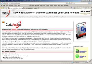
Organize your product information Figure: How to organize your product information.
Testimonials are a great way of making people comfortable with dealing with your company. They give the website a positive vibe and provide users with something relational that they will identify with (problems solved, needs met, people made happy, economic crisis avoided, etc.)
SSW have a random testimonials box up the top of many pages. One example is the About Us page.

Figure: Testimonials as displayed on SSW's About Us page Another alternative is having the testimonials listed down the right hand side of the screen. An example of this can be seen at: http://www.ericjsmith.net/codesmith/.
An interesting spin on the previous link is a website that still has the testimonials down the right hand side of the page, however it displays exerts of these testimonials in comic book style speech bubbles. An example of this can be seen at: http://www.richtextbox.com/richtextbox/.
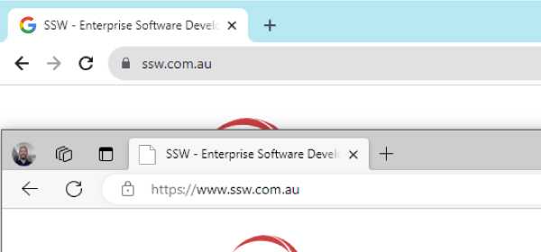
A Favicon is an image file included on professionally developed sites. The favicon reflects the look and feel of the website or the organizations' visual identity.
Which formats and sizes to use?
The format of the image must be one of PNG (a W3C standard), GIF, or ICO. You can export your favicon in all necessary sizes on Favicon Generator website.
How to implement the favicon?
- Copy your company's favicon to the root of the site
- Add the highlighted code below inside the
<head>tag in your HTML
<head>
<title>Page Title</title>
<link rel="shortcut icon" href="/images/favicon.ico" type="image/x-icon" />
</head>
Figure: One line of HTML lets you add your company's icon to your web page
This works for most websites, including ASPX WebForms, MVC and WordPress.
One of the first things you need to include when building a website is an 'About Us' section. An 'About Us' section gives the website credibility and more importantly gives readers an overview of you and your company.
At SSW we based our 'About Us' page on 4 criteria; these are 4 aspects that we feel potential clients would want to know. Below is an example of the most important aspects we felt needed to be addressed on the SSW 'About Us' page:
-
Target
- Our location - Sydney
- We specialise 'in .NET solutions for ...'
- Products offered: 24 developer utilities for .NET developers
-
Credibility
- SSW has been running Microsoft .NET User Group for 10 years
- Chief Architect is the Australian Microsoft Regional Director
-
Services Offered
- Technologies we use
- Customized software solutions
-
Goals
- To develop customized solutions for each client to meet specific specifications
To see the final result of these standards, see SSW 'About Us'.
-
