"Logos are more important than we realize – a logo is often your first impression of a company and as such having a good one will go a long way to being memorable and instilling a sense of trust and familiarity."
- ADAM COGAN, SSW CHIEF ARCHITECT

"Logos are more important than we realize – a logo is often your first impression of a company and as such having a good one will go a long way to being memorable and instilling a sense of trust and familiarity."
- ADAM COGAN, SSW CHIEF ARCHITECT
In 2012 we launched a new SSW website with the influence of Windows 8 and Metro tiles. Our nearly 20 year old logo started to look dated.
Then we began a serious effort to reinvent our branding for this new age of digital media.
On the SSW new logo, you may just recognize several elements inspired from our original logo – the web, the globe and the "swoosh", as Adam Cogan loves to call it. Our goal was to retain the elements that made our company recognizable, but freshen it up with a Metro touch.
We kept the "swoosh" but replaced the globe and the web with the four squares as homage to our proud Microsoft affiliation.
Of course we tightened the overall alignment and straightened the font - now using Helvetica Neue LT Pro 95.
We hope you like it!

The primary colors for SSW are the red and charcoal. These colors should be predominant for major elements in all SSW communication.
#CC4141 | RGB (204,65,65) | CMYK (14,89,78,3)
#333333 | RGB (51,51,51) | CMYK (69,63,62,58)
On occasions, the other two grey shades (secondary colors) can be used with a designer's approval.
#AAAAAA | RGB (170,170,170) | CMYK (35,28,28,0)
#797979 | RGB (121,121,121) | CMYK (54,45,45,10)
More standard colors can be found at SSW Typography & Web Design References - Colors page.
Remember, the logo is a valuable corporate asset that must be used consistently in the proper, approved forms. There are some ways we also don’t want our logo used.

Don't add effects, such as shadows, borders, gradients...

Don't compress the logo...
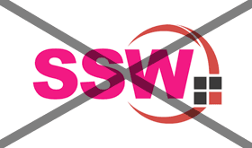
Don't alter the colors...

Don't change the size of the "swoosh"...

Don't place the logo on backgrounds that provide insufficient contrast...

Don't change the font...

Don't place the logo inside shapes...
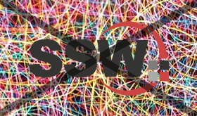
Don't place the logo on a visually cluttered or patterned background...

Don't create a 3D version of the logo...