Do you design websites and apps to be responsive (aka mobile-friendly)?
Loading last updated info...
Ensure your websites and apps are responsive (mobile-friendly). While you might have a high-resolution monitor at your workstation or home, it's important to remember that many users access content through their mobile phones or tablets.
Your goal should be to create designs that seamlessly adapt to various screen sizes, from small mobile displays to large desktop monitors.
Note: The proportion of web users on mobile devices compared to desktop varies by region and demographic. Mobile web usage generally outpaces desktop.
Responsive design remains crucial in today's digital landscape. It enables websites and apps to dynamically adjust their layout and content presentation based on the user's device, ensuring a consistent and optimal viewing experience across all platforms.
However, responsive design is just the beginning. To truly cater to mobile users, it's essential to consider factors beyond mere adaptability. This includes optimizing for touch interaction, prioritizing fast page load speeds, and crafting concise and easily digestible content on smaller screens.
The 10 essential mobile user experience (UX) elements
When designing for mobile web, several factors are particularly relevant for ensuring a smooth UX. Here are the most important ones:
- Responsive Design: Ensure your website layout is responsive and adjusts seamlessly to various screen sizes, resolutions, and orientations, providing a consistent experience across devices
- Fast Loading Speed: Mobile users expect quick access to content. Optimize your website for fast loading times by minimizing file sizes, leveraging browser caching, and optimizing images
- Thumb-Friendly Navigation: Design navigation menus and interactive elements to be easily accessible and operable with the thumb, considering the natural reach of users holding their devices in one hand
- Clear Call-to-Actions (CTAs): Use clear and prominent CTAs that are easily tappable on mobile screens. Ensure they stand out from surrounding content and provide concise instructions for users
- Optimized Content: Tailor content for mobile by using concise and scannable text, high-quality images optimized for mobile viewing, and prioritizing relevant information above the fold
- Gesture Support: Incorporate intuitive touch gestures (such as swiping, pinching, and tapping) to enhance user interactions and provide intuitive navigation within your website
- Cross-Device Compatibility: Test your website across various mobile devices and browsers to ensure compatibility and consistent performance
- Mobile-Friendly Forms: Simplify input forms by minimizing the number of fields, using mobile-friendly input controls, and implementing features like auto-fill and input validation to enhance the user experience
- Page Layout and Content Hierarchy: Optimize your website's layout and content hierarchy for mobile screens, ensuring that key information is prominently displayed and easily accessible without excessive scrolling or zooming
- Accessibility: Prioritize accessibility features such as resizable text, high contrast modes, and screen reader compatibility to ensure that all users, including those with disabilities, can access and interact with your website effectively
Tip: Including responsiveness to your Definition of Done (DoD) is a valuable step. It helps ensure your project meets the needs of all users, providing a consistent and accessible experience.
Measure and improve your website’s performance
Google PageSpeed Insights is a valuable tool for optimizing your website's performance, including its mobile user experience.
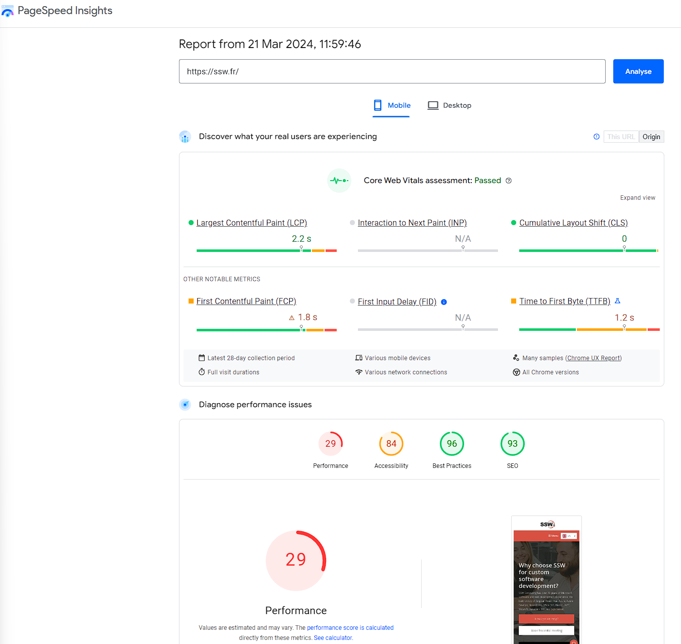
Figure: Google PageSpeed Insights provides both lab and field data about your site's loading speed on mobile devices, along with actionable recommendations to improve performance