This is an example rule + markdown cheatsheet to show you the things you can use to format an SSW rule.
1. Headings, paragraphs, and blockquotes
# This is a heading 1Lorem ipsum dolor sit amet. Ut enim ad minim veniam, quis nostrud exercitation. qui officia deserunt mollit anim id est laboru.Excepteur sint occaecat cupidatat non proident, sunt in culpa qui officia deserunt mollit anim id est laborumsunt in culpa qui officia.## This is a heading 2### This is a heading 3#### This is a heading 4 ##### This is a heading 5###### This is a heading 6 and below is a blockquote> Lorem ipsum dolor sit amet, consectetur adipiscing elit. Integer posuere erat a ante. > - Someone famous in Source Title
Figure: Markdown to generate headings and blockquotes
This is a heading 1
Lorem ipsum dolor sit amet. Ut enim ad minim veniam, quis nostrud exercitation. qui officia deserunt mollit anim id est laboru.
This is a heading 2
Lorem ipsum dolor sit amet. Ut enim ad minim veniam, quis nostrud exercitation. qui officia deserunt mollit anim id est laboru.
This is a heading 3
Lorem ipsum dolor sit amet. Ut enim ad minim veniam, quis nostrud exercitation. qui officia deserunt mollit anim id est laboru.
This is a heading 4
Lorem ipsum dolor sit amet. Ut enim ad minim veniam, quis nostrud exercitation. qui officia deserunt mollit anim id est laboru.
This is a heading 5
Lorem ipsum dolor sit amet. Ut enim ad minim veniam, quis nostrud exercitation. qui officia deserunt mollit anim id est laboru.
This is a heading 6
Lorem ipsum dolor sit amet. Ut enim ad minim veniam, quis nostrud exercitation. qui officia deserunt mollit anim id est laboru.
...and this is a blockquote:
Lorem ipsum dolor sit amet, consectetur adipiscing elit. Integer posuere erat a ante.
Someone famous in Source Title
2. Text decorations
*This text will be italic*_This will also be italic_**This text will be bold**__This will also be bold___You **can** combine them_~~strikethrough~~ <mark>These words</mark> are surrounded by a <mark> (HTML needed)
Figure: Markdown to generate different text styles
This text will be italic This will also be italic
This text will be bold This will also be bold
strikethrough
*You can combine them*
These words are surrounded by a <mark> (HTML needed)
3. Lists
#### Unordered lists* This is the first item of an unordered list* This is the second item of an unordered list1. This is the first item of an ordered list inside an unordered list2. This is the second item of an ordered list inside an unordered list * This is the third item of an unordered list* This is the first item of an unordered list inside another* This is the second item of an unordered list inside another1. This is the first item of an ordered list inside a nested unordered list2. This is the second item of an ordered list inside a nested unordered list #### Ordered lists1. This is the first item of an ordered list2. This is the second item of an ordered list3. This is the third item of an ordered list* This is the first item of an unordered list inside an ordered list* This is the second item of an unordered list inside an ordered list1. This is the first item of an ordered list inside another2. This is the second item of an ordered list inside another
Figure: Markdown to generate lists
Unordered lists
This is the first item of an unordered list
This is the second item of an unordered list
This is the first item of an ordered list inside an unordered list
This is the second item of an ordered list inside an unordered list
This is the third item of an unordered list
This is the first item of an unordered list inside another
This is the second item of an unordered list inside another
This is the first item of an ordered list inside a nested unordered list
This is the second item of an ordered list inside a nested unordered list
Ordered lists
This is the first item of an ordered list
This is the second item of an ordered list
This is the third item of an ordered list
This is the first item of an unordered list inside an ordered list
This is the second item of an unordered list inside an ordered list
This is the first item of an ordered list inside another
This is the second item of an ordered list inside another
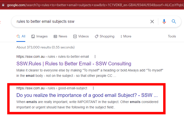
Our main headings auto-generated anchor links so users can easily access a section of a long page like this one. E.g. https://ssw.com.au/rules/rule/#4-links
::: greybox
This is a box using the class "greybox".
:::
Figure: Markdown to generate boxes
This is a box using the class "greybox".
This is a box using the class "highlight".
This is a <div> using the class "info". Works the same as using a <p> . Lorem ipsum dolor sit amet, consectetur adipiscing elit, sed do eiusmod tempor incididunt ut labore et dolore magna aliqua. Ut enim ad minim veniam, quis nostrud exercitation.
This is a <div> using the class "china". Works the same as using a <p> . Lorem ipsum dolor sit amet, consectetur adipiscing elit, sed do eiusmod tempor incididunt ut labore et dolore magna aliqua.
This is a <div> using the class "codeauditor". Works the same as using a <p> . Lorem ipsum dolor sit amet, consectetur adipiscing elit, sed do eiusmod tempor incididunt ut labore et dolore magna aliqua.
This is a <div> using the class "todo". Works the same as using a <p> . Lorem ipsum dolor sit amet, consectetur adipiscing elit, sed do eiusmod tempor incididunt ut labore et dolore magna aliqua. Ut enim ad minim veniam, quis nostrud exercitation ullamco.
See this json file for all supported languages and their aliases we can use in Rules. See below for some examples:
leticeCream = 'chocolate';if(iceCream === 'chocolate') {alert('Yay, I love chocolate ice cream!'); } else {alert('Awwww, but chocolate is my favorite...'); }
Figure: Javascript code block
IFEXISTS (SELECT1FROM INFORMATION_SCHEMA.TABLES WHERE TABLE_TYPE='BASE TABLE'AND TABLE_NAME='Employees' ) ALTERTABLE [dbo].[Employees]( …… ) ON [PRIMARY] ELSECREATETABLE [dbo].[Employees]( …… ) ON [PRIMARY]
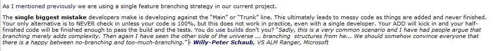
It doesn’t matter what type of information you have, suffering a data loss is frustrating and takes time and money to restore and recover.
Whenever you have to delete content, take an extra step and and paste it into an email thread as a safety step. You should also inform people that care about that content.
This way it's easy for others to see what was removed, and put it back if necessary.
Note: This doesn't replace the necessity of having a backup.
It doesn’t matter what type of information you have, suffering a data loss is frustrating and takes time and money to restore and recover.
Whenever you have to delete content, take an extra step and and paste it into an email thread as a safety step. You should also inform people that care about that content.
Every time you decide that a process should be documented, it’s important to double check that the content does not already exist.
Spending 5 minutes Googling can save you a lot of clean up and maintenance later.
Figure: You should think twice before adding content. As a great Australian Kerry Packer once said: "If you want to pass a new law, why don't you do it only when you've repealed an old one?"
Every time you decide that a process should be documented, it’s important to double check that the content does not already exist.
Spending 5 minutes Googling can save you a lot of clean up and maintenance later.
When writing any content it is vital you cut unnecessary words to keep the reader interested and focused. This is especially important for dense or technical documentation.Your writing can be less wordy and still get the message across.
Click the "Select" button
Figure: Bad Example - Unnecessary words
Click "Select"
Good Example - Short and direct
"Building Software that People Understand"
Figure: Bad Example - Common filler word "that"
"Building Software People Understand"
Figure: Good Example - Remove filler words for a clearer message
Improve your content and ask - how many words don't provide value or clarity?
When writing any content it is vital you cut unnecessary words to keep the reader interested and focused. This is especially important for dense or technical documentation.
Your writing can be less wordy and still get the message across.
The best way to emphasize your point is to show the pain first, and then the solution. Use "Bad example" and "Good example" with crosses and ticks, respectively, in captions.
This structure can be used with images, videos, pieces of code, or text in boxes. Just make sure to include the appropriate caption for each element.
Giving the bad example first will raise users' expectation...
Figure: Bad example - Kid not in his seat
Then showing the solution by giving a good example as the result, will make them feel released.
Figure: Good example - Kid in his seat
Usually, further information on how to achive the good example is added after the examples. E.g. Add a heading "More information" with extra details.
You may also use "OK" examples for things that are acceptable but can be done better.
The best way to emphasize your point is to show the pain first, and then the solution. Use "Bad example" and "Good example" with crosses and ticks, respectively, in captions.
Clear communication is essential for success, and especially helpful in professional or technical contexts. You should make your content more visually interesting and easier to scan quickly. Lists and emojis are great tools to achieve that.
Lists are great to make texts easier to digest. Emojis makes it even easier to consume when a lot of information is present. By using them you can enhance the communication experience. But when repeated excessively, they can become a hindrance rather than a help.
DRY, which stands for ‘don’t repeat yourself,’ is a principle of software development that aims at reducing the repetition of patterns and code duplication in favor of abstractions and avoiding redundancy.
This is especially valid for words in lists, but also applies to different types of content. You should keep only the part that is unique in each list item.
Following this rule:
Is important to help you increase productivity
Is important to help you save time
Is important to help you reduce stress
Bad example – Repeating words... Not following DRY :(
Following this rule is important to help you:
Increase productivity
Save time
Reduce stress
Good example – No repeated words... using the DRY principle
Emojis
When there are multiple items listed, it can be challenging to distinguish between them quickly, leading to confusion and miscommunication. If the same emoji is repeated multiple times within a list, it can create visual clutter and make the list more difficult to read.
When creating a list that includes emojis, avoid repeating the same emoji 3 or more times within a list. Instead, add the emoji to a "introductory sentence" or "lead-in sentence". This helps to keep the content concise, readable, and consistent. Thus making it easy to scan the list and understand the benefits and drawbacks of a particular situation.
✅ Pros
✅ Increases productivity
✅ Saves time
✅ Reduces stress
❌ Cons
❌ May be challenging to implement
❌ May take time to adjust
❌ Can be challenging to maintain
Bad example – Using an excessive amount of emojis. Not following DRY :(
✅ Pros
Increases productivity
Saves time
Reduces stress
❌ Cons
Requires effort to implement
May take time to adjust
Can be challenging to maintain
Good example – Using the DRY principle
Following the DRY principle by avoiding excessive repetition of words/emojis helps to create content that are visually interesting and easy to read, while also promoting efficient and maintainable content creation.
Clear communication is essential for success, and especially helpful in professional or technical contexts. You should make your content more visually interesting and easier to scan quickly. Lists and emojis are great tools to achieve that.
Lists are great to make texts easier to digest. Emojis makes it even easier to consume when a lot of information is present. By using them you can enhance the communication experience. But when repeated excessively, they can become a hindrance rather than a help.
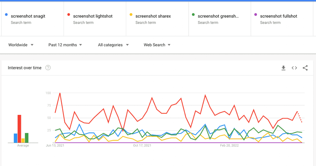
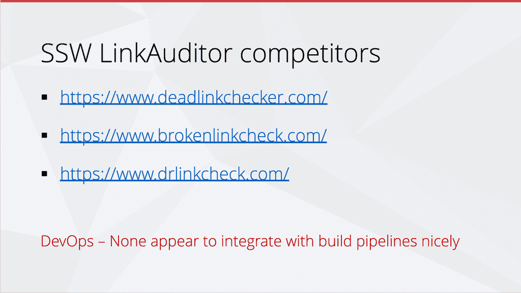
A picture says a thousand words, so using screenshots to provide context is invaluable. However, it isn't always clear to others what part of the screenshot they need to be looking at. So, it is important that you edit your screenshots to add extra info such as highlighting critical information.
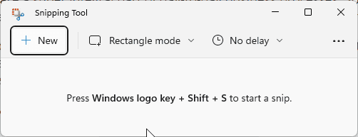
Windows provides a default tool for taking and editing screenshots called the Snipping Tool. However, it is quite limited in functionality. For example, it doesn't provide the ability to draw a neat rectangular box quickly and easily.
There are heaps of great tools that provide much more advanced functionality. The best tools are
Figure: Lightshot is the most popular screenshot tool
Source: Google Trends
Figure: Bad example - The Windows Snipping Tool isn't powerful enough for most business use cases
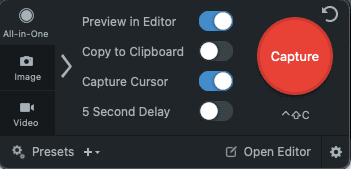
Figure: Good example - Snagit is the gold standard and provides tonnes of user friendly features
A picture says a thousand words, so using screenshots to provide context is invaluable. However, it isn't always clear to others what part of the screenshot they need to be looking at. So, it is important that you edit your screenshots to add extra info such as highlighting critical information.
Windows provides a default tool for taking and editing screenshots called the Snipping Tool. However, it is quite limited in functionality. For example, it doesn't provide the ability to draw a neat rectangular box quickly and easily.
You should always use discretion in your public documentation. Hide any sensitive information, like your clients’ names, from screenshots and general documentation.
Figure: Good example – Others can’t see the clients’ names
You should always use discretion in your public documentation. Hide any sensitive information, like your clients’ names, from screenshots and general documentation.
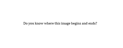
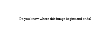
Imagine you're browsing a website. You come across an area on the page that seems oddly blank, only to realize it's a white image blending seamlessly into the white background. This disrupts the browsing experience. So how do you prevent that?
The Importance of Image Borders
Making your images distinct is a key part of creating a user-friendly website. You should add borders to images, especially those with a white or light-colored background.
Visibility: A border makes the image stand out, even if the website's background color matches the image's color.
Professionalism: Borders can add a sense of completeness to your site's design.
Figure: Bad Example - Can't tell where the image begins and ends!
Imagine you're browsing a website. You come across an area on the page that seems oddly blank, only to realize it's a white image blending seamlessly into the white background. This disrupts the browsing experience. So how do you prevent that?
We've all missed a piece of a message and found out later that we'd got it wrong. This can lead to miscommunication, mistakes, and lost time. Even worse, when finding out later that someone has misread something, there can be a lot of work to fix! But, there are ways to prevent this. Do these things to always make your writing clear:
An important case - don't let anybody skim over negation and misinterpret your message:
"We found that moving CodeAuditor's scan engine (docker image) to be hosted on GitHub Action is not feasible."
Figure: Bad example - it's possible to miss the word 'not'
"We found that moving CodeAuditor's scan engine (docker image) to be hosted on GitHub Action is not feasible."
Figure: Good example - The bolding draws attention to the main idea, which is 'No'!
When highlighting items (file names, user commands etc.) be sure to:
Distinguish the items from the rest of the surrounding text; and
Use the following rules to highlight items in your document:
Style
Use this style on
Example
Bold text
Menus, commands, dialog box options, file names and paths
To access the application, click Start | Programs | Accessories | System Tools | Disk Defragmenter
Initial Capitals + Bold
File paths and file names
Now open C:\My Documents\Invoice.doc.
Different colour styling
Web UI - Important words on headings
Want to build an Angular application?
UPPER CASE
Code keywords and database elements
Use the INNER JOIN clause in SQL Server to join one table to another.
Monospace (Courier New font)
Code samples, error messages
You will see the following error: error opening database: database is currently in use.
We've all missed a piece of a message and found out later that we'd got it wrong. This can lead to miscommunication, mistakes, and lost time. Even worse, when finding out later that someone has misread something, there can be a lot of work to fix! But, there are ways to prevent this. Do these things to always make your writing clear:
Email templates are an awesome way to help people save time writing emails. Often the template needs to indicate a piece of text that should be replaced with custom content. When you need to identify text that should be replaced (e.g. in an email template), it's important to use a consistent way of indicating the replaceable text with a placeholder.
Use a consistent character to make it clear which piece of text should be substituted.
Video: Choose the Best Text Placeholders (3 min)
However, everyone has their own preferences about which placeholder character to use 🥸
For example:
SSW Rules historically used xxx
SSW Intranet | Sales templates use ❌❌❌
SSW GitHub Sprint Templates use ✏️xxx
SQL developers are used to [ ]
Word Mail Merge users are used to « »
API and React developers are used to { }
Angular developers are used to {{ }}
Visual Studio code reviewers are used to TODO:
Let's see these in action:
The quick brown fox xxx over the lazy dog
The quick brown fox ❌❌❌ over the lazy dog
The quick brown fox ✏️xxx over the lazy dog
The quick brown fox [ action ] over the lazy dog
The quick brown fox « action » over the lazy dog
The quick brown fox { action } over the lazy dog
The quick brown fox {{ action }} over the lazy dog
The quick brown fox {{ ACTION }} over the lazy dog (currently the standard in SugarLearning and SSW Rules)
The quick brown fox TODO:action over the lazy dog
More info on the origins
[] are commonly used to label things. On sensitive emails, the text [Sec: Official] gets appended or prefixed to the subject, for example.
Using [] for replaceable text can be confusing since there is already the common usage for labelling.
Angular interpolation uses {{ and }} as a delimiter. They indicate a variable and we think this is a very clear way to indicate that something needs to be replaced because it is very uncommon to see this syntax outside of Angular code.
So, double curly brackets are recommended instead of square brackets to indicate replaceable text.
In certain places such as Sales templates, you cannot afford to miss a single placeholder
Of course, if you want to make it even more obvious then highlight the text in yellow... however you can't do it in many places like Microsoft Forms... so another option is to use an emoji like the ✏️ or to make it super obvious the three ❌❌❌
Another way to draw attention to text is to make the placeholder all caps.
Replaceable text is often seen in email templates:
To:
[Client email]
Subject:
[Project name] - Test please
Hi [Client name],
I've been working on [Project name] and just deployed version [Version number] with the latest requirements.
Test please - [Link]
Regards,
[Your name]
Figure: Bad example - Using square brackets for replaceable text
To:
{{ CLIENT EMAIL }}
Subject:
{{ PROJECT NAME }} - Test please
Hi {{ CLIENT NAME }},
I've been working on {{ PROJECT NAME }} and just deployed version {{ VERSION NUMBER }} with the latest requirements.
Test please - {{ LINK }}
Regards,
{{ YOUR NAME }}
Figure: Good example - Using double curly brackets for replaceable text... with spaces, and words in UPPERCASE
Email templates are an awesome way to help people save time writing emails. Often the template needs to indicate a piece of text that should be replaced with custom content. When you need to identify text that should be replaced (e.g. in an email template), it's important to use a consistent way of indicating the replaceable text with a placeholder.
Use a consistent character to make it clear which piece of text should be substituted.
Whenever writing numbers, it's generally a good idea to use numerals, especially for complicated numbers. Numerals are more easily noticed when a page is scanned by a user's eye.
For example:
There are seventy three good reasons to do this.
Figure: Bad example - The number is spelled out
There are 73 good reasons to do this.
Figure: Good example - This is easier to read and more noticeable
Certain editorial guidelines suggest using numerals for numbers 10 and above, while numbers 9 and below should be written out. However, when it comes to web content, we generally prefer using numerals regardless.
Whenever writing numbers, it's generally a good idea to use numerals, especially for complicated numbers. Numerals are more easily noticed when a page is scanned by a user's eye.
Remember to use dividers when referring to large sums or phone numbers.
Total: $27216
Phone: 14XXXXXXXXX
Figure: Bad example - These numbers are unwieldy and difficult to read
Total: $2,721.65
Phone: +1 XXX XXX XXXX
Figure: Good example - Symbols or some spaces make these large numbers easier to read
Note:
For currency references, different countries use periods in place of commas and vice-versa.
E.g. In the United States and Australia: $2,367.48 / In France and Brazil: $2.367,48.
Remember to use dividers when referring to large sums or phone numbers.
The structure should follow: Number, Street Name, City, State (abbreviation) Postal Code, Country
Beware of the commas positioning (inexisting between State and Postal Code)
Don't use dashes, slashes, or bars to separate the elements (OK if it is in the Street Name part)
Country is not always necessary depending on the audience
If you have enough space, it is OK to write it in 2 lines
We're in Australia and this should work for most countries' addresses, but some specific locations might have different address structures that won't allow following this rule
Level 1, 81-91 Military Rd | Neutral Bay - NSW, 2089 Australia
Figure: Bad example - SSW main office address not following the standard address formatting
Level 1/81-91 Military Rd, Neutral Bay, NSW 2089, Australia
Figure: Good example - SSW main office address following the standard address formatting
Use a consistent format when writing addresses.
The structure should follow: Number, Street Name, City, State (abbreviation) Postal Code, Country
Beware of the commas positioning (inexisting between State and Postal Code)
Don't use dashes, slashes, or bars to separate the elements (OK if it is in the Street Name part)
Country is not always necessary depending on the audience
If you have enough space, it is OK to write it in 2 lines
We're in Australia and this should work for most countries' addresses, but some specific locations might have different address structures that won't allow following this rule
The way your inbound links are worded makes a big difference. They play an important factor for search engine results and for the users.
Having descriptive links with relevant words improves your website SEO and gives a more friendly experience to users.
For example, if a website had millions of inbound links that described it as "Movies for Free", when someone searches for "free movies" on Google, it would point to this website.
So what does this mean? All those links that are pointing to pages on your website displayed as 'More', 'Link', 'This' or 'Click Here' aren't doing you any favors when it comes to increasing your Google rankings.
"For tips and tricks to increase your Google Ranking click here"
Figure: Bad example #1 - Generic words on links won't help your website rankings
"Check out this link for tips and tricks to increase your Google Ranking"
Figure: Bad example #2 - Generic words on links won't help your website rankings
"For tips and tricks to increase your Google Ranking read this"
Figure: Bad example #3 - Generic words on links won't help your website rankings
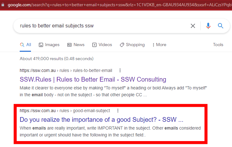
Also, if you make your the link the entire URL, it won't be very readable to users. You should replace it with a descriptive sentence using relevant words.
Figure: Good example - Descriptive links will help your website rankings and the users
You can also use links to give people a chance to investigate further on a topic. In which case, give the hyperlink enough and consistent info so they know what exactly they're clicking on.
"China is a booming market and now is the time to take advantage of this growing user base. If you have a successful application that you would like to bring to the Chinese market, then working with SSW can help streamline your entry into this market. More on SSW Chinafy."
Figure: Good example - Give users context with a link at the end to get more information on the topic
The way your inbound links are worded makes a big difference. They play an important factor for search engine results and for the users.
Having descriptive links with relevant words improves your website SEO and gives a more friendly experience to users.
When you’re sending emails, or pinging someone in Teams, your URLs should be as clean as possible. Having no extra noise ensures that they are easy to read, and it is more aesthetically pleasing. It is also a good idea to break a line before an URL, improving its readability.
Note: URLs have become increasingly cluttered with the introduction of CampaignIDs (used to track customer activities and other information). When you're sharing the URLs, it is better to make them as clean and readable as possible... So, delete everything after the question mark (including the CampaignID suffix).
To:
Bob
Subject:
Purchase please - new hand dryer
Hi Bob,
Here is the link to the new hand dryer that you wanted to see:
Figure: Bad example - Dirty URL with superfluous information
To:
Bob
Subject:
Purchase please - new hand dryer
Hi Bob,
Here is the link to the new hand dryer that you wanted to see:
Vortex Hand Dryer, Super Quiet motor, 3 Years Warranty OZ2100
$184 (no electrical installation required – plugs in – for the men's bathroom upstairs)
ozwashroom.com.au/hand-dryer-285
Best,
Dave
Figure: Good example – Clean URL on a new line is easy to read and looks much better
Presentations
For presentations, it's especially important to keep URLs cleaner. Remember to always remove https://www. from links in your presentations. It keeps the slides cleaner and more readable.
Figure: Bad example - Showing unnecessary extra noise: "https://www."
Figure: Good example - Clean links in a presentation
When you’re sending emails, or pinging someone in Teams, your URLs should be as clean as possible. Having no extra noise ensures that they are easy to read, and it is more aesthetically pleasing. It is also a good idea to break a line before an URL, improving its readability.
Note: URLs have become increasingly cluttered with the introduction of CampaignIDs (used to track customer activities and other information). When you're sharing the URLs, it is better to make them as clean and readable as possible... So, delete everything after the question mark (including the CampaignID suffix).
To:
Bob
Subject:
Purchase please - new hand dryer
Hi Bob,
Here is the link to the new hand dryer that you wanted to see:
Figure: Bad example - Dirty URL with superfluous information
To:
Bob
Subject:
Purchase please - new hand dryer
Hi Bob,
Here is the link to the new hand dryer that you wanted to see:
Vortex Hand Dryer, Super Quiet motor, 3 Years Warranty OZ2100
$184 (no electrical installation required – plugs in – for the men's bathroom upstairs)
ozwashroom.com.au/hand-dryer-285
Best,
Dave
Figure: Good example – Clean URL on a new line is easy to read and looks much better
Presentations
For presentations, it's especially important to keep URLs cleaner. Remember to always remove https://www. from links in your presentations. It keeps the slides cleaner and more readable.
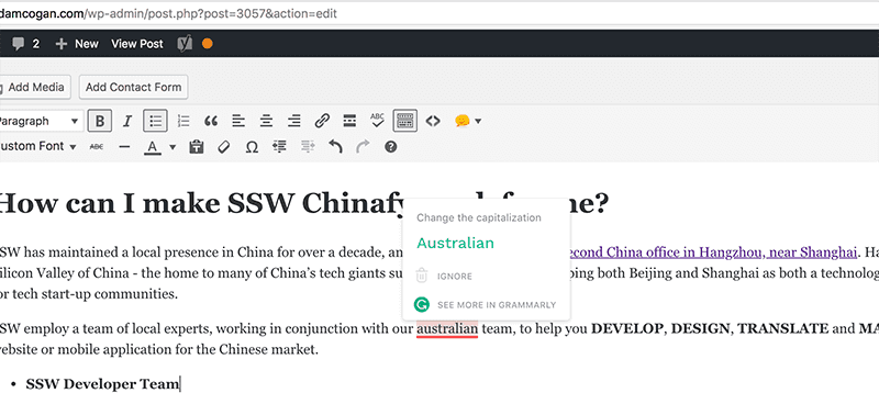
It's important to use correct capitalization when writing titles/headings for web content. For main titles, you should capitalize the first word, all nouns, all verbs (even short ones, like "is"), all adjectives, and all proper nouns. Leave subtitles in normal sentence form.
You can find more rules & tips on capitalizing here:
Figure: Bad example for titles - Inconsistency on words' capitalization
"The Lord of the Rings – Return of the King"
Figure: Good example for titles - Only conjunctions and prepositions (both having similar rules) should not be capitalized. E.g. "at", "on", "but", "and", "with", etc
It's best to only do this on main titles, and leave subtitles in normal sentence form - only capitalize the first word and proper nouns. Basically, it saves hassles... English is a confusing language, and there are too many variations that cause too many arguments.
Figure: Good example - The main title has capitalization and the subtitles don't
It's important to use correct capitalization when writing titles/headings for web content. For main titles, you should capitalize the first word, all nouns, all verbs (even short ones, like "is"), all adjectives, and all proper nouns. Leave subtitles in normal sentence form.
You can find more rules & tips on capitalizing here:
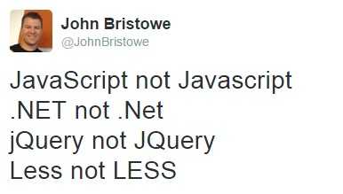
With so many different capitalization conventions used in technology names, it can be confusing to know which convention to use for which technology.
Figure: John Bristowe tackled some of the most commonly confused tech names in this tweet
The main 5 types used are:
All uppercase – ALL UPPERCASE
All lower case – all lowercase
Pascal case - PascalCase
Camel case – camelCase
Only first letter capitalized - Onlythefirstletter
Here’s a quick overview:
.NET - All uppercase
DevOps - Pascal case
JavaScript - Pascal case
jQuery - Camel case
Angular (previously AngularJS) - Only first letter capitalized
SharePoint - Pascal case
email - All lowercase
MVC - All uppercase
CRM - All uppercase
SAP - All uppercase
Salesforce - Only first letter capitalized
gulp - All lowercase
Agile - Only first letter capitalized
Scrum - Only first letter capitalized
(Note: Scrum is not an acronym, so it should never be spelled "SCRUM") |
Figure: Bad example - If you want to be taken seriously as an expert in the subject, you should properly and consistently spell, punctuate, and capitalize the technology you are working with
Figure: Good example – the technology is consistently capitalized correctly across the page
With so many different capitalization conventions used in technology names, it can be confusing to know which convention to use for which technology.
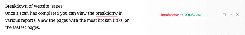
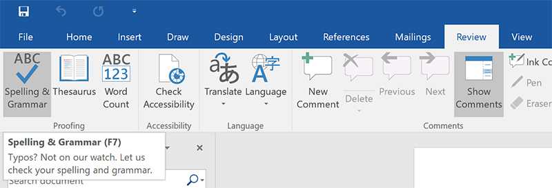
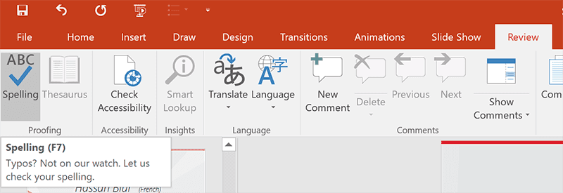
Improper spelling, grammar, and punctuation gives a bad impression of your company and can result in your message not being conveyed correctly. Emails with no full stops or commas are difficult to read and can sometimes even change the meaning of the text. And, if your program has a spelling checking option, why not use it?
Any other text can be checked manually. Go to Grammarly, create a New Document and Paste your content to check your text.
Figure: A typo caught by Grammarly
Documents
On Word, press F7 (or on the ribbon go to Review > Spelling & Grammar ) to check your .docx text.
Figure: Click on "Spelling & Grammar" button to check your web content
Presentations
On PowerPoint, press F7 (or on the ribbon go to Review | Spelling & Grammar ) to check your .pptx text.
Figure: Click on "Spelling" button to check your web content
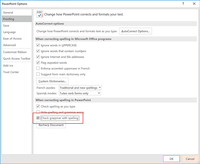
You should also keep "Check grammar with spelling" checked in your PowerPoint Options | Proofing:
Figure: Make sure "Check grammar with spelling" is enabled
Improper spelling, grammar, and punctuation gives a bad impression of your company and can result in your message not being conveyed correctly. Emails with no full stops or commas are difficult to read and can sometimes even change the meaning of the text. And, if your program has a spelling checking option, why not use it?
Attention to detail plays a vital role to effective communication. Grammar, spelling, and/or syntax mistakes, though seemingly minor, can significantly affect the clarity and professionalism of your writing.
Common language pitfalls
Embracing the modern standard not only keeps your writing current but also ensures consistency in your communication.
Use "email" not "e-mail" or "EMail"
Use "cannot" not "can not"
Use "website" not "web site"
Use "username" not "user name"
Use "taskbar" not "task bar"
Use "OK" not "Ok" or "okay/Okay"
Use "aka" not "AKA" or "a.k.a"
Note: Although Wikipedia considers multiple ways to spell the acronym for "also known as", the convention is simply "aka" - with all letters in lowercase and not separated by dots/spaces.
Syntax changes the meaning of certain words
Often when writing technical documents, you will instruct the reader to 'set up' his PC or run a 'setup' file.
"Setup" is a noun, basically meaning an 'arrangement'(e.g. "The software setup")
"Set up" is a phrasal verb, most commonly meaning 'to establish something.' (e.g. "To set up a computer")
How can you remember this? Mentally replace "setup" or "set up" with "setting up". If the sentence still basically makes sense, use two words. If it doesn't, use the single word. For example, the sentence "...he is setting up the shop" makes sense. "The setting up was all wrong" does not.
Be careful with homophones
Words like “verses” and “versus” are homophones, meaning they are pronounced the same but have different spelling and different meanings. Always ensure you are using the correct word. If you're not, it won’t be picked up by spell checkers.
“Verses” refers to lines of poetry or bible passages (e.g. "Matthew 5:41 is one of my favourite bible verses")
“Versus” refers to 2 or more parties in opposition to one another, especially in sports or legal situations (e.g. "Floyd versus Mayweather")
“Versus” can be shortened to “vs.”, which is common in sporting situations, or “v.”, which is the standard abbreviation for legal scenarios.
More examples
"Their" shows possession (e.g. "It's their car")
"There" indicates a place (e.g. "It's over there")
"They're" is a contraction for "they are" (e.g. "They're going to the party")
"Principal" can refer to a person who leads a school or organization or can mean the original sum of money (e.g. "The school principal is retiring" or "The principal amount of the loan")
"Principle" refers to a fundamental truth, rule, or value (e.g. "Honesty is a guiding principle in their company")
"Weather" relates to the state of the atmosphere (e.g. "The weather is sunny today")
"Whether" is used to introduce choices or possibilities (e.g. "I'm uncertain whether to attend the meeting")
Language precision is a valuable skill and is essential for effective communication - they significantly impact how your writing is perceived.
By following these guidelines and staying current with language conventions, you can enhance the clarity, professionalism, and effectiveness of your communication.
Attention to detail plays a vital role to effective communication. Grammar, spelling, and/or syntax mistakes, though seemingly minor, can significantly affect the clarity and professionalism of your writing.
Acronyms are a common way to shorten words or phrases, but using niche terms can lead to confusion and misunderstandings. It's important to avoid jargon, especially for those new to a particular field or industry. To ensure clear communication, avoid unfamiliar acronyms where possible and use the full term instead.
Avoid niche acronyms to avoid confusion.
Don't use acronyms in titles, headings, or other prominent places. This can make it hard for some readers to understand the content those headings describe.
If you must use an uncommon acronym, clearly define it the first time you use it.
Be consistent. If you use an acronym for a term or phrase, use it consistently throughout your content.
Ash: I'm attending FBC next week.
Eddie: What is FBC?
Bad example: This conversation is unclear as Eddie doesn't know FBC
Ash: I'm attending FireBootCamp next week
Eddie: Awesome!
Good example: No acronyms, clear communication
Ash: I'm attending FBC (FireBootCamp) next week. Would you like to come with me?
Eddie: Yeah! FBC sounds great.
Good example: Defined acronyms can be used, but be careful to not assume the other person is aware of the term if you don't know for sure
By avoiding unclear acronyms and using the full names of the terms or phrases, the message is easier to understand.
NB: Track this.
Bad example: NB is unclear and old-fashioned
Note: Track this.
Good example: "Note" is more common and understandable
Well-known acronyms that we commonly see (FYI, URL, HTTPS, GIF, etc.) are more acceptable and safe to use.
Acronyms are a common way to shorten words or phrases, but using niche terms can lead to confusion and misunderstandings. It's important to avoid jargon, especially for those new to a particular field or industry. To ensure clear communication, avoid unfamiliar acronyms where possible and use the full term instead.
When explaining steps in a process. For example, for printing a file, make sure to say something "will" happen or is happening. This is especially important when describing your own software, because saying something "should" happen implies that it may or may not happen (there could be bugs!).
To print your document:
Select File | Print. The Print dialog should now show
Select the number of copies and click "Print". The file should now print
Figure: Bad example - Using "should" implies uncertainty
To print your document:
Select File | Print. The Print dialog is shown
Select the number of copies and click "Print". The file will now print
Good example - Using present or future tense implies confidence
This is not detected by SSW CodeAuditor because it picks up false positives.
When explaining steps in a process. For example, for printing a file, make sure to say something "will" happen or is happening. This is especially important when describing your own software, because saying something "should" happen implies that it may or may not happen (there could be bugs!).
The words we choose can significantly impact user experience. One such area of careful consideration is the language surrounding user authentication.
User authentication
While "Log in" has been widely used in the past, for modern applications it is preferred to use "Sign in". The term is widely recognized, intuitive, and aligns well with the modern user's expectations.
Note: The term "Login" as a noun (no spaces) is still widely used in content, often interchangeably with the term "username."
Warning: It's advised to steer clear of using "logon." This term, although it may have historical roots, has fallen out of favor and could potentially confuse users. Opting for more widely accepted alternatives ensures a smoother user experience.
Use "Register" for creating acccounts
When prompting users to create accounts, "Sign up" may cause confusion with "Sign in". Based on that, "Register" can offer a clearer indication of the action being taken, fostering a sense of formality and commitment.
Note: "Join" is a versatile term that can be suitable, depending on the context. For instance, it works well when inviting users to become part of a group or community.
Always align terminology with the expectations and preferences of your target audience to create a seamless and positive interaction. By embracing the clearer, user-friendly terms "Sign in" and "Register" we can contribute to a more intuitive and consistent user experience.
The words we choose can significantly impact user experience. One such area of careful consideration is the language surrounding user authentication.
When writing any documentation it is important to put only one space after commas or other punctuation. This makes the document easy to read and looks more professional. For example:
Looking for your sent emails through a searching tool is simple.By using Windows Desktop search,you can search your relevant emails by recipient and/or by subject.
Figure: Bad example - No space after comma and full stop
Looking for your sent emails through a searching tool is simple. By using Windows Desktop search, you can search your relevant emails by recipient and/or by subject.
Figure: Bad example - Two spaces after comma and full stop
Looking for your sent emails through a searching tool is simple. By using Windows Desktop search, you can search your relevant emails by recipient and/or by subject.
Figure: Good example - One space after full stop and comma
When writing any documentation it is important to put only one space after commas or other punctuation. This makes the document easy to read and looks more professional. For example:
“Make a change to the content of the system you're currently looking at - If you don't know it is called SugarLearning, then we have a real problem :)”
Figure: Bad example - Uppercase after "-"
“Make a change to the content of the system you're currently looking at - if you don't know it is called SugarLearning, then we have a real problem :)”
When writing technical documentation, one of your primary objectives is to ensure the document is written consistently to ensure a flowing reading experience. Ensure the reader and author are correctly referenced throughout your document.
When one wants to scan for viruses, you can open the antivirus software.
Figure: Bad example - The user is referred in two ways and flow is broken
When you want to scan for viruses, open the antivirus software.
Figure: Good example - There is no noticeable break in the reading flow
The first example is bad because it confuses the reader as to whom the author is referring.
It is occasionally acceptable to use the first person, "we", "I", "us", "our" etc.
An example of an acceptable use of first person is: "We recommend that you backup your database first." However, you must never use the first person to refer to the reader.
We will now open a web browser and go to the home page.
Figure: Bad example - It is unclear who the "we" is
You can now open a web browser and go to the home page.
Figure: Good example - These instructions are clear and direct
When writing technical documentation, one of your primary objectives is to ensure the document is written consistently to ensure a flowing reading experience. Ensure the reader and author are correctly referenced throughout your document.
An important area to apply strict standards to is documenting instructions. The way in which instructions are worded and arranged is very important in helping the user understand the instructions. Therefore, the instructions should be minimalistic, clear and concise.
We often see documentation like: '...then you click on Select All Programs from the Start menu'. This is bad! You should keep it simple and always list the items in the order the user selects them.
Be sure you keep the operations clearly in the right order:
...then you click on All Apps from the Start menu
Figure: Bad example - Wrong order and too many words
Click Start, then All Apps, then Accessories, then Calculator.
Figure: Bad example - No visual cue is given for separate steps
Start - All Apps - Accessories - Calculator
Figure: Bad example - Dashes are easy to glance over
Start --> All Apps --> Accessories --> Calculator
Figure: Bad example - This is better but may be interpreted incorrectly
Start | All Apps | Accessories | Calculator
Figure: Good example - Makes it easy to follow
If you follow this rule, users won't be confused.
An important area to apply strict standards to is documenting instructions. The way in which instructions are worded and arranged is very important in helping the user understand the instructions. Therefore, the instructions should be minimalistic, clear and concise.
We often see documentation like: '...then you click on Select All Programs from the Start menu'. This is bad! You should keep it simple and always list the items in the order the user selects them.
Be sure you keep the operations clearly in the right order:
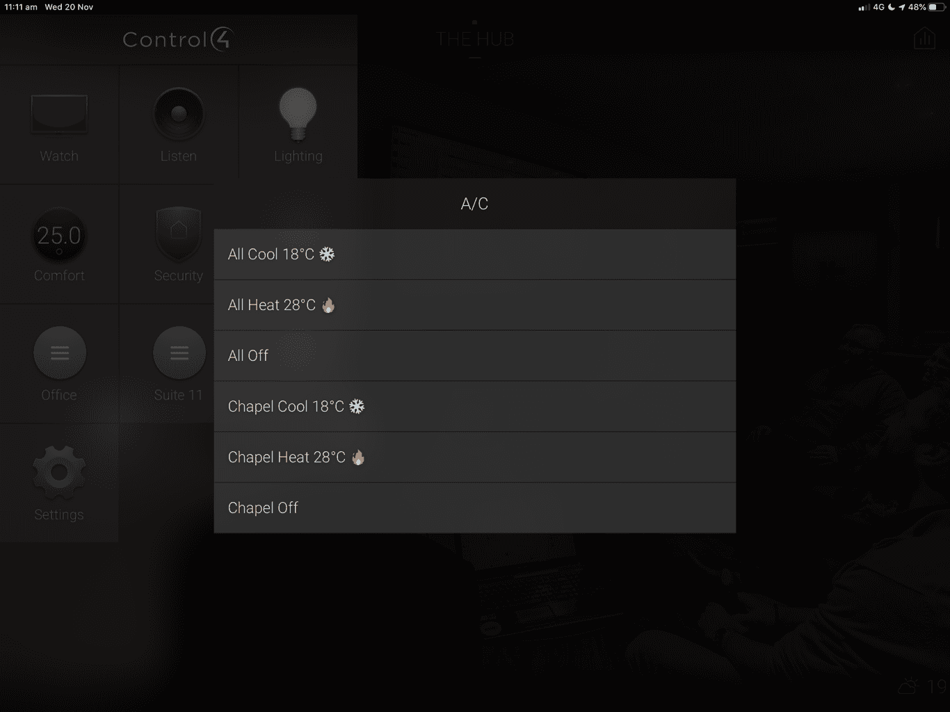
It's usually easier for users to remember where given information is when it is associated with an image/icon. This is especially true for non-technical people or the ones that are not very familiar with digital workspaces.
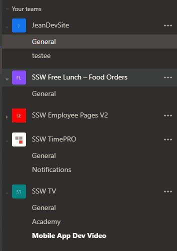
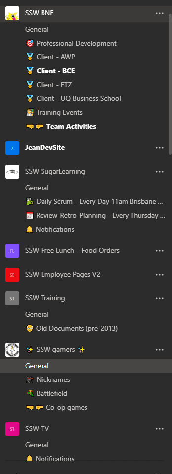
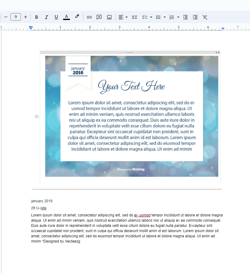
An easy and fun way to alleviate this issue and boost user adoption to Microsoft Teams is to use Emojis in your channel names (using Windows Key + .)!
Figure: Bad example - Teams Channel names without emojis
Figure: Good example - Teams Channel names have emojis
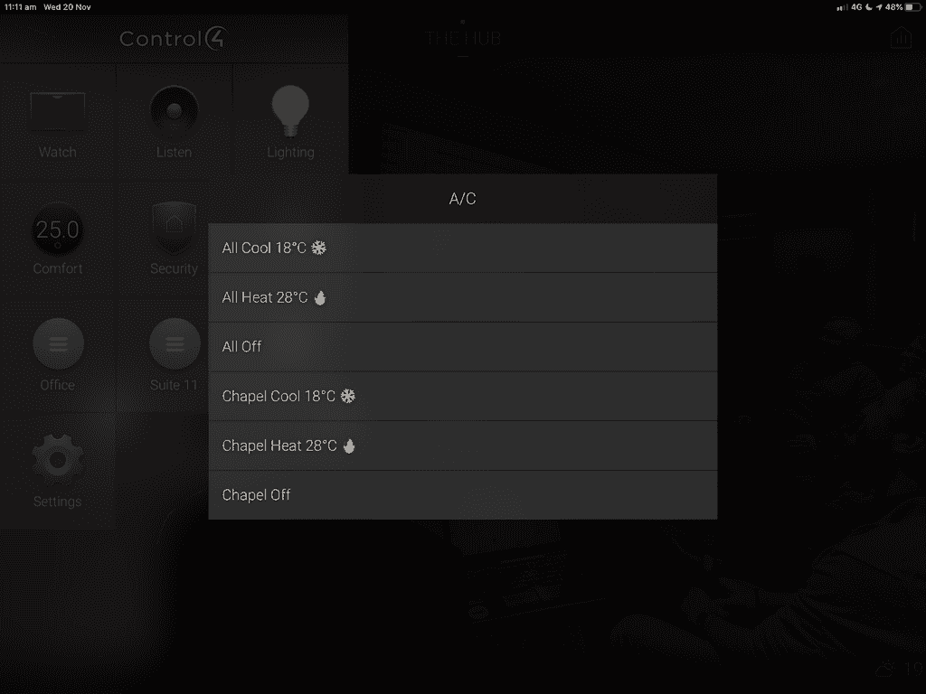
Figure: Good example - Control4 automation Mobile UI is more friendly with emojis
Figure: Good example - Some appointments can benefit from an emoji too, like a Sprint meeting in Scrum
Fast to load (lightweight as no image)
UI - Consistent look
Maintenance of needing to upload to server
Bad example - Regular list items
Tip: Always remember to add a space between the emoji and text, for better readability.
✅ Fast to load (lightweight as no image)
✅ UI - Consistent look
❌ Maintenance of needing to upload to server
Good example - Emojis give context to each item
Note: When having lists that use emojis, be aware that if they are longer than 3 items, you should follow DRY - avoid repeated elements.
It's usually easier for users to remember where given information is when it is associated with an image/icon. This is especially true for non-technical people or the ones that are not very familiar with digital workspaces.
Writing in large blocks of text is a common practice, but it can hinder readability. Incorporating line breaks and spacing significantly enhances content readability. This allows readers to navigate through the text more easily, absorb information more effectively, and stay engaged with the material.
Warning: For web (HTML/Markdown), line breaks should not be used to to create layout spacing!
You should use CSS margin and/or padding instead.
On the other hand, in regards to emails and/or informal documents, line breaks can be used for spacing. In these cases, correct syntax is not crucial, and breaking a line is more convinient than dealing with margins/line spacing.
Long paragraphs
Consider breaking lines/paragraphs when you have a long block of text. You should aim to separate the information by context.
SSW is made up of a great team of staff that is passionate about technology and how it meets business needs. Today SSW has offices in Sydney, Melbourne, Brisbane, Newcastle, Strasbourg (France) and Hangzhou (China), with over 100 employees. Want to meet them? Have a look at SSW People.
Figure: Bad example - Long block of text
SSW is made up of a great team of staff that is passionate about technology and how it meets business needs.
Today SSW has offices in Sydney, Melbourne, Brisbane, Newcastle, Strasbourg (France) and Hangzhou (China), with over 100 employees.
Want to meet them? Have a look at SSW People.
Figure: Good example - The text is separated by paragraphs
Notes, Tips, PS
Content elements like Note, Tip, PS (and similar) should be on a new line to enable better readability. It is beneficial to bold those words.
Test the login functionality thoroughly. Note: Try both valid and invalid credentials.
Figure: Bad example - No line break before the note
Test the login functionality thoroughly.
Note: Try both valid and invalid credentials.
Figure: Good example - The "Note" being on a fresh line and in bold makes it much easier to read
Figure: Good example - The URL being on a fresh line makes it much easier to read
Headings
It's a good idea to have some space after headings.
Hey Bob,
Check out this awesome new video about the SSW Cultural Exchange Program!
Figure: Bad example - No spacing after heading
Hey Bob,
Check out this awesome new video about the SSW Cultural Exchange Program!
Figure: Good example - Spacing after heading
Multiple items as lists
If you text has information that can be turned into multiple items, you should do so, by creating a list. For example, when sending PBIs for a Sprint.
I have 2 PBIs in the coming Sprint: Product Backlog Item 88994: Performance | Create a new App Service plan and Product Backlog Item 88823: Azure | Create a new App Service Plan in West US for SL production resource group. I will do the IoC after.
Figure: Bad example - Block of text
I have 2 PBIs in the coming Sprint:
PBI 88994: Performance | Create a new App Service plan
PBI 88823: Azure | Create a new App Service Plan in West US for SL production resource group
I will do the IoC after.
Figure: Good example - List is used to separate information and make it easier to digest
It is also recommended to include spaces after an image or a figure description. These elements need breathing space to help users focus on them.
Writing in large blocks of text is a common practice, but it can hinder readability. Incorporating line breaks and spacing significantly enhances content readability. This allows readers to navigate through the text more easily, absorb information more effectively, and stay engaged with the material.
Quotation marks can help user distinguish controls from the normal words. This is especially important in technical documentation, as the control names can be normal words.
Click the Upgrade link
Figure: Bad Example - It's not clear that Upgrade is a control
Click the "Upgrade" link
Figure: Good Example - This is much clearer to the user what to search for
Quotation marks can help user distinguish controls from the normal words. This is especially important in technical documentation, as the control names can be normal words.
It is a good idea to create a dummy company to represent all clients on internal/external documentation, including a made-up name for the person behind that company.
For example, anytime you need to show a scenario of dealing with clients, use the made-up company called "Northwind" which is managed by the also made-up client "Mr. Bob Northwind", often referred to as just "Bob".
Most of documentation starts from a real-world situation, but you don't want to expose real clients' names.
Hi Mark Zuckerberg,
We need to make sure the project Facebook app will be approved before summer.
Regards,
Bad example - Using real people and real companies as examples
Hi Bob,
We need to make sure the project Northwind app will be approved before summer.
Regards,
Good example - Using dummy consistent names on examples
It is a good idea to create a dummy company to represent all clients on internal/external documentation, including a made-up name for the person behind that company.
For example, anytime you need to show a scenario of dealing with clients, use the made-up company called "Northwind" which is managed by the also made-up client "Mr. Bob Northwind", often referred to as just "Bob".
Readability of URLs is important, so you should consider making a short URL. However, it is not just making the length as short as possible - it should be friendly.
If you use a unfriendly and long link people can't see what they are clicking through to. In fact, this is what most spammers rely on.
Good example - The nice and clean URL makes it easy to see what the link is about
Sometimes even a nice URL can be improved by removing all the filler words and just keep the main keywords. This way your URL's are more friendly. Also, make sure your main keywords are relevant for searches.
Figure: Good example - The filler words removed and only 'juicy' words remain
Bit.ly
Sometimes you are not in control of the link. In those cases, use Bitly to transform any long URL into a shorter, more readable link.
Auto-shorten link: bit.ly/3zTHz8b
OK example - Auto-generated shorten URL - It's short but hard to remember
When have a Bitly account, you can customize links to a more readable option.
Custom shorten link: bit.ly/VS-2022-Sample
Good example - Short URL, and easier to remember
Readability of URLs is important, so you should consider making a short URL. However, it is not just making the length as short as possible - it should be friendly.
When naming documents and images, use descriptive words and kebab-case (where you separate words with hyphens) to make your files more easily discoverable.
✅ Choose the right words
The file name and its title is regarded more highly by search than the content within documents. Also, the file name is what is displayed in search results, so by making it descriptive you are making it easier for people to identify the purpose of your document.
Once you have chosen the best words, make it readable and consistent in formatting:
❌ Avoid spaces
Monthly Report.docx
Figure: Bad example - File name using spaces to separate words
As far as search goes, using spaces is actually a usable option. What makes spaces less-preferable is the fact that the URL to this document will have those spaces escaped with the sequence %20. E.g. sharepoint/site/library/Monthly%20Report.docx. URLs with escaped spaces are longer and less human-readable.
Figure: Bad example - File name using CamelCase doesn't have spaces but also doesn't contain any separators between words
This is a popular way to combine words as a convention in variable declarations in many coding languages, but shouldn't be used in document names as it is harder to read. Also, a file name without spaces means that the search engine doesn't know where one word ends and the other one begins. This means that searching for 'monthly' or 'report' might not find this document.
❌ Avoid Snake_Case
Monthly_Report.docx
Figure: OK example - Underscored (Snake_Case) URLs have good readability but are not recommended by Google
Underscores are not valid word separators for search in SharePoint, and not recommended by others. Also, sometimes underscores are less visible to users, for example, when a hyperlink is underlined. When reading a hyperlink that is underlined, it is often possible for the user to be mistaken by thinking that the URL contains spaces instead of underscores. For these reasons it is best to avoid their use in file names and titles.
✅ Use kebab-case
monthly-report.docx
Figure: Good Example - File name uses kebab-case (dashes to separate words)
A hyphen (or dash) is the best choice, because it is understood both by humans and all versions of SharePoint search.
You may use Uppercase in the first letter in Kebab-Case, however it's important to keep consistency
Extra
Add relevant metadata where possible
If a document library is configured with metadata fields, add as much relevant information as you can. Metadata is more highly regarded by search than the contents within documents, so by adding relevant terms to a documents metadata, you will almost certainly have a positive effect on the relevance of search results.
Ensure filenames are unique when tracking files with Git
Within a team, there may be a mix of operating systems being used by its members. For users on MacOS or other OS's that have case-sensitive filenames, it's crucial to ensure that filenames are unique. For example, don't use 'File.txt' if 'file.txt' already exists. This is especially important if these files are being tracked with Git, as it can cause issues for users on Windows, which has case-insensitive filenames.
When naming documents and images, use descriptive words and kebab-case (where you separate words with hyphens) to make your files more easily discoverable.
It is very important to have your Word, PowerPoint, PDFs, and design documents up-to-date. You should also make it easy for anyone to identify which version they are looking at. The most effective way to achieve this is by placing the version number on the right-hand side of the footer.
Figure: Good example - Version number on the RHS of a design document
For internal use, it is also good practice to include the major version number in the name of the files. This helps navigating through the old and the new versions, and makes it easy to roll back any changes and use an older version. For public files you should not include version numbers.
Warning: This should only be changed on major versions and only on internal documents.
Figure: Good example - Internal file names show the version information
It is very important to have your Word, PowerPoint, PDFs, and design documents up-to-date. You should also make it easy for anyone to identify which version they are looking at. The most effective way to achieve this is by placing the version number on the right-hand side of the footer.
Often while doing a task, you follow a process. If it's a repeatable task, it's important that the process is documented and up-to-date. Otherwise, the next person to do the task won't know the right thing to do. The job is not done until it's documented - documenting/updating a standard is part of the "Definition of Done" in such tasks.
When should you do it?
Document or update a process as soon as a change happens. Don't wait until the task is complete because it will likely be forgotten.
Say a meeting where multiple options were discussed and a decision was made. You must communicate the client and the team, but before sending a 'Done', make sure the decision and its reasons are documented and accessible by others who didn't attend the meeting (e.g. Create or update a rule). This way others may not need a meeting next time.
If you are really under the crunch and your task is critically urgent (e.g. Production website is down), then send yourself an email to action the standard update later.
Where should you do it?
Processes are usually stored in different places depending on the context they apply to.
Induction (e.g. SugarLearning) - Links to standards/rules + test knowledge
Often while doing a task, you follow a process. If it's a repeatable task, it's important that the process is documented and up-to-date. Otherwise, the next person to do the task won't know the right thing to do. The job is not done until it's documented - documenting/updating a standard is part of the "Definition of Done" in such tasks.
Architectural Decision Records (ADRs) are lightweight documents use to record important decisions in your project. They do not necessarily have to be related to architecture, but could be any important decision made by the team.
What are the dangers of not documenting important decisions?
Lack of transparency and communication
Loss of intellectual property
Loss of historical context
Risk of repeating mistakes
Difficulty in auditing and governance
What are the advantages of using ADRs?
Providing documentation and historical context
Collaboration and communication
Informed Decision making
Decision re-evaluation
Avoiding blind acceptance or reversal
The act of documenting an important decision, forces developers to think more objectively about their decision. If the decision is likely to cause contention it may be quicker to document it via an ADR and get feedback, than it would be to implement the change and let the reviewer try to infer your reasoning.
Additionally, documenting decision 'deciders' ensures that we have a 2nd pair of eyes across the decision, just like we do with the checked by rule, test please rule, and pull-requests.
ADRs can also help with knowledge sharing across teams, as other Solution Architects will have access to a succinct explanation of the problem and the decided solution.
Another benefit is that future developers joining the project now have access to the historical context as to why certain decisions were made.
Where should ADRs be stored?
They should be stored wherever the technical documentation for your project lives. Storing them in Git along with your code works well, but alternatively wherever your technical documentation lives (i.e. a wiki).
What Can I use to Create and Manage ADRs?
There are several tools available to help create and managed ADRs, but one of the best ones is Log4Brains. Log4Brains can help to create and view ADRs.
This can be installed by running:
npm install -g log4brains
You can then initialize your git repo by running:
log4brains init
Which will guide you through a simple setup process.
Architectural Decision Records (ADRs) are lightweight documents use to record important decisions in your project. They do not necessarily have to be related to architecture, but could be any important decision made by the team.
The English language is really complex, and often during a discussion you don't know the context until you get midway through the sentence, or even the end of the sentence. This problem is particularly notable when you are browsing a page on Google, because you lack the context of the rest of the page.
For example, a page might have a category on a website, but when you look at it in Google results, that category may not be shown.
Incorporating a prefix into webpage titles enhances clarity and immediately provides valuable context for users.
At a bare minimum, the context should be completely fleshed out in the title of a page. However, the gold standard is to use prefixes.
Prefixes provide several benefits including:
Skimming - Establishing context without having to read the full content
Contextualizing - Priming the reader on the subject matter
Finding - Helping the reader quickly jump to the right content in a list
Grouping - Categorizing content together without the need for a complex bespoke solution
Bad example - There is no context provided in the title, it could be about subjects for Meetings, Conferences, Videos or something entirely different
OK example - The context is included in the title
Good example - The prefix very clearly identifies the subject in the title
The English language is really complex, and often during a discussion you don't know the context until you get midway through the sentence, or even the end of the sentence. This problem is particularly notable when you are browsing a page on Google, because you lack the context of the rest of the page.
For example, a page might have a category on a website, but when you look at it in Google results, that category may not be shown.
Incorporating a prefix into webpage titles enhances clarity and immediately provides valuable context for users.
A standard computer keyboard can produce dozens of different symbols. Some of these are commonly used, whereas others are used only rarely. It is important to know what each symbol is called and how to spell it in English. That way, if you are uncertain of how or when to use a particular symbol, you can look it up and get your answer. Below is a table of common keyboard symbols and their spellings.
A standard computer keyboard can produce dozens of different symbols. Some of these are commonly used, whereas others are used only rarely. It is important to know what each symbol is called and how to spell it in English. That way, if you are uncertain of how or when to use a particular symbol, you can look it up and get your answer. Below is a table of common keyboard symbols and their spellings.
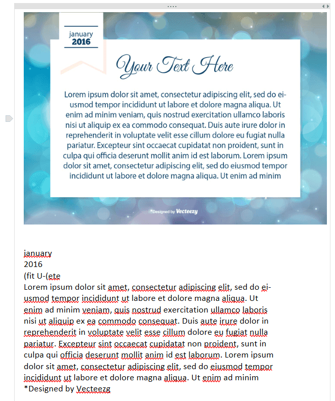
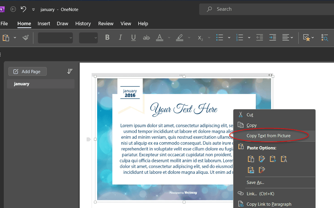
Have you ever stumbled upon a useful chart, diagram, or infographic with embedded text, only to find that the text can't be copied? This is incredibly frustrating because the information is locked in an image format. The process of manually typing out the text can be time-consuming and prone to errors. There are a couple ways to solve this:
Method 1: Using OneNote
Using OneNote is simple. All you do is paste your image into OneNote, right click on it, and click Copy Text from Picture.
Figure: Paste image into OneNote and right click on it
Figure: Good example - The text pastes below the image. Easy!
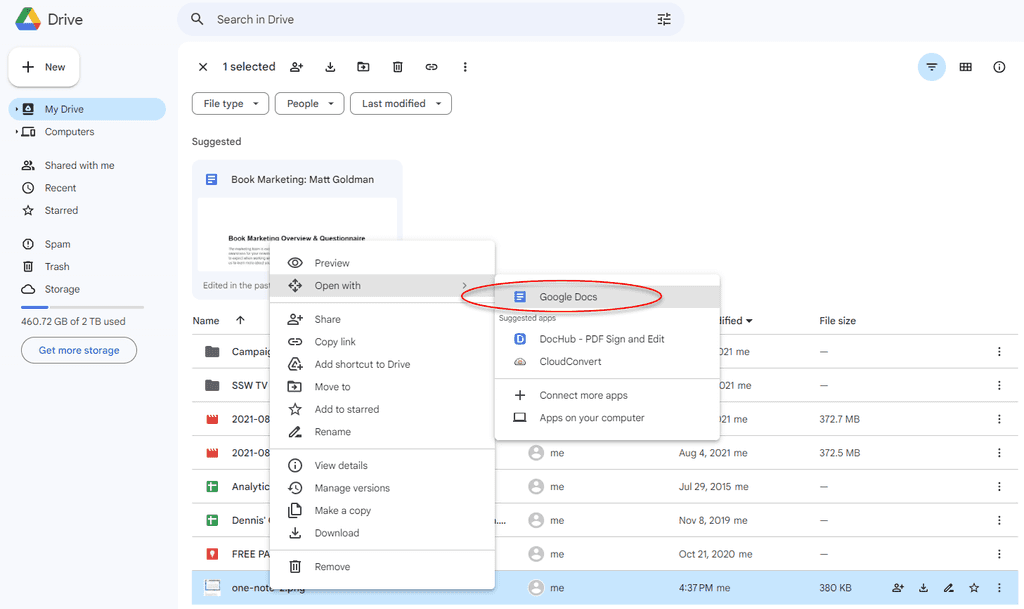
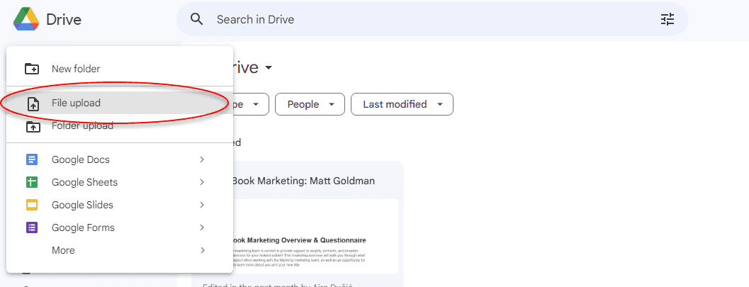
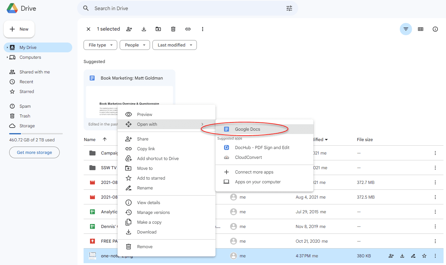
Method 2: Using Google Drive
In Google Drive you need to upload your image as a new file. Then you need to right click on the image file and select ** Open with | Google Docs**.
Figure: Upload your image first
Figure: Open your image with Google Docs
Figure: Good example - The text is added to the new document!
Have you ever stumbled upon a useful chart, diagram, or infographic with embedded text, only to find that the text can't be copied? This is incredibly frustrating because the information is locked in an image format. The process of manually typing out the text can be time-consuming and prone to errors. There are a couple ways to solve this: