Do you make users intuitively know how to use something?
Loading last updated info...
- When we see a door, we immediately know that we can open it and go through it
- Links in blue and underlined has an affordance of clickability
- Buttons can be pressed
- Scrollbar moves the document in the window
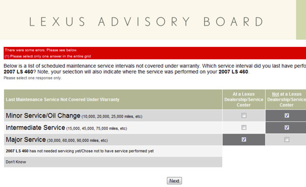
❌ Figure: Bad example - The affordance of the checkbox makes this UI misleading
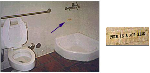
❌ Figure: Bad example - If this mop sink didn't look so much like a urinal and wasn't right next to the toilet, maybe the sign wouldn't be necessary

❌ Figure: Bad example – It might not have been a good idea to place a male policeman where the exhaust pipe is
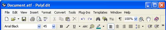
❌ Figure: Bad example - Old Microsoft Word - Because of the UI, people never knew they could use styles e.g. normal, H1, H2
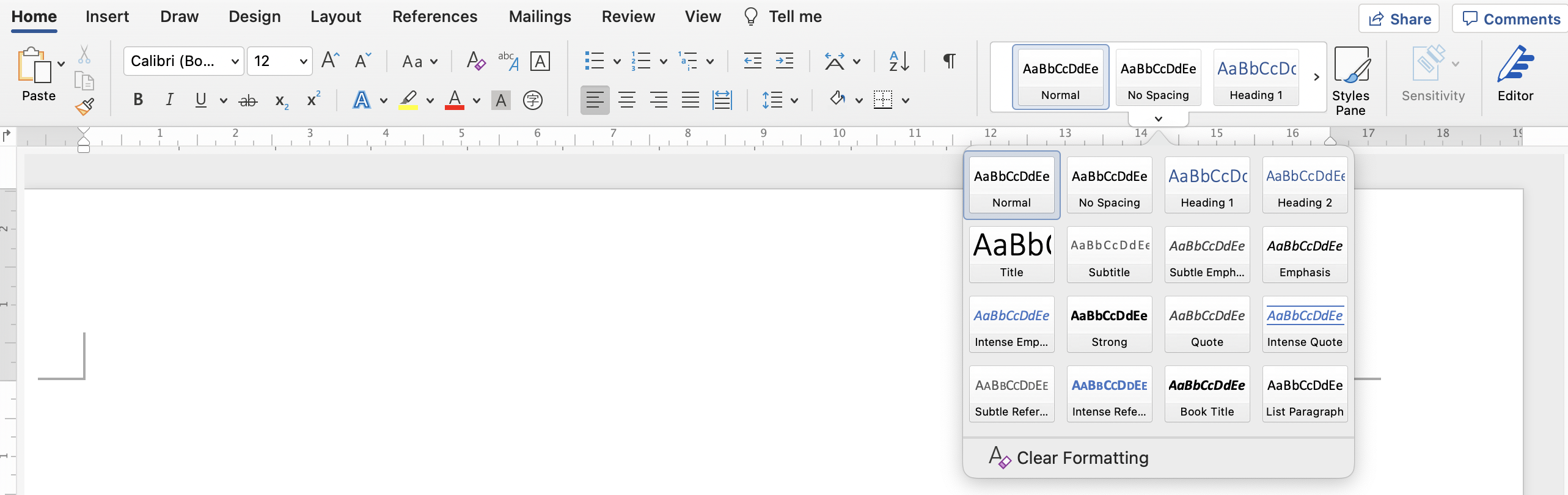
✅ Figure: Good example - New Microsoft Word - Because of the new ribbon UI, people intuitively know how to use styles
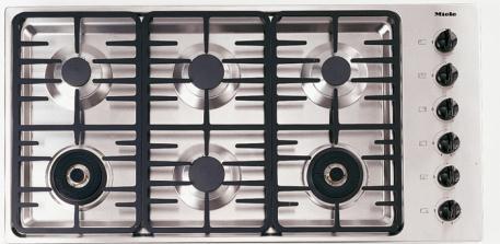
❌ Figure: Bad example - Which is the dial that controls the top-right stove?
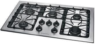
✅ Figure: Good example - In this layout, it's easy to see which dial controls which stove