Want to get Power BI working for you? Check SSW's Power BI Consulting page.
Power BI offers a variety of visualizations, each suited for different types of data and insights. Choosing the correct visualization is crucial for effectively communicating data stories.
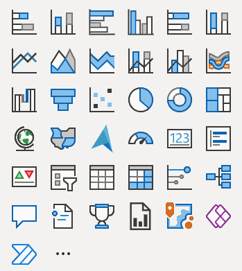
Here's a guide to understanding when to use each type of visualization provided in Power BI, according to the visual selector interface.
Your reports and dashboards should tell the right story to your end users. They should be able to get the gist of the report at a glance and not have to work at trying to understand what it means.
To follow best practices for version control for Power BI reports you must know about the following features:
Power BI reports are generally published directly into the Power BI Service. But doing so has many drawbacks. For example, you can't see:
- What was changed
- Who made the change
- When the change was made
In other words, the history of the changes isn't recorded anywhere.
You can save report under My Workspace and share it with your team. This is bad because if you leave your company, your report is gone!
It's better to save reports under Group Workspace and share it with the team.
Using colour in reports can bring them to life, or else make them confusing and noisy, so make sure youre intentional with them.
Many reports are expanding on what could be expressed as a single number. When this is the case, make sure that number is clear and bold at the top right of the report.
Ideally this should be a single number, not a group of numbers. If there is more than one, make sure one is chosen as the main one and put the others in a less prominent colour, size, or position.
An even better option is to show this number as a KPI, which shows historical values for that number in the background, and potentially a target. this gives contextto whether the number you're seeing is a "good" or "bad".
Leveraging AI tools for critiquing and enhancing reports and dashboards can significantly improve their quality and effectiveness. Free AI tools such as the Report Enhancer GPT, can be used for this purpose, which checks your report against the International Business Communication Standards (IBCS).
The Power BI Portal can be customized with custom branding. The items that can be changed to make Power BI fit into an organizations brand are:
- Logo
- Cover Image
- Theme Colour
It's tempting when you create a Power BI report to put slicers wherever they fit, but this can lead to an incosistent experience for users.
- Do you know when to use each visualization in Power BI?
- Do you always choose the right visual for your reports?
- Do you know the Power BI version control features?
- Do you use version control with Power BI?
- Do you know where to save reports?
- Do you know the best practices around colour?
- Do you have a single focus number for each report when possible?
- Do you use AI to critique and improve your Reports and Dashboards?
- Do you know how to add custom branding to the Power BI portal?
- Do you place your slicers consistently?
- Do you know not to use Alphabetical Sorting?
- Do you monitor Power BI report usage?
- Do you use 'Email Subscriptions' to get reports in your inbox?
- Do you know how to integrate Power BI with Reporting Services 2016?
- Do you know the difference between Calculated Columns and Measures in Power BI?
- Do you use the Dataverse connector when connecting the Dynamics 365?
- Do you know when to use SSRS over Power BI?
- Do you gather insights from company emails?
- Do you create Power BI Template Apps?