Data Layout - Do you show data and chart in one?
Loading last updated info...
Users of the report service will find the data easier to understand and compare. However, in order for the report to be understandable, the data and chart must be clear and uncluttered.
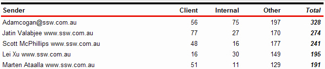
❌ Figure: Bad example - There is no chart to visually represent the data
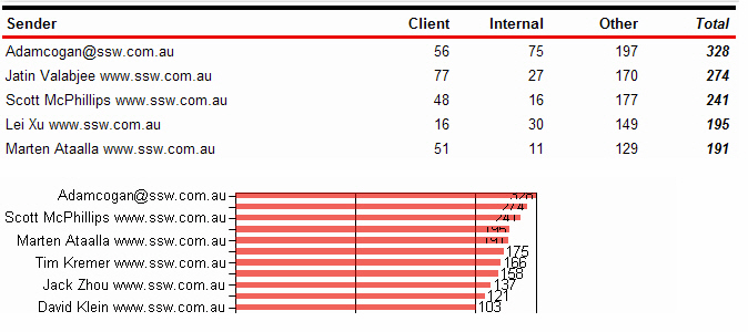
❌ Figure: Bad example - There is a chart, however it is not clear
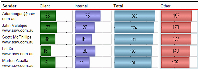
✅ Figure: Good example - Data and chart are clearly integrated into one