Do you have consistent SharePoint Sites?
Last updated by Brady Stroud [SSW] about 1 year ago.See historyIt's important for all your SharePoint Sites to be as consistent as possible. This helps users' navigation through new pages as they know exactly where to look.
Following these simple rules makes this really easy:
- Put your preferred navigation in the same place (usually on the left-hand side)
- Keep the headings consistent
- Use icons for each type of link, so users easily know what to expect when clicking on a link (E.g. A Microsoft Word document is going to open a Word document) Aldo, a link to "Home" looks the same on every page.
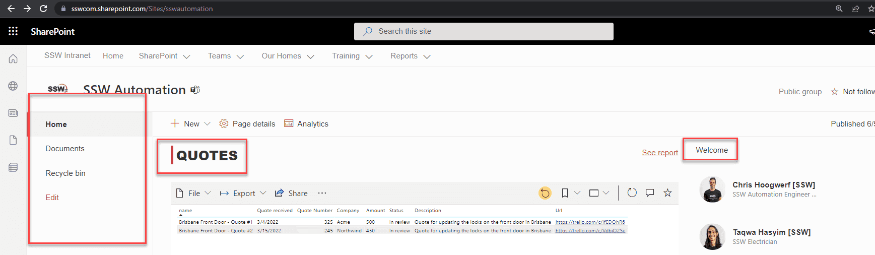
Navigation consistency between pages
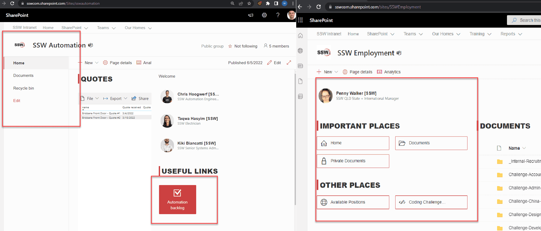
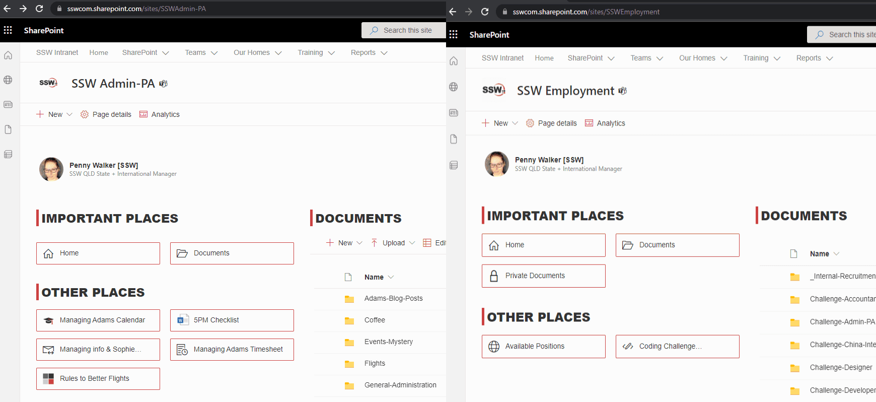
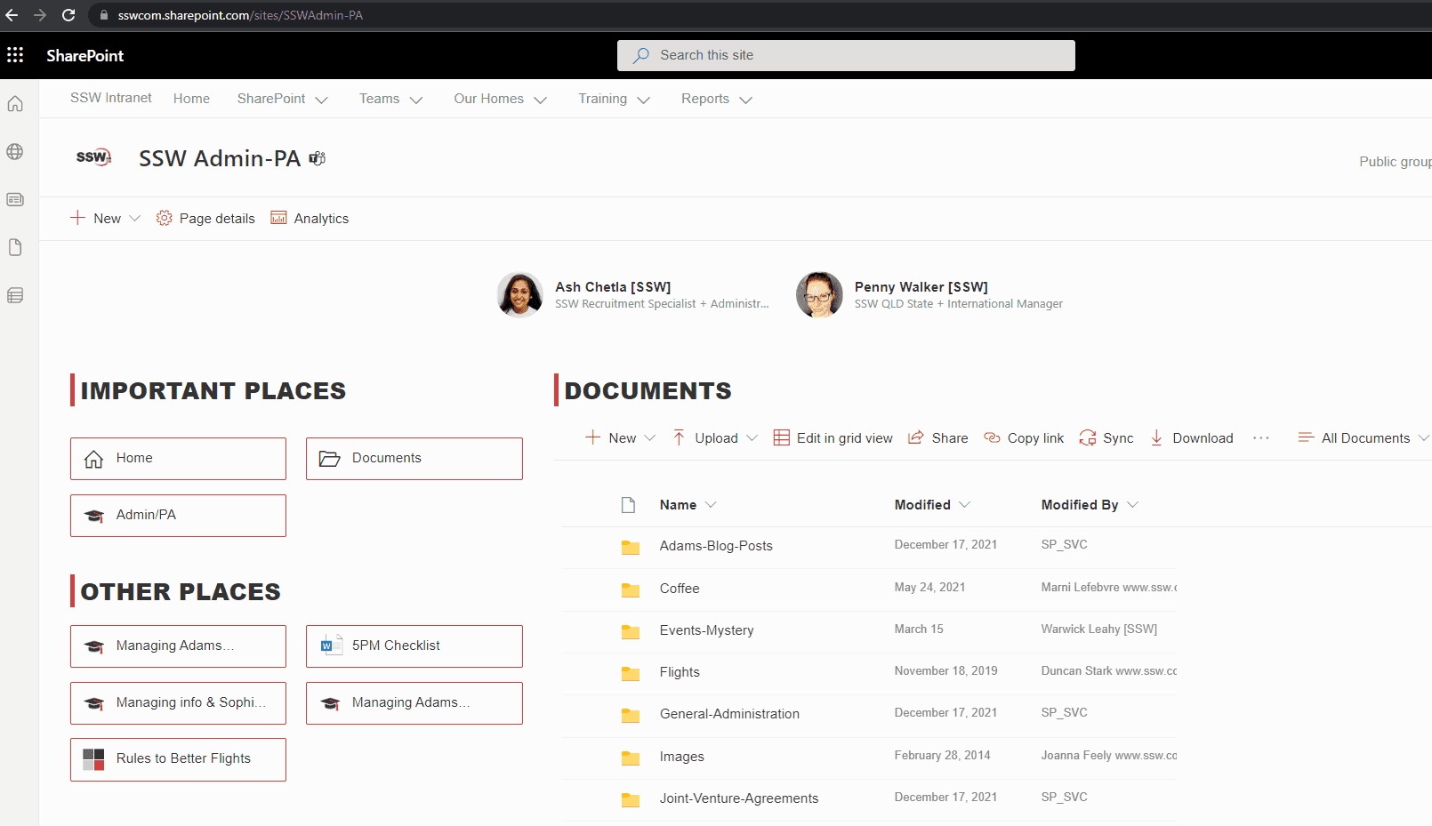
Headings and icons consistency within a page