Do you have a design system?
Loading last updated info...
When every screen looks a little different and design → dev handoffs turn into nitpicking sessions, you are missing a design system.
A design system bridges the gap between design and engineering, aligning everyone around a shared language and providing the tools to build faster and better. It avoids inconsistent UI, longer review cycles, and time spent debating minor visual tweaks.
The stakes are higher now that AI agents write UI too. A coded design system decides whether an agent assembles your real components or invents new ones every time.
Video: Stop Rebuilding UI: The Real Power of Design Systems Explained (3 min)
Signs you need a design system
You usually feel the pain before you can name it. Common signs:
- ⚠️ Production doesn't match the design intent
- Spacing, font, color, and radius shift between screens for no reason
- A "small" change in one place turns into a hunt through the codebase
- Reviews get dominated by visual nitpicking
- Style guides are outdated, scattered, or missing entirely
What a design system contains
| Part | What it is |
| Tokens | The small, reusable decisions underneath everything: color, spacing, fonts, radius. Define them once and every component inherits them. |
| Component library | Buttons, inputs, modals, and patterns, with their variants and usage rules. |
| Documentation | Usage guidelines, dos and don'ts, examples, and live demos. |
| Governance | Clear ownership, a contribution process, handoff tools, and semantic versioning to manage updates. |
The 5 levels
"Design system" means different things to different people, from a single design file to a full coded platform. Knowing your level tells you what to build next.
| Level | Stage | What it adds |
| 1 | Design Library | A design file (e.g. Figma) with consistent styles and reusable components like buttons and inputs. |
| 2 | Documented System | Usage guidelines, naming conventions, dos and don'ts, accessibility notes, and basic governance. |
| 3 | Design-Dev Alignment | Tokens mapped to code, creating a shared language for color, spacing, type, and other foundational styles. |
| 4 | Coded Components | Components live in code (e.g. Storybook) and match the design library. |
| 5 | Scalable Ecosystem | Formal governance, versioning, a contribution model, changelogs, and multi-product use, often with its own portal. |
Tip: The jump that matters most is from a design file → coded components. Until your components exist in code, the system stays a reference rather than something you build from.
Real-world examples
These are all great examples of level 5 design systems:
- SSW Design System - Tokens, coded components, and usage rules built to design and build from
- Atlassian Design System - Tokens, patterns, tone of voice, and code
- Google Material Design - Theming, deep docs, and ready-to-use code
- IBM Carbon - Enterprise-level, open source, and WCAG-compliant
- Shadcn - Headless components + Tailwind, great for custom styling and modern UIs
- Shopify Polaris - Design, content, and accessibility all in one
- Wise Design - Multi-brand theming, shared tokens, and flexible components
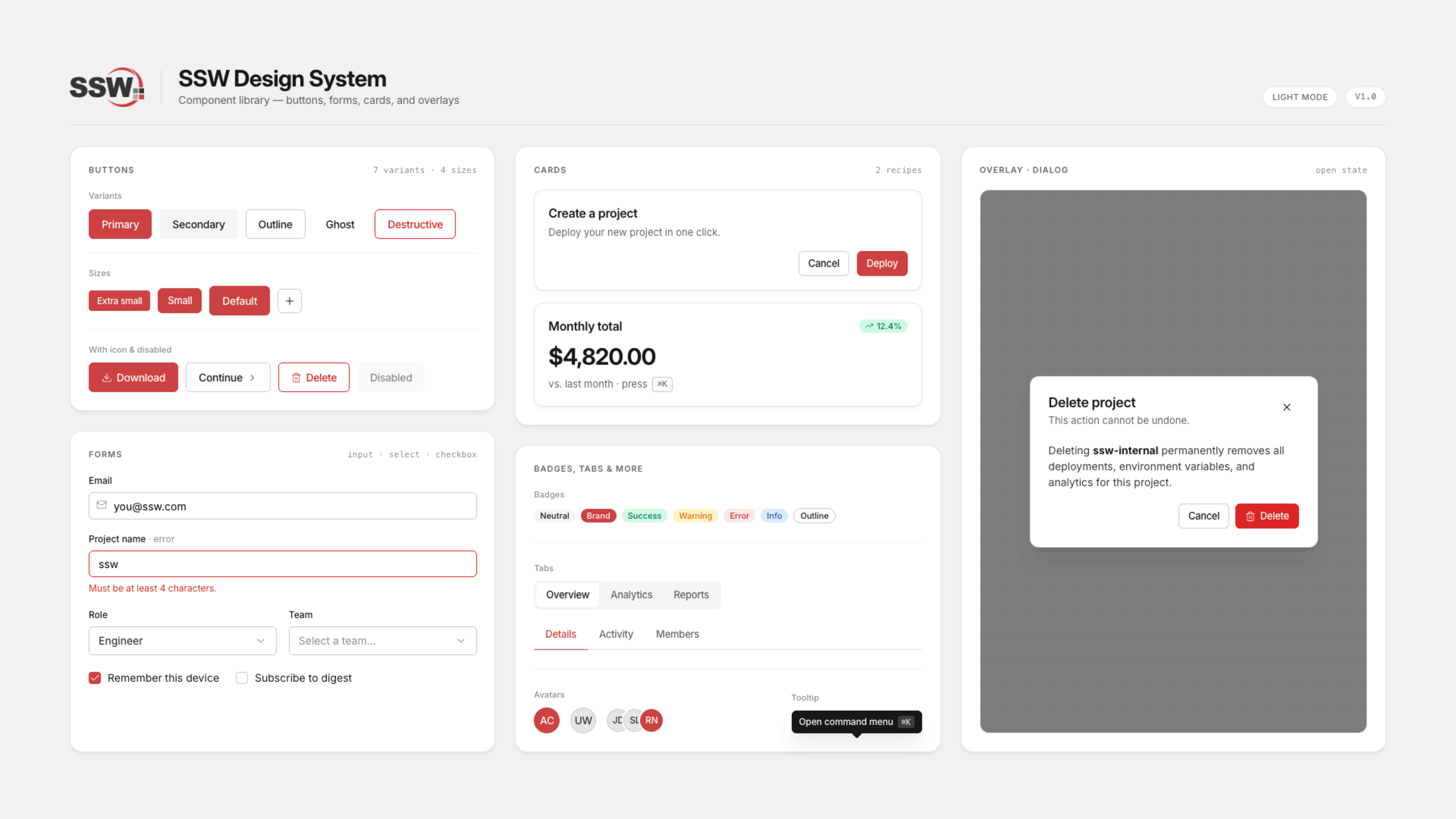
Figure: Snapshot of a few components from the SSW Design System
Why AI raises the stakes
Agentic workflows let developers cover more ground at record speed. Without a system they can build from, developers (and their agents) will build UI from scratch, which makes it easier than ever to make a mess 10x faster.
A coded design system changes what the agent has to work with. Instead of inventing components, it assembles ones you have already designed, reviewed, and tested.
We built ours in Storybook https://design.ssw.com.au which our agents read through MCP. This is what pulls our real components into context.
How to set up a design system
You do not need the whole thing on day one. Most teams start with a handful of shared components and grow from there.
- Audit what you have - Look for visual and structural inconsistencies
- Choose a direction - Build a bespoke system from the ground up, or adopt an open-source one and tweak it to match your brand
- Define your tokens - Start with the color, spacing, and type values unique to your brand
- Build your first components - Focus on core UI elements: header, footer, buttons, input fields
- Get the tokens into code - Tools like Style Dictionary can push your tokens into code
- Move the components into code too - Somewhere both developers and agents can pull from, like Storybook
- Document as you go - Usage notes, examples, and versioning
- Set up ownership and checks - Decide who maintains it, then add visual regression and accessibility audits so it stays honest
Tip: Start small enough to ship something useful quickly, then expand. A shared library with a few solid components already saves time. The coded layer is where it starts paying off, for your developers and your AI agents alike.
Learn more
Video: Welcome to design systems - Lesson 1 : Introduction to design systems (15 min)