Do you display information consistently between linked pages?
Loading last updated info...
When redirecting users to another page, make sure that the text is consistent between the two pages.

✅ Figure: Good example - The text is taken from where the "More on SSW Chinafy" link at the end goes

✅ Figure: Good example - You can see the text again here, at the link's destination
When we want to point users to a page, we simply use the summary part of that page as narrative on the other page, with a "More" hyperlink to that page. The resulting effect is when the user clicks the link, the page begins with exactly the same information again. As a result, the user is never confused and has a nice flow between pages when navigating around the site.
As an example, the SSW website follows a consistent order: a summary of the product/service and its benefit, followed by a link for more information on that topic.
Tip: In this scenario where the summary serves as a teaser for more detailed content, have the link at the end of the section, so it's the natural next step for someone who has read it and wants to know more.
The same applies to links in your applications – use the same text layout and a "More" hyperlink to a page with the same description, so the user is never confused when navigating from your application to the web.
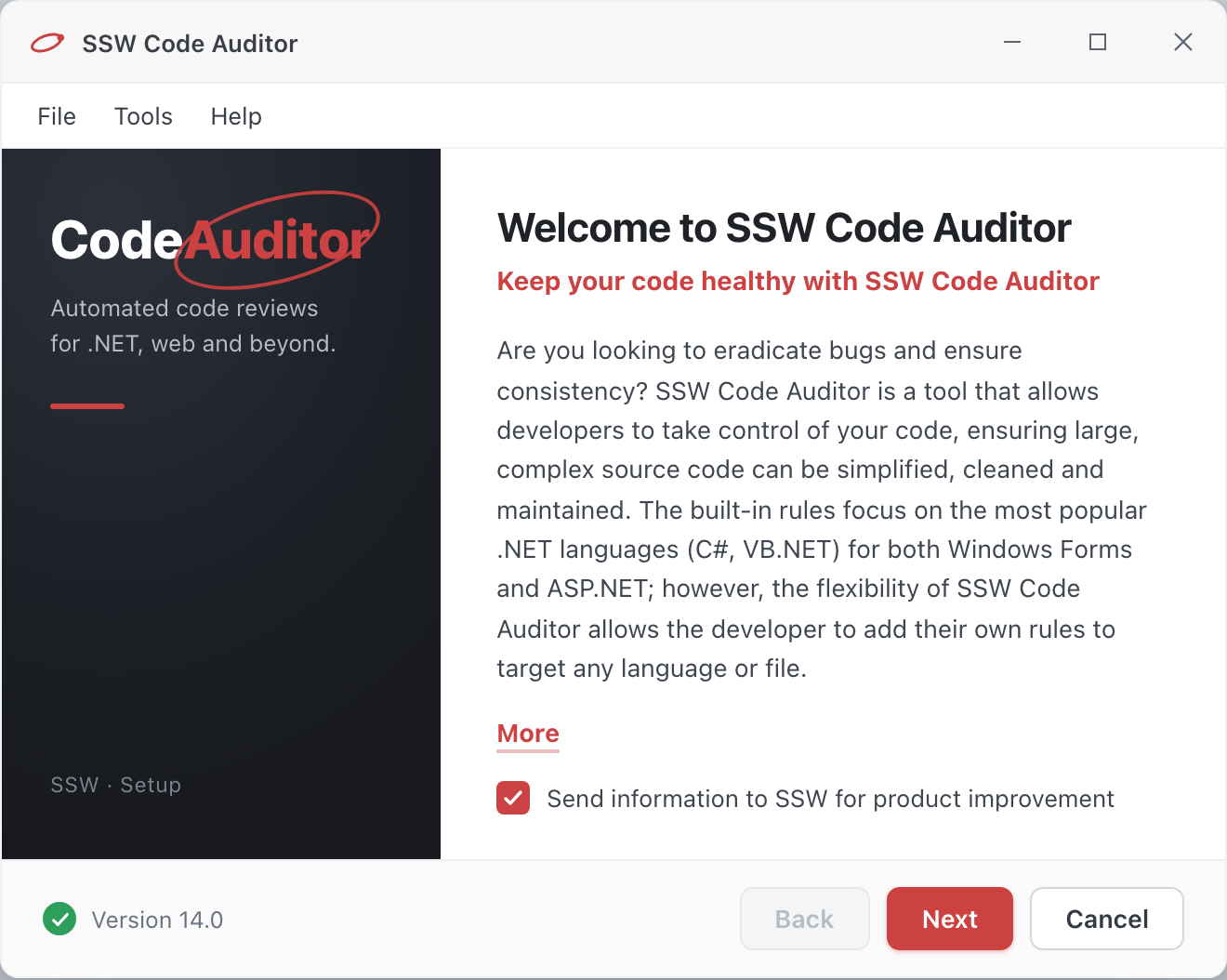
Figure: The application displays a description with a link to the web page

Figure: See how the text in the application is reflected in the link