Do you use display classes to responsively hide/show content?
Loading last updated info...
When designing responsive websites, it's important to consider what content is appropriate for each screen size. Desktops might have large navigation areas and extra content in a sidebar, whereas the phone might focus on other content.
By default, Bootstrap will wrap the columns and make them full width on phones. If you want to hide content rather than let it wrap you can use the .d-none class or one of the .d-{sm,md,lg,xl}-none classes for any responsive screen variation.
More information on Display property - Quickly and responsively toggle the display value of components and more with our display utilities.
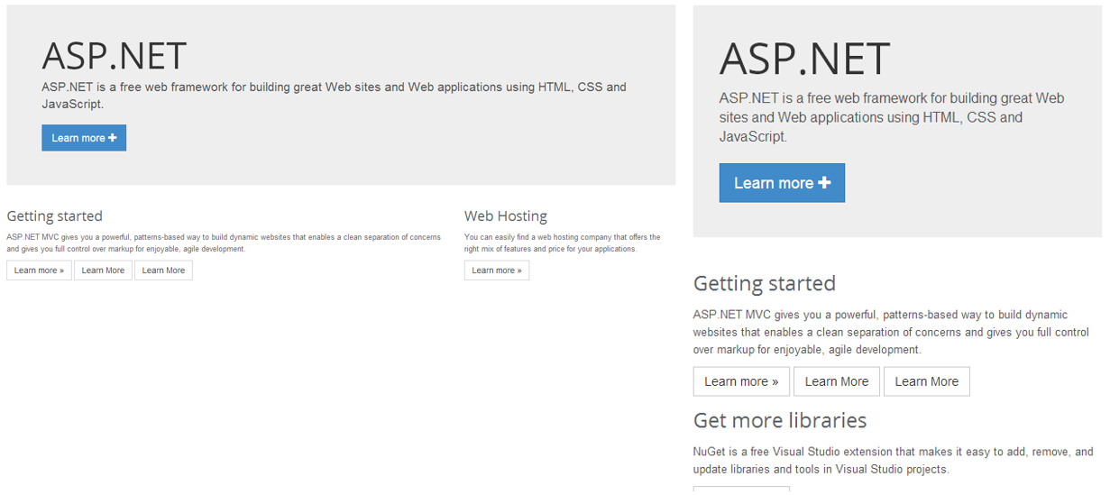
❌ Figure: Bad example - The mobile view on the right has a large unnecessary title
Remove the title by adding the .hidden-xs class.
<h1 class="d-xl-none">ASP.NET</h1>
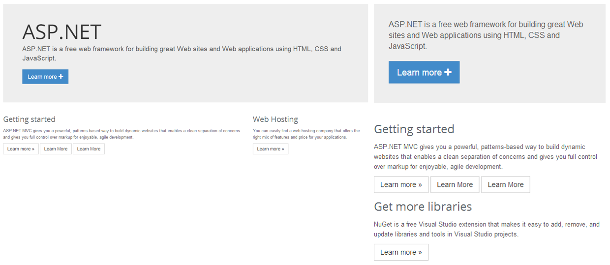
✅ Figure: Good example - The mobile view is now leaner and cleaner thanks to Bootstrap display classes