Do you use the hamburger menu icon wisely?
Loading last updated info...
Hamburger menus are everywhere. They are popular and they declutter mobile UIs but the downside is that the menu items are less discoverable and require an extra click.
Video: Hamburger Menu Icon Update (3 min)
When should you use a hamburger menu?
Use it only when screen space is tight (typically on mobile). Otherwise, always prefer showing navigation visibly.
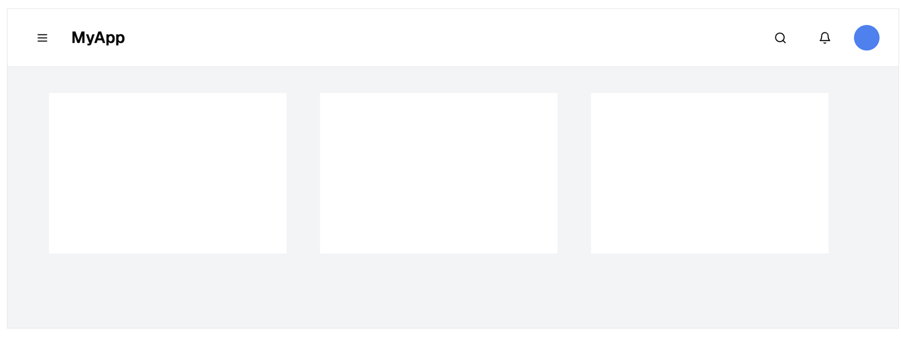
❌ Figure: Bad example - On desktop, navigation should be visible when screen space allows. Hiding it behind a hamburger reduces usability
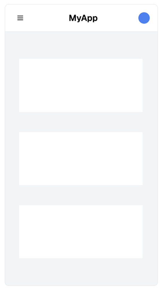
✅ Figure: Good example - On mobile, screen space is limited, so hiding the nav behind a hamburger is appropriate
✅ Best practices
Users expect consistency in navigation — so make sure your hamburger menu behaves the way they expect.
- Placement: The best location depends on your site’s purpose:
- For utility or web app pages, keep the hamburger menu in the top-left corner - this follows common patterns (see Microsoft example below)
- For marketing or brand-focused pages, prioritize logo visibility - in this case, place the hamburger menu on the top-right to give prominence to your logo
- Icon design: Use the standard three-line icon - don't reinvent it
- Toggle behavior: When opened, the hamburger icon should transform into a cross (X) to indicate it can be closed
- Branding: If your layout includes only a logo and menu, favor left alignment for improved visibility and brand recognition
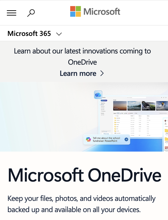
✅ Figure: Good example - Microsoft keeps its hamburger menu in the top-left corner, following established UX patterns for consistency and familiarity
Hamburger menus rock! Especially on mobile.