Do you make mockups look like mockups?
Loading last updated info...
A polished mockup can make an unbuilt feature look ready to ship. During an early design review, that confusion shifts the conversation from "Is this the right flow?" to "When does this go live?"
When you want feedback on structure and behaviour, use a visibly rough, paper-like mockup and put Mockup - not built inside every screen. The appearance and status label should still make sense when someone forwards the image without your explanation.
Show the idea without implying it is built
Tools that generate UI mockups or build prototypes with AI can produce polished screens before the team agrees on the flow. Visual polish does not establish implementation progress.
In these synthetic Northwind illustrations, the layout and example data stay the same. The styling and build-state label change, and the fictional reviewer responses illustrate the difference in focus.
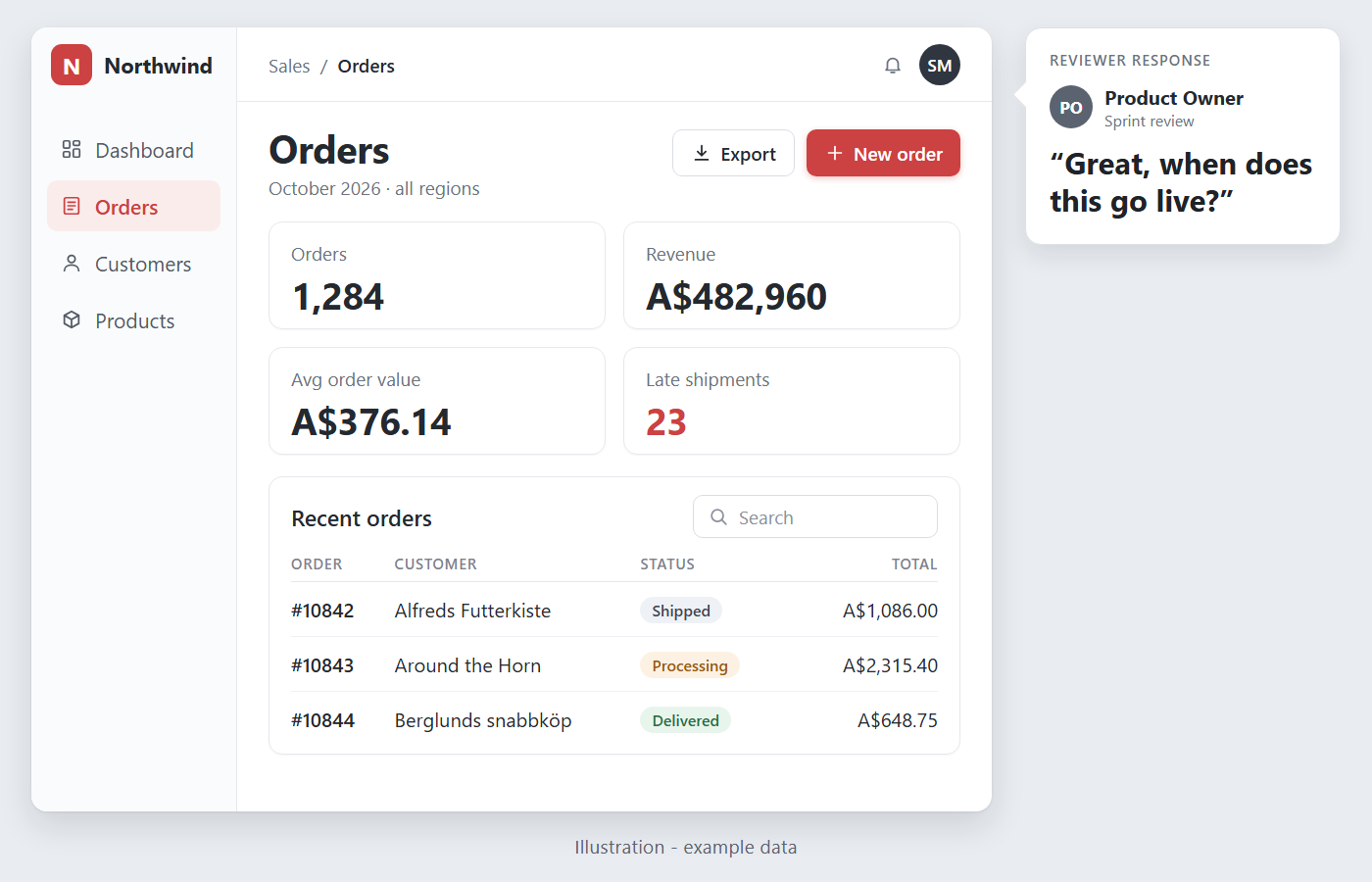
❌ Figure: Bad example - Illustration - Finished-looking controls and no build-state label invite a delivery question
Make early feedback about the flow
Use rough outlines, simple blocks and readable handwritten-style text while exploring the concept. Low-fidelity wireframes keep attention on structure and functionality before colours and visual detail. Leave out brand polish unless branding is the subject of the review.
Keep the explicit Mockup - not built label too: a hand-drawn appearance can also be an intentional production style. Put the label in a reserved area so it stays prominent without obscuring the content you want reviewed.
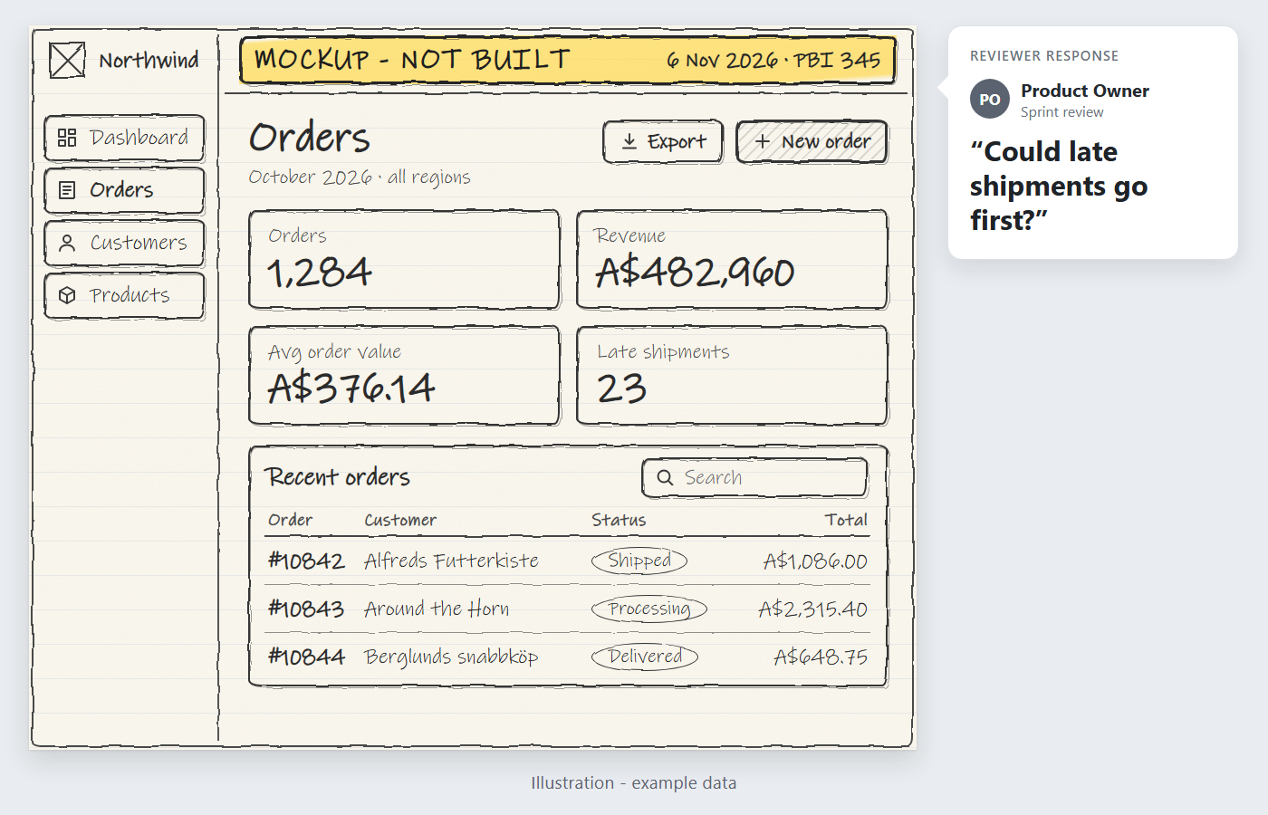
✅ Figure: Good example - Illustration - Sketchy styling and an explicit build state frame a question about information order
For a component-based approach, Looseleaf offers hand-drawn React components under an MIT licence. The illustrations above demonstrate the visual approach; they are not screenshots of Looseleaf.
Check the exported image before sharing
- Status - Include Mockup - not built on every screen and export, not just in the accompanying message.
- Context - Add a date and the Product Backlog Item (PBI) identifier. Link to the PBI beside the image so decisions and open questions stay with the work.
- Data - Use synthetic records or public sample data, such as Northwind, and label them example data. Keep real customer records out of mockups.
- Readability - Open the export at the size the recipient will see. Check that the status, controls and text remain readable, with no labels covering content.
- Review question - State the decision you need, such as "Should late shipments appear first?" Ask a colleague to identify the build state and review question without the surrounding conversation. Revise the export if either is unclear.
Use polish when visual detail is the decision
Use a high-fidelity design for brand review, final appearance approval or usability testing that depends on realistic visual detail. Rough styling can hide problems with spacing, contrast or control states.
Label an unimplemented design Design - not built, with a date and PBI identifier. After design approval, use Approved design - not built to keep approval separate from implementation. If some behaviour already works, state exactly what works and what remains proposed instead of marking the whole screen as unbuilt.
See when to create mockups and prototypes for choosing fidelity, storyboards for exploring journeys, and design handover for sharing agreed work with developers.