Want to get Power BI working for you? Check SSW's Power BI Consulting page.
Power BI offers a variety of visualizations, each suited for different types of data and insights. Choosing the correct visualization is crucial for effectively communicating data stories.
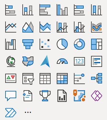
Figure: The out of the box visuals from Power BI
Here's a guide to understanding when to use each type of visualization provided in Power BI, according to the visual selector interface.
Your reports and dashboards should tell the right story to your end users. They should be able to get the gist of the report at a glance and not have to work at trying to understand what it means.
To follow best practices for version control for Power BI reports you must know about the following features:
Power BI reports are generally published directly into the Power BI Service. But doing so has many drawbacks. For example, you can't see:
- What was changed
- Who made the change
- When the change was made
In other words, the history of the changes isn't recorded anywhere.
You can save report under My Workspace and share it with your team. This is bad because if you leave your company, your report is gone!
It's better to save reports under Group Workspace and share it with the team.
Using colour in reports can bring them to life, or else make them confusing and noisy, so make sure youre intentional with them.
Many reports are expanding on what could be expressed as a single number. When this is the case, make sure that number is clear and bold at the top right of the report.
Ideally this should be a single number, not a group of numbers. If there is more than one, make sure one is chosen as the main one and put the others in a less prominent colour, size, or position.
An even better option is to show this number as a KPI, which shows historical values for that number in the background, and potentially a target. this gives contextto whether the number you're seeing is a "good" or "bad".
Leveraging AI tools for critiquing and enhancing reports and dashboards can significantly improve their quality and effectiveness. Free AI tools such as the Report Enhancer GPT, can be used for this purpose, which checks your report against the International Business Communication Standards (IBCS).
The Power BI Portal can be customized with custom branding. The items that can be changed to make Power BI fit into an organizations brand are:
- Logo
- Cover Image
- Theme Colour
It's tempting when you create a Power BI report to put slicers wherever they fit, but this can lead to an incosistent experience for users.
The default sort order for most visualizations is alphabetical, but you should almost always change this.
Monitoring Power BI report usage provides the organization with a valuable insight into the effectiveness of their reporting strategies. By tracking how reports are being accessed and engaged with, businesses can make data-driven decisions to optimize their content, allocate resources efficiently, and enhance the user experience.
This information is essential for understanding which reports are delivering the most value, enabling organizations to prioritize their efforts, improve content relevance, address performance bottlenecks, and align their resources with actual demand. Moreover, monitoring report usage supports security and compliance efforts by detecting unauthorized access patterns, ensuring data protection.
Users can quickly subscribe to emails of the report pages that matter most. Once subscribed, Power BI will regularly send screenshots and a link for the report page directly to your inbox.
There are 2 ways to integrate Power BI with SSRS (SQL Reporting Services) that will allow you to be able to find all of your relevant reports from wherever you look for them
When you run into a wall in Power BI and feel like you've exhausted the out of the box functionality, that when it's time to investigate what a bit of DAX can do for you.
When creating a Power BI connection to Dynamics 365, the first thing that comes to mind when searching for a connector is to search for Dynamics 365, seems logical enough right?
Knowing when to use SQL Server Reporting Services (SSRS) over Power BI can ensure that you are using the tools most efficiently to help drive your business.
The emails exchanged within your company are more than just communication tools, they are a rich source of data. By analyzing and interpreting this data, you can:
Power BI Template Apps are an efficient way to package, distribute, and maintain Power BI reports and dashboards for external users.
Once published, a Template App lives in the Power BI Apps marketplace, where users can install it and either explore it with the default sample data or connect it to their own data.
The ideal development workflow is to clone the repository, make changes in Power BI Desktop, and follow the standard feature-branch and pull-request process.
However, when an administrator needs to make a small Power BI report change without waiting for a developer, a Git-connected Development workspace provides a simple editing experience.