-
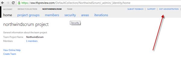
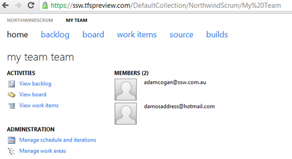
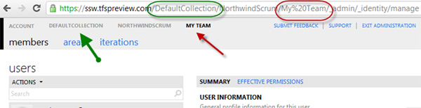
Administration Mode is less than obvious
A user does not know they are in administration mode. Why? Well
the 'NorthwindScrum' project is bold and not the 'Exit
Administration' link
-
-
Figure: A user does not know they are in administration mode.
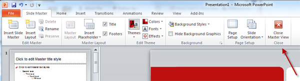
Add the red cross and rename to 'Close Administration View'
-
-
Figure: Copying PowerPoint's UI for its Master View mode would
help
-
Move the admin stuff off the home page, into the menu drop down
Moving this into a dropdown menu would make the home page
cleaner... and this info would be available on all pages - not
only when you are on the home page.
-
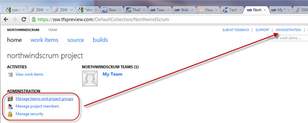
- Figure: Moving this to menu drop down would be better
-
The back button – ooowww!
Yes, I know it is the big things that matter :-)
-
-
Figure: Can we have something like the top left (good
example), rather than the bottom right (bad example)
So 2 things to fix. The position of the button and the style...
-
The web has meant that navigation is now expected at the top
of a form. So I would move it to the top left of the white
popup form
- Also in this case an icon would be better than text
-
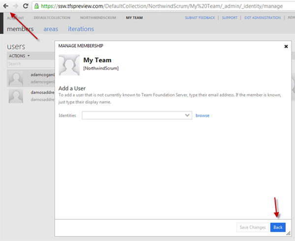
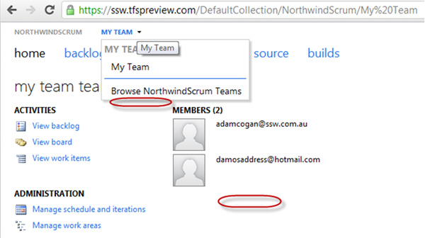
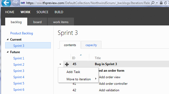
Adding a member is not so intuitive
-
- Figure: I want to add a 3rd member… how?
-
- Figure: In these 2 places please add "Add Member"
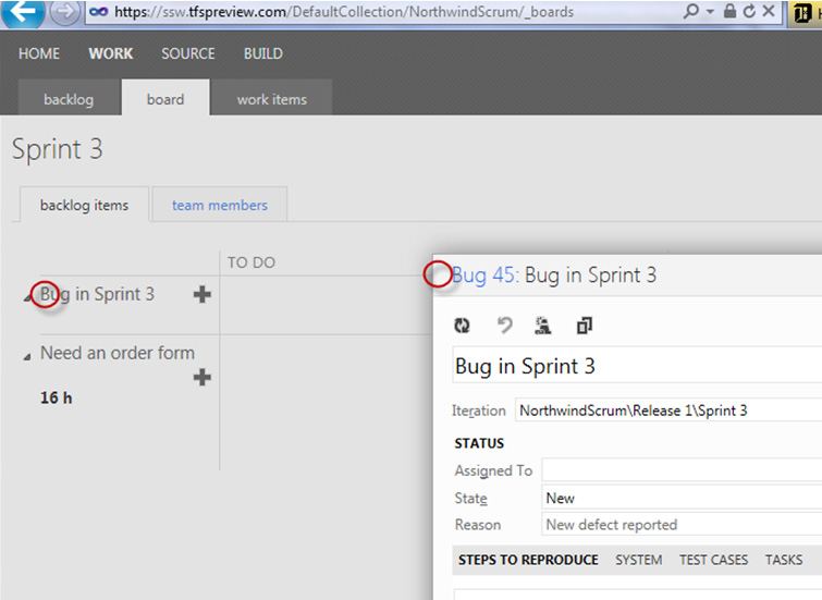
More Information
This is how you do it currently... which is not too obvious
-
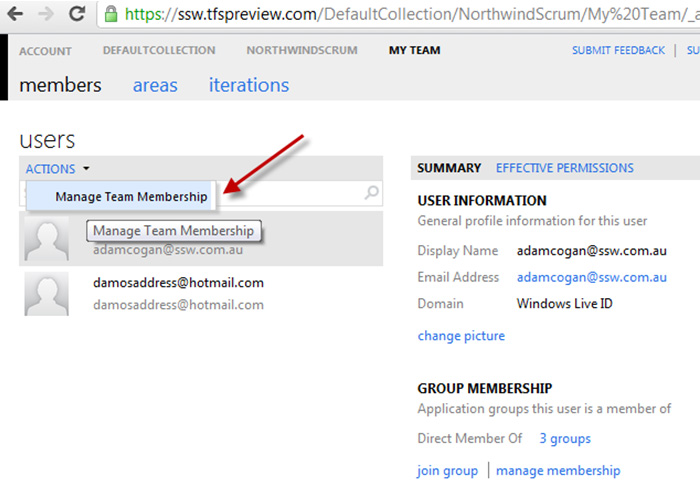
- Figure: Step 1 of adding a Member
-
-
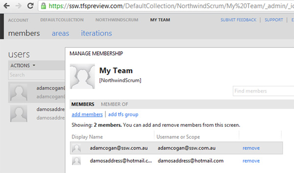
Figure: Step 2 of adding a Member. Really finding this "add
members" (underlined) hyperlink is too hard
PS: You don't need the text "You can add and remove members from
this screen" - it is just noise
PPS: You need to say "Adding a member is simple, just ask for
their Live ID email"- it makes it clear that Live IDs are
required.
-
Nice urls don't have %20
DefaultCollection = Good
My Team = Bad
I am just pointing out that if you look at the 2 arrows
(below)… you have a space in one and not in the other.
I am only referring here to the 'out of the box' experience...
I understand some people will put spaces in their own names.
That said: I believe that people should be warned/stopped from
putting spaces into fields that render in the URL
-
- Figure: The green is good. The red is bad
-
Store a list activity
I would love to see new section 'Summary of Activity'
I could see when the others last logged in... and what recent
projects they have been working on, when they last jumped on.
Also recent files... their checkins... the work items that they
have been working on...
PS: Links to reports would be even nicer gold plating
-
- Figure: Has Eric logged on? Has he done anything?
-
Allow me to rename a team and keep the links working
I can rename a team (e.g. from the auto-generated "My Team" into
something more meaningful).
However this means that all links are invalid and if users are
already working with the backlog items, then they will get ugly
errors.
-
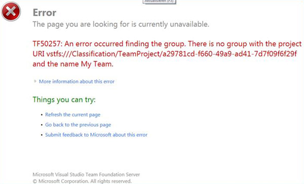
- Figure: I want to eliminate this error message
That is a nice error message... well as nice I have seen for a
while... but the goal should be to remove this error message
altogether.
I would like to see this happen by adding in an entry into Tools
| Options … auto populate it with:
Additional URLs
| Name |
Description |
|
| [ NorthindOldName ] |
[ (auto added from Rename) ] |
[ delete ] |
|
[
]
|
[
]
|
|
Obviously you would not be able to name a project to one that is
used (e.g. the old name NorthwindOldName) until they had removed
this record.
More Information:
To do it you could use:
http://www.iis.net/download/URLRewrite
or
http://urlrewriter.net/
Open Source URL Rewriter for .NET / IIS / ASP.NET
or
URL Routing - system.web.routing in asp.net 4 (recommended)
http://weblogs.asp.net/scottgu/archive/2009/10/13/url-routing-with-asp-net-4-web-forms-vs-2010-and-net-4-0-series.aspx
Even Better:
If you had an extensive model (like MVC Orchard’s Gallery)
then I am sure I could get Tiago Pascoal to write this add-in.
-
I would love a Gallery
Hi, VS team! If you had an extensive model (like MVC
Orchard’s Gallery) then I am sure you could sit back and
relax and let guys like Tiago Pascoal do all the work.
-
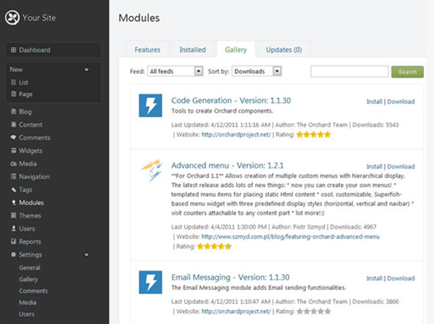
- Figure: Make TFS Azure a platform... like MVC Orchard
In the CMS Orchard, modules are great. They can:
-
be additional fields or functionality to existing features
-
be a widget (that you can add to various zones and layers)
-
create a new administration menu option with all kinds of
wonderful new features
So the possibilities for devs are pretty endless.
Basic Orchard CMS website owner with no development skills can
experience:
- a wonderful array of modules via the Gallery
-
a simple Gallery where they download, install, and enable a
module with only 2 clicks
-
an ever growing list of modules that keeps growing and growing
as developers create more
The community does the work. Awesome.
-
In IE, 'Add a Favourite' should mention the Team Project name
first
-
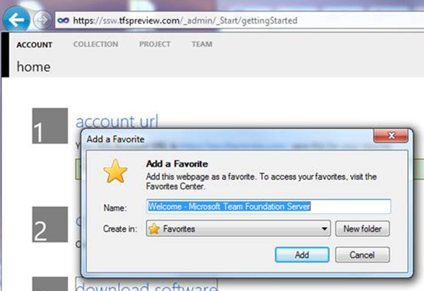
-
Figure: Change from "Welcome - Microsoft Team Foundation
Server" to "SSW - Microsoft TFS Online"
-
TFSPreview - Intro sentences would help
-
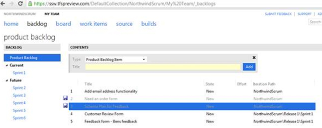
-
Figure: How about a sentence at the top E.g. Here the Product
Owner adds user stories and prioritizes them
-
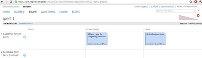
-
Figure: How about a sentence at the top E.g. Here the team use
this for their daily standups. Select the 'Person' combo on
the right to highlight your items. Then proceed with answering
the 3 questions for the daily standup
-
TFSPreview - Support LiveID + Skype
I have noticed that a lot of people (general VS devs) don't have
a LiveID... or tell me they don't remember what it was.
Now Microsoft has purchased Skype... consider allowing us to
sign in with Skype?
As a minimum it would help when LiveID is down or has cookie
problems (which has been happening for years)
-
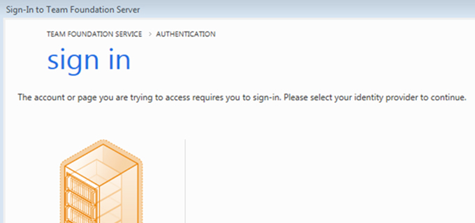
-
Figure: Let’s make this LiveID authentication screen
less of a barrier
-
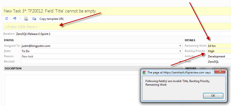
TFSPreview – Lets improve the validation with the muscle
of jQuery
Validation should be inline using jquery etc
Let's keep up with asana.com which has a nice responsive UI,
with nice validation.
-
-
Figure: Bad example – Not easy to know I have made 3
mistakes here. I don’t want to read a Message box (it is
so 1980s)
-
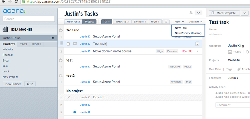
-
Figure: If you have not tried Asana.com for 10 minutes, you
should. It is a lovely approach to work items
-
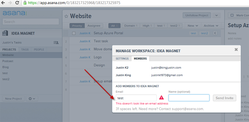
-
Figure: Good example – Asana.com has lovely control
validation, powered by jQuery
-
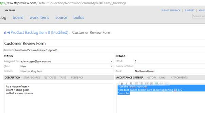
TFSPreview - unreadable on a projector
-
The font is too small for this page – nobody could
read it in the room….. totally unreadable on a
projector
Not very Web 2.0
Note: Specifically the stuff highlighted was the
problem….. it was a demo nightmare
-
In addition there is *no way* to manually change the font of
the text highlighted.
Why?
It is a HTML field after all
-
-
Figure: It is a HTML field – let me change the font
– better still change the out of the box experience
-
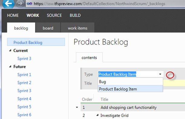
TFSPreview - Allow customization of the right click menu
Suggestions:
- Allow customization of the right click menu
- Out of the box add menu item “Add: Bug”
-
- Figure: I should have another option "Add: Bug"
-
TFSPreview Board - Help me tell the difference between a Bug and
a PBI
What I would like out of the box:
To enable me to tell if it is a bug or a bug, I would like the
font to be red... Even nicer add a little Bug icon.
What I would like in terms of global customization:
But even better... I expect that I could define this at a global
field level. Yes I know this is formatting, but I think
formatting should be included in the global field level.
Even better isolate it out into a skin/theme file... Then I
could develop a cool one. Examples:
- IBM blue - based on my company
- Window 8 tile theme / metro
- Apple iPad style
-
-
Figure: Currently I can't tell which ones are bugs. I would
like the font to be red... Even nicer add a little Bug icon
-
-
Figure: (Advanced) If I wanted something different to what is
in the box, I would like to define it and then it would also
show in other places like the backlog
-
Help me create a roadmap for a project
Currently there is no option for creating a roadmap containing
the large stories ("Epics").
-
-
Figure: On the PBI add checkbox "Epic". Even better give us
the ability to add tags (with a built in one called "Epic")
-
-
Figure: Add a node "Roadmap" that shows "Epics". This will be
useful to put on the boardroom wall to help implement this
rule:
Do you have a war room?
-
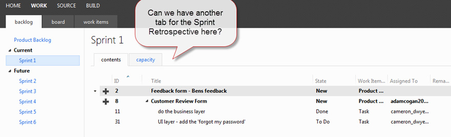
Help me to add notes for the Sprint Retrospective *during* the
Sprint
It is easy when the Sprint Retrospective time comes, to forget
some of the events that have caused problems during the Sprint.
Therefore people bring up things that they recall e.g things
that happened in the last day or two.
A solution is to have a place to add the notes as you go.
Currently there is no place to store notes from the Sprint that
we can use as part of our retrospective.
Note: Even a link to a SharePoint wiki would do (not ideal)
-
-
Figure: We need one more tab, with one field called "Retro
notes"
-
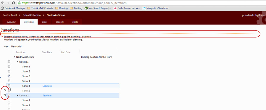
Help me to understand that my settings have been saved on the
Administer account iterations page
On a web page, generally, people expect to change options and
click a save button.
Currently when a user changes a setting, the AJAX animations
appear
very
briefly. Many students in my Scrum class were unsure if their
settings had been saved and asked:
"Where is the save button on this page?"
-
-
Figure: Where is the save button? The first circle is a very
unusual thin line that is meant to indicate saving is in
progress. The second circles appear ever so briefly
-
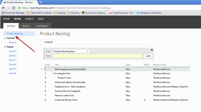
Improve Product Backlog View
To assist with management of a large Product Backlog it would be
helpful to have:
- A column to show type (either PBI or Bug)
- A column for severity (for Bugs)
- Bold on the PBIs that are Epics
PS: Customizing of columns would be nice too… but the
default experience is what is important.
-
- Figure: Add some columns to the default experience
-
TFSPreview - I want a URL to share with my Product Owner (aka
the Customer)
I would love a customer portal for each team project (I need a
wiki and document library).
This is how it might work...
-
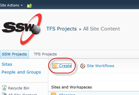
- Figure: In SharePoint 2010 , Click "Create"
Come to a form to enter some parameters...
And a link in TFSPreview.com would be added to my SharePoint (or
Office365)
More Information:
-
-
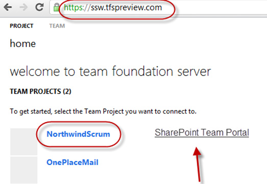
Figure: Hook it up to TFSPreview.com E.g. Enter 2 parameters
such as "URL" and "Team Project Name" and then a new link
appears (E.g. "SharePoint Team Portal")
-
-
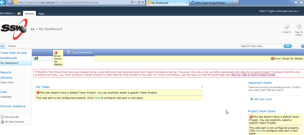
Figure: Note: This is the busted site I get today (with
TFS2010 and SharePoint), if I click on "Create"
-
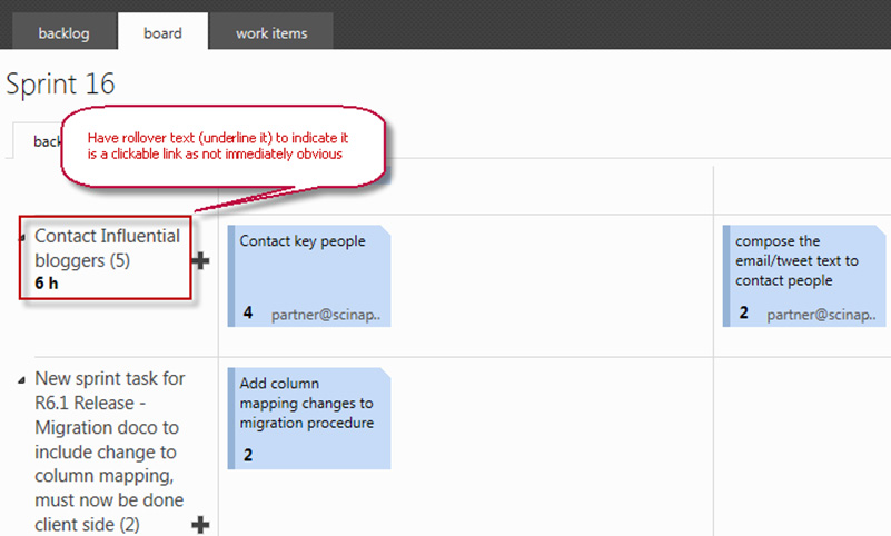
TFSPreview – Add rollover on PBI Title, to indicate
clickable link
I was watching a team that did not know you could click on the
"PBI title".
In the Board View, to help make it clear that the PBI text is
clickable, add a rollover as per this rule
Do you underline links (and include a rollover)?
-
-
Figure: On the Board tab, when hovering over the text,
underline it to indicate it is clickable
-
Board - Highlight the selected row when clicked with the mouse
(in the white space of row)
In a daily standup (and sprint review) currently it is easy to
get lost regarding what item is currently being discussed.
Please allow visually highlighting a row. It will provide some
clarity around the item being discussed (during a stand up or
sprint review).
From a customer in a retro:
"Adam, during today's session, I was forever trying to work
out which item was being discussed."
James Fox
-
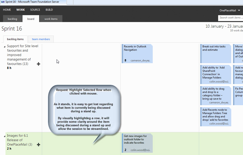
- Figure: Allow highlighting a row
-
Have a nice URL like GitHub
I would like a nice url to add to my Bio… such as
TFSPreview.com/AdamCogan
See below for an example:
-

-
Figure: Grant have a nice Gitrub URL:
github.com/gskinner
-
TFSPreview and SharePoint 2010 – looking for love
Do what do I use for a wiki?
This message indicates I can setup SharePoint if I start
reading... I think you should save their time and say "Sorry,
you cant have SharePoint Integration"
-
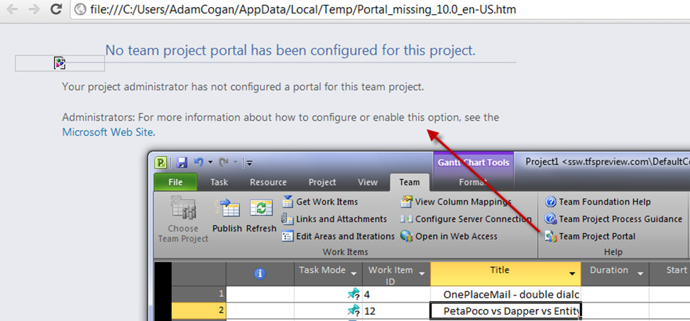
-
Figure: Clicking "Team Project Portal" should tell me it is
not supported on TFSPreview.com
-
TFSPreview - Adding TFS Server - avoid me getting an error
I am hoping you can fit this into the Winnowing machine because
otherwise...
Users first experience when connecting to TFSPreview will be:
-
Click
Connect
-
Type the url they think will work eg. ssw.tfspreview.com ...or
the new name eg. tfs365 :-)
- Boom - error
-
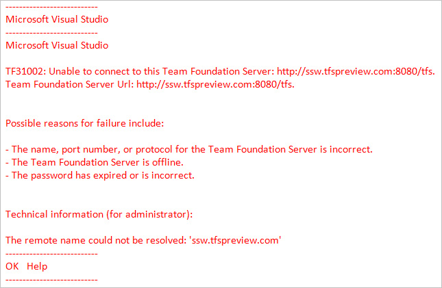
- mmm...Do we want people needlessly getting this error?
Suggestion
-
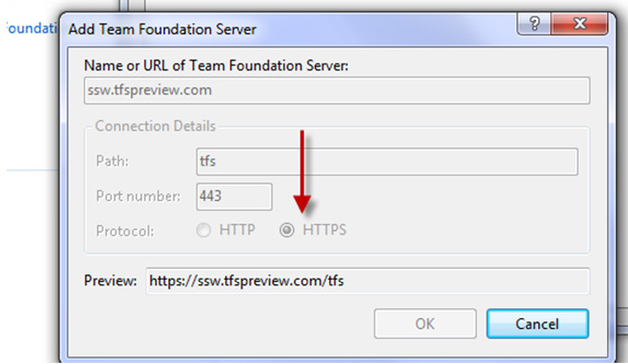
-
Figure: When you type 'tfspreview' then switch it to "HTTPS"
-
Guidance on Bugs
On my last PSD scrum course... the 1st question after demoing
TFSPreview was:
When do you choose a "bug" instead of a "PBI"?
And what are the pros and cons?
I am sure my answer was not the same as other trainers. And what
about all other devs that don't do training... Those guys make
their decisions based on their own screwed up dev experiences
-
-
Figure: I would like some guidance with a little "info" tip
here. My bug guidance is to use that term carefully. Any
feedback on
Is your client clear on the definition of a bug?
is welcome