Do you have consistent SharePoint Sites?
Loading last updated info...
It's important for all your SharePoint Sites to be as consistent as possible. This helps users' navigation through new pages as they know exactly where to look.
Video: SharePoint Sites for Admins - Tips for Managing SharePoint with Warwick Leahy (5 min)
Following these simple rules makes this really easy:
- Put your preferred navigation in the same place (usually on the left-hand side)
- Keep the headings consistent
- Use icons for each type of link, so users easily know what to expect when clicking on a link (E.g. A Microsoft Word document is going to open a Word document) Aldo, a link to "Home" looks the same on every page.
Navigation consistency between pages
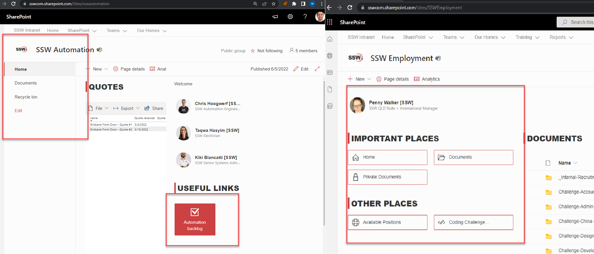
❌ Figure: Bad example - The page on the left has totally different navigation to the page on the right
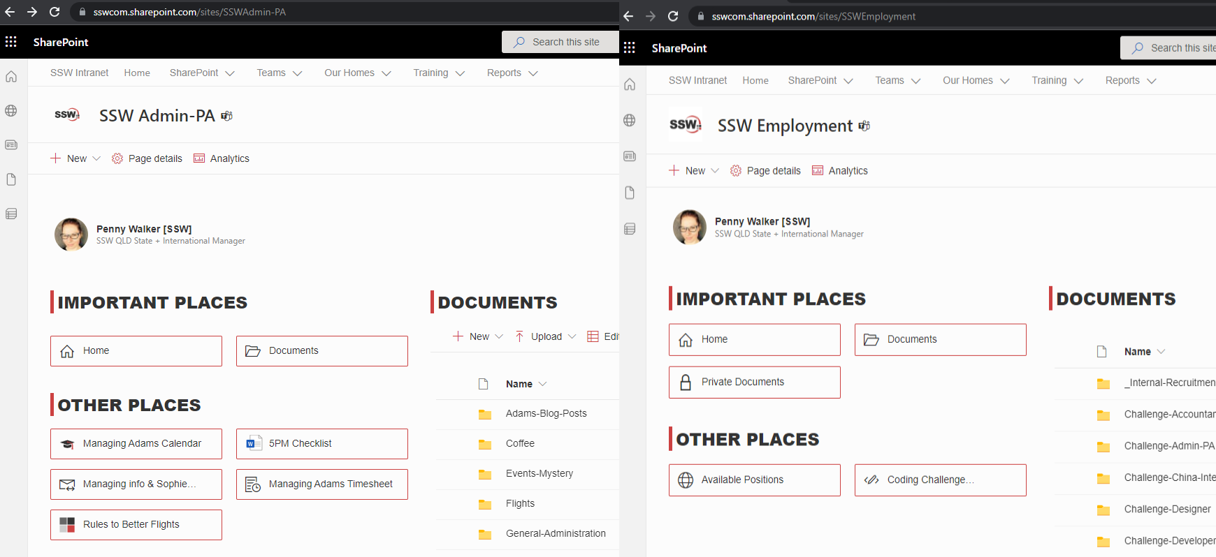
✅ Figure: Good example - Both pages looking consistent - common navigation elements in the same spot
Headings and icons consistency within a page
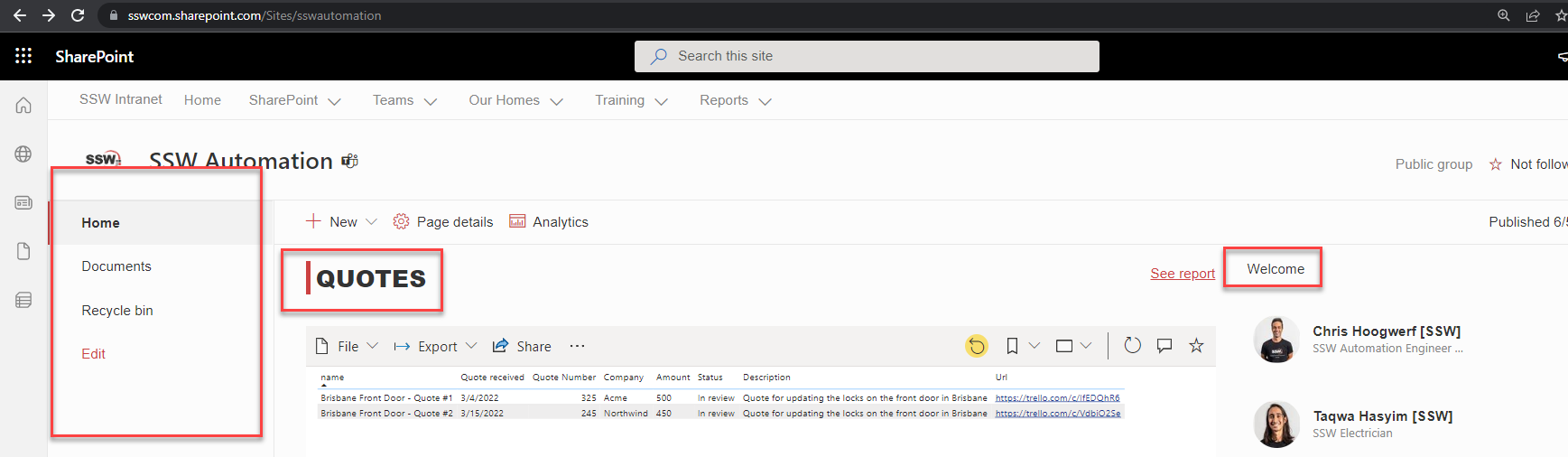
❌ Figure: Bad example - There are no icons to help users on the left navigation + the headings are the different
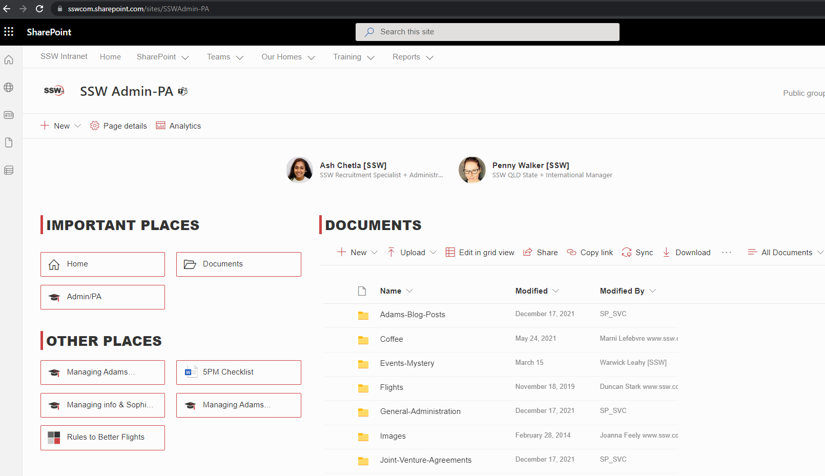
✅ Figure: Good example - Icons help users to know what files each link open on the left navigation + the headings are the same