Screen Recordings - Do you make sure your browser is easy to view?
Loading last updated info...
Most developers like to set up their screen efficiently – often that means small fonts, visible bookmark bars and a huge amount of browser tabs and taskbar items. While this is great for efficiency, it is not very good for recordings or presentations, and the clutter should be removed.
- Before recording
- Removing unnecessary tabs - Open the tab in its own window
- Avoiding small fonts - Zoom in to 125% by holding Ctrl and scrolling up on the mouse wheel. If you're using a 4K or large monitor, consider zooming further or increasing your display scale to 175% or 200% instead of the recommended 150%
- Hiding the bookmark bar
- Windows shortcut: Ctrl + Shift + b
- Mac shortcut: Cmd + Shift + b
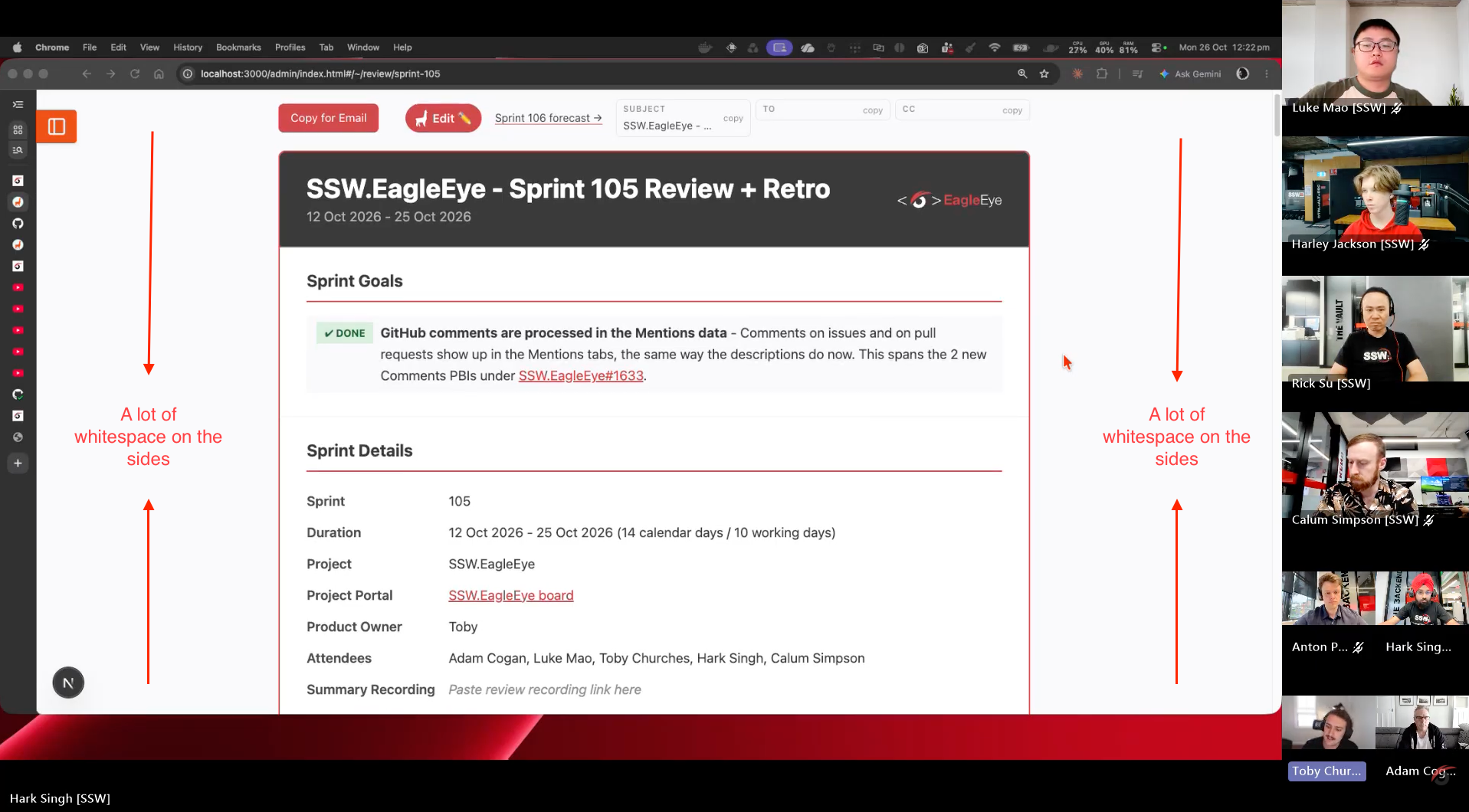
❌ Figure: Bad example - A lot of whitespace on the sides while sharing the screen
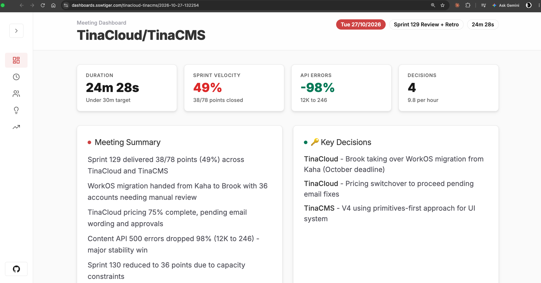
✅ Figure: Good example - Browser zoomed in at 125% and no whitespace on the sides
When demonstrating specific UI elements, code snippets, or small checkboxes, keeping the 100% full screen makes it hard for viewers to see the details, especially on mobile devices. You should guide the viewer's focus using one of the following two methods:
2. During recording
- Zoom in on a section of interest, follow the established guide on using tools like ZoomIt or built-in OS features to spotlight your cursor - rules/screen-recording-spotlight.
- This saves massive post-production time.
3. After recording
- If the raw recording is pinned at full screen, the editor must manually create focal points in the timeline.