Do you clearly indicate editable, read-only, and calculated fields?
Loading last updated info...
When a field cannot be edited, make its read-only state visually clear. A common convention is to use a grey background so users can immediately distinguish it from editable fields.
This applies to web forms as well as documents and spreadsheets. For example, fields populated from another system, calculated values, generated IDs, or values the current user does not have permission to change should look different from editable inputs.
On the web
Use the appropriate HTML behavior as well as the visual treatment:
- Use
readonlywhen users should be able to focus, select, and copy the value but not change it - Use
disabledwhen the control should not be interactive at all. Remember that disabled form controls are generally not submitted with the form - Do not rely on grey styling alone — the field should also be programmatically read-only or disabled so its behavior matches its appearance
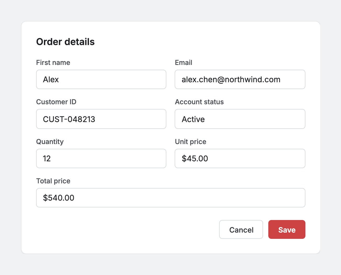
❌ Figure: Bad example - Different field types look the same
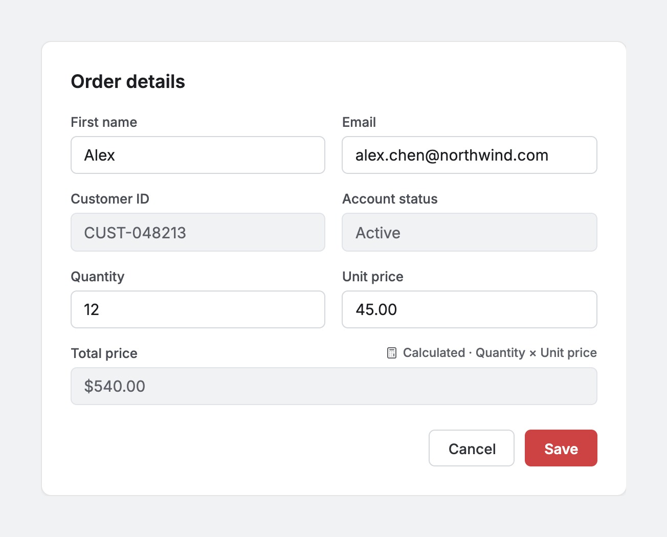
✅ Figure: Good example - Editable, read-only, and calculated fields are clearly distinguished
In Word or Excel
Locking cells or tables may not always be necessary. However, you should still prevent users from accidentally changing calculated or system-controlled values. Using grey cells provides a clear visual indication that these values should not be edited.
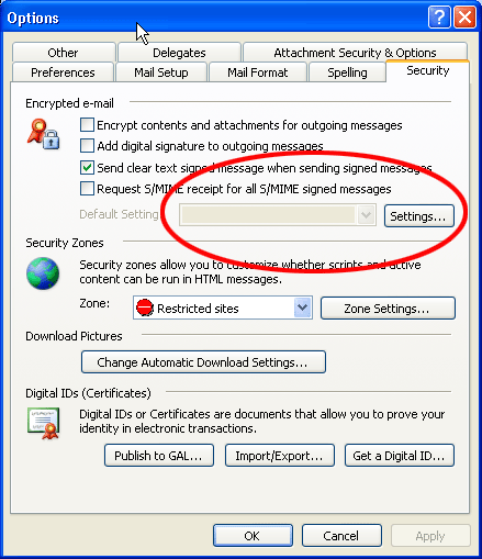
✅ Figure: Good example - Read-only fields are greyed out
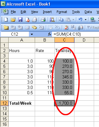
✅ Figure: Good example - Calculated fields in Excel are greyed out
Conversely, editable fields should have a clear editable appearance, typically using a white background. The important thing is consistency: users should be able to tell at a glance which values they can change and which they cannot.