If you still need help, visit our User Interface & User Experience showcase and book in a consultant.
You’ve spent the last sprint designing and building a feature. It looks clean, the logic makes sense, and everyone on the team agrees it’s “obvious” how it works.
Then a real user tries it, and gets stuck immediately. Buttons are missed, terminology is misunderstood, and users don't follow the journey we carved out for them. These problems are rarely caught in code reviews or internal demos, but they surface instantly when you test the interface with real users.
Shipping a high-risk feature without testing it with users is a gamble. If your update affects sign-up flows, checkout processes, or dashboards, you can’t afford to guess. Usability issues that slip through can cost you revenue, reputation, and rework time.
Even experienced designers and developers miss things. The only way to validate an interface is to observe real users attempting real tasks.
The corner stone of good user interface design is that if your users need instructions, you haven't done a good job. Of course with particularly complex applications there will be exceptions to this rule, but all developers should aim to make your interface as self-evident as possible.
- When we see a door, we immediately know that we can open it and go through it
- Links in blue and underlined has an affordance of clickability
- Buttons can be pressed
- Scrollbar moves the document in the window
Accidentally deleting important data can be a disaster for your users and your support team. A poorly placed or unclear destructive action can result in irreversible mistakes, lost data, and frustrated users.
These actions need to be carefully designed with strong visual cues, clear labels, and proper safeguards.
The human brain:
- Never searches for OR compares all options
- Prefers smaller sets of options (4 or less)
- Picks the first option that looks good enough
- Prefers a shorter option to a longer one
- Makes a compromise between speed and accuracy
Thinking about UI, the objective is to create clean interfaces by minimizing clutter. You do that by removing noise. One of the most common ways to avoid noise is the removal or de-emphasis of labels whenever possible.
Displaying the date and time of change as a tooltip when users hover over the time of change can be an effective approach for interfaces with limited space or when providing both pieces of information together could lead to confusion.
Tooltips allow users to access additional information about the context of the date and time of change without cluttering the main interface.
People may not notice important words or statuses in your interface at first glance. Adding a simple and clear icon beside the text helps users quickly understand the meaning without needing to stop and read every detail.
This improves clarity, reduces confusion, and helps users take the right action faster.
When there are key words that you want people to notice, you can add a spot of color on the important word for emphasis.
The tone of your application speaks volumes about how users view it. Read this Google documentation on the voice of Android.
Remember to use dividers when referring to large sums or phone numbers.
 Figure: In the first example, although the text is technically aligned, it does not 'look' it. In the second one, the "V" has been moved into the margin, but the optical alignment is now correct
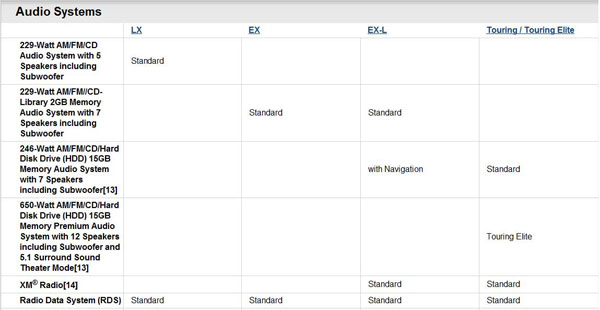
❌ Figure: Bad example - Hard to read these columns
The search direction of a list should be obvious. When it comes to a multicolumn list, you should always head down instead of across for legibility.
Vertical lists are much easier to scan than horizontal lists, because all items are aligned to left, when you're looking for an item, you don't need to read the entire word, you can quickly scan the first letters and get directly to the item you look for.
It's OK to use text because it's more natural, but use columns if you need:
- reordering
- side by side comparison
- totals
You should put all the useful and current information on the homepage and also make it easy to find your core functions there.
When you're giving an update on progress on a task list or a schedule,
strike outthe items that have been completed. Not only does it visually explain where you are, it also gives you a great sense of satisfaction...If users want to share information or media, then make it easy for them!
Make your data easily accessible by incorporating a "search box" that helps users find relevant information quickly.
per page
1 - 20 of 34 itemsper page
1 - 20 of 34 items