Rules to Better Websites - Navigation - 35 Rules
Ensure your links are easily distinguishable from the background and surrounding text by always making them underlined. Users expect underlined texts to be a link; and links to be underlined.
Note: Underlines are not necessary on obvious links, like menu/breadcrumb items or buttons. On the other hand, hover effect (see more below) should always exist.
For more information on this, please go to SSW website.
Figure: Good example - The link is nice and clear
Tip: You can use a different color on underlines as a nice touch.
Never underline a text that isn't a link
Use bold or another styling if you need emphasis.
When you develop on SharePoint, you do not have a full copy of web.config in your Visual Studio project.
Figure: Bad example - Never underline the text when it isn't a link
When you develop on SharePoint, you do not have a full copy of web.config in your Visual Studio project.
Figure: Good example - Using bold for emphasis
Include a hovering effect
Rollovers are also important as they offer visual feedback to a user that this link that will take them somewhere. While there is a myriad of ways to do this; color change is recommended because it preserves text readability. Hover the good example above to see this working.
The basic CSS for changing the link color on hover is:
a:hover {
    color: #cc4141;
}
Avoid other effects on hover for text
Effects like bold, scaling, rotation, or background changes can distort text, making it harder for users to read and interact with links.
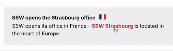
Figure: Bad example - Using bold on hovering may cause a text shift Note: These effects may be used for buttons or other non-text content elements.
Do not use borders to replace underlines
The default implementation of underlines in CSS is
text-decoration: underline;.Another way to add look-alike underlines is by adding
border-bottom: 1px;, for example. In this case, you could even have a dotted line under the text. It's not recommended you use this method - It may create extra pixels in the interface, which can potentially cause other problems in your UI:
Figure: Bad example - The different border size pushes the content down 
Figure: Bad example - Borders going over the text area The way your inbound links are worded makes a big difference. They play an important factor for search engine results and for the users.
Having descriptive links with relevant words improves your website SEO and gives a more friendly experience to users.
For example, if a website had millions of inbound links that described it as "Movies for Free", when someone searches for "free movies" on Google, it would point to this website.
So what does this mean? All those links that are pointing to pages on your website displayed as 'More', 'Link', 'This' or 'Click Here' aren't doing you any favors when it comes to increasing your Google rankings.
"For tips and tricks to increase your Google Ranking click here"
Figure: Bad example #1 - Generic words on links won't help your website rankings
"Check out this link for tips and tricks to increase your Google Ranking"
Figure: Bad example #2 - Generic words on links won't help your website rankings
"For tips and tricks to increase your Google Ranking read this"
Figure: Bad example #3 - Generic words on links won't help your website rankings
Also, if you make your the link the entire URL, it won't be very readable to users. You should replace it with a descriptive sentence using relevant words.
"For tips and tricks to increase your Google Ranking go to https://www.ssw.com.au/rules/rules-to-better-google-rankings"
Figure: Bad example #4 - Whole URL on links won't help your users
"For tips and tricks to increase your Google Rankings go to Rules to Better Google Rankings"
Figure: Good example - Descriptive links will help your website rankings and the users
You can also use links to give people a chance to investigate further on a topic. In which case, give the hyperlink enough and consistent info so they know what exactly they're clicking on.
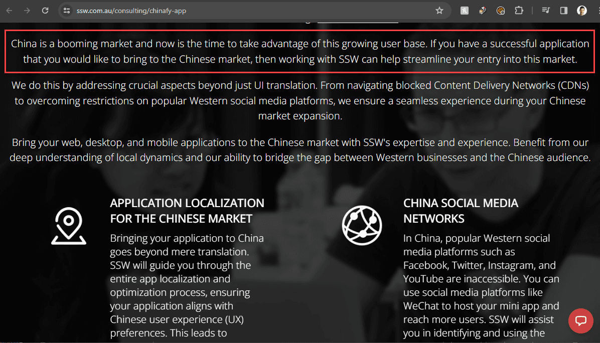
"China is a booming market and now is the time to take advantage of this growing user base. If you have a successful application that you would like to bring to the Chinese market, then working with SSW can help streamline your entry into this market. More on SSW Chinafy."
Figure: Good example - Give users context with a link at the end to get more information on the topic
Note: If for some reason you need to include the URL instead of a nice descriptive text, it is recommended to:
Distinguishing visited links is very helpful to show where users have been before. Visited links should still stand out but not as obvious as unvisited ones. This is default on most browsers, but after adding custom styling to your website, you may need to include it.
Tip: Give visited links a less saturated colour to give that "used" look.
Figure: Good example - Visited links are marked different from unvisited Specifying style for visited links is very simple. Just add the HEX color code to your CSS file as per:
a:visited {
  color: #xxxxxx;
}
Warning: Be careful not to overuse CSS attributes on visited links - a color change is enough.
The active menu item should stand out from the others. This way you make it easy for users to know where they are at in the website.
Figure: Bad example – You can't tell where you are in the site 
Figure: Good example – It’s easy to see where you are at So you started your site with simple navigation but then you find yourself a few years later with site navigation that is saturated with links and everything looks messy.
Mega menu allows you to present your links in groups and make use of typography, icons and supporting images to explain user's choices.
By dividing site navigation into groups users will have better view of your site's structure at a glance and thus presenting them with meaningful choices. You can also group key pages together and give them emphasis.
Of course, don't use a mega dropdown menu just because you can. Turning your normal navigation into mega-menu whilst keeping it as one continuous level is generally a no-no. in the same manner, just because mega-menus have room, doesn't mean you should overload them.

Figure: Bad Example - Long drop down menu requires scrolling and difficult to see at a glance. 
Figure: Good Example - Links are grouped into distinct category 
Figure: Bear in mind that mobile menus are limited Hamburger menus are everywhere—those three stacked lines that hide site or app navigation. They became popular for decluttering mobile UIs, but they come at a cost: reduced discoverability, slower navigation, and lower engagement.
Video: Hamburger Menu Icon Update (3 min)When should you use a hamburger menu?
Use it only when screen space is tight—typically on mobile. Otherwise, always prefer showing navigation visibly.
A desktop web app with ample space hides primary navigation behind a hamburger menu.
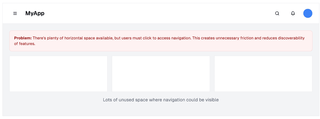
Figure: Bad example – On desktop, navigation should be visible when screen space allows. Hiding it behind a hamburger reduces usability A mobile app uses a hamburger menu to preserve space while offering a clean, focused UI.
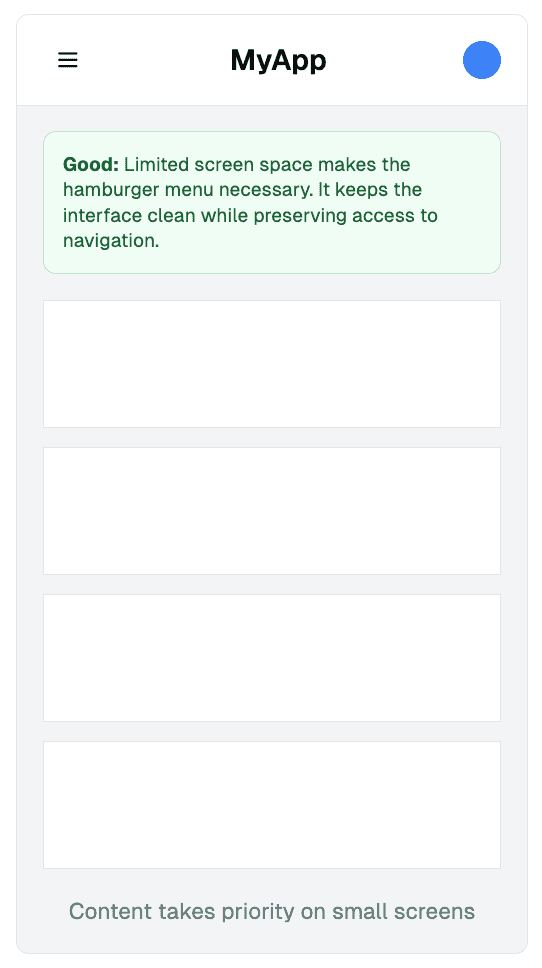
Figure: Good example – On mobile, screen space is limited, so hiding the nav behind a hamburger is appropriate Where should you place it?
Device/Platform Preferred Placement Why Android apps Top left Matches Material Design and Android conventions iOS apps Top right Aligns with iOS patterns; better for right-thumb reach Mobile websites Top left Consistent with web standards; easier for navigation + back button Desktop websites Top left (if used) Only use if screen space is constrained (e.g. dashboards) ❌ Common mistakes to avoid
- Using a top-right hamburger on desktop – This breaks user expectations. On desktop, primary navigation belongs on the left or fully visible
- Combining a hamburger menu with bottom navigation – Choose one. Using both creates confusion and redundancy
- Hiding essential links – Important actions should be visible. Hiding them behind a menu lowers engagement and completion rates
✅ Best practices
- Use the standard 3-line icon – don't reinvent it
- Include clear animation or toggle state
- Make sure it's easy to reach on mobile—don’t place in hard-to-tap corners
- If you only have a logo + menu, favor left placement for balance and ergonomics
- Test with users to confirm comprehension and usability
Use the hamburger menu only when needed, place it where users expect it, and never use it as an excuse to hide important navigation. Always test your decisions—navigation is too important to guess.
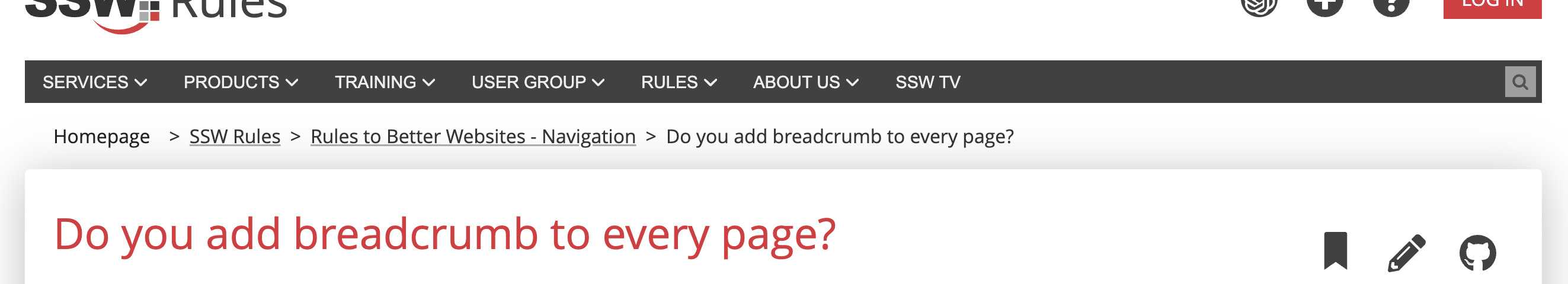
Keeping a breadcrumb trail on every page is necessary. It is a navigation tool so users can easily locate themselves and find what they are looking for quickly. But don't link a page to itself!
Integrating a breadcrumb trail on webpages brings these benefits:
- provides users with a clear and visual navigational path - they understand their location within the website's structure
- enhanced user navigation
- easy to backtrack to previous pages and explore related content
- reduced effort required to navigate through complex websites
- allows users to quickly access information - more engagement
- improves overall website usability
Additionally, breadcrumbs contribute to better search engine optimization, as they provide search engines with a clear understanding of the website's hierarchy, helping to improve website visibility and rankings in search results.
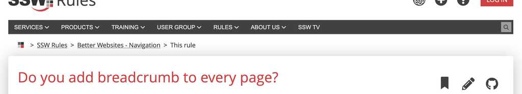
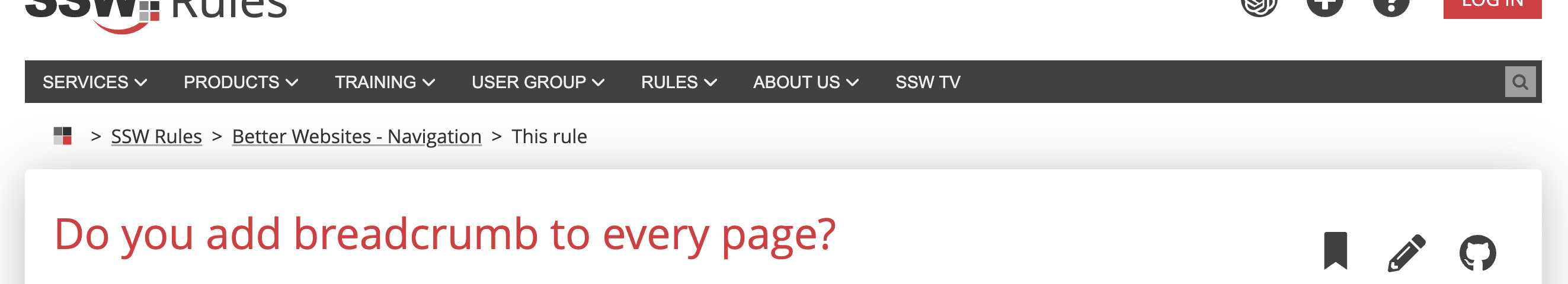
Figure: Good example - Breadcrumb has many benefits Breadcrumbs are an essential part of website navigation, providing users with a trail of links to indicate their location within a site's hierarchy. To maximize their effectiveness, it's important to keep breadcrumbs short and concise. By simplifying them, we reduce confusion and make them easier to understand, improving the overall user experience.
Shortening breadcrumbs helps prevent information overload, ensuring that users can quickly scan and comprehend the trail without feeling overwhelmed by long and repeated texts. Some ways to achieve that:
- Replace "Home" with an icon
- Keep only the main words for categories
- Replace the current page title with "This Page"

Figure: Bad example - Long breadcrumb with repeated words 
Figure: Good example - Short breadcrumb makes it simple to read Breadcrumbs guide users through your website interactions. They are important as they give the user a sense of confidence in using your application. The user will tend to feel lost and unsure of what to do next if a application does not guide them properly. Good navigation through directional headings removes this feeling and gives the user confidence. This rule is especially important when it comes to design an e-commerce check out process, or a software set up wizard.
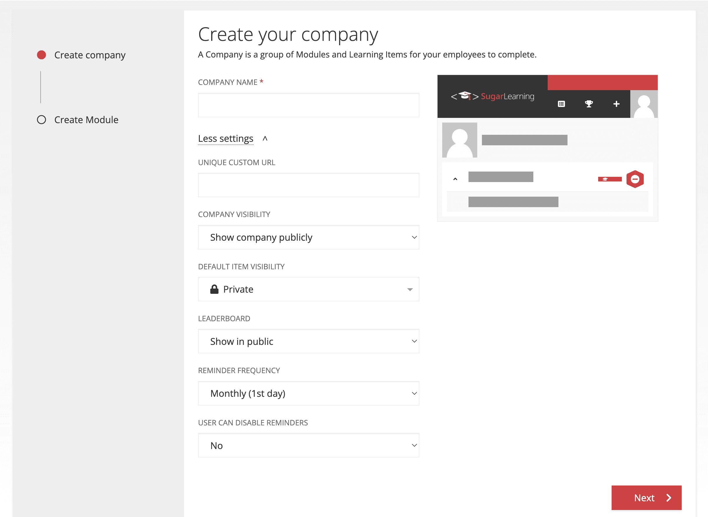
A great wizard should includes a 'Wizard Breadcrumb', that gives the user the confidence that they are progressing as expected in the process.
It should do the following:
- Show the user where they are up to, previous steps, and the next steps in the process. This gives the user an idea of how long the process will take
- Allow the user to go back to previous steps allows them to change or review a previous choice
It should have the following:
- Clear and intuitive interface - An interface that is easy to understand and use, with clear instructions and user-friendly design
- Step by step guidance - Guide users through the process of setting up a new company with clear, concise instructions that are easy to follow
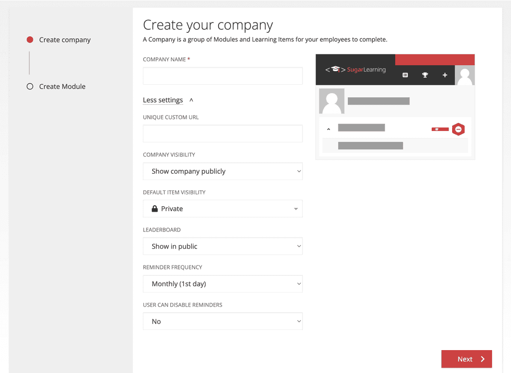
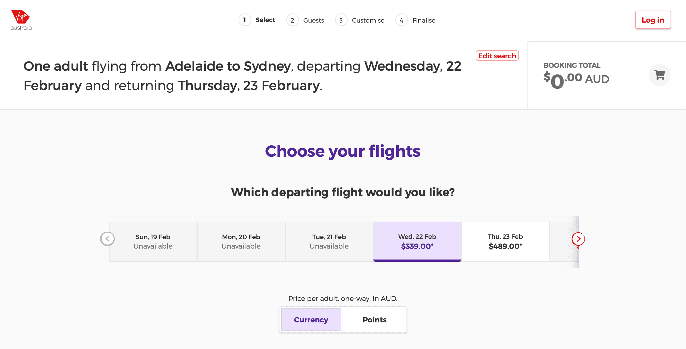
Figure: Good example - SugarLearning's "Create your company" wizard 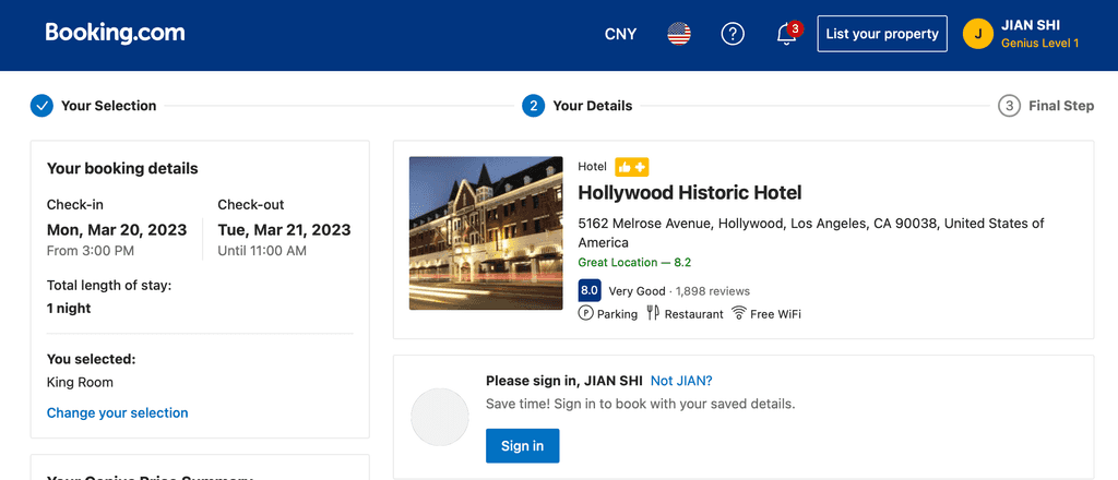
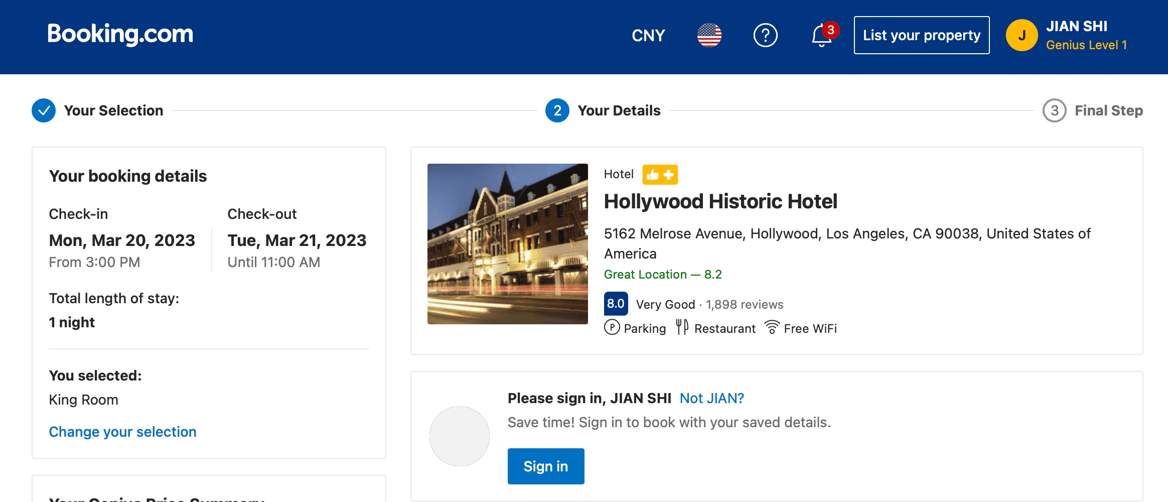
Figure: Good example - The heading from booking.com shows the user at what stage of the ordering process they are at, and what they can expect next. This covers the whole billing process 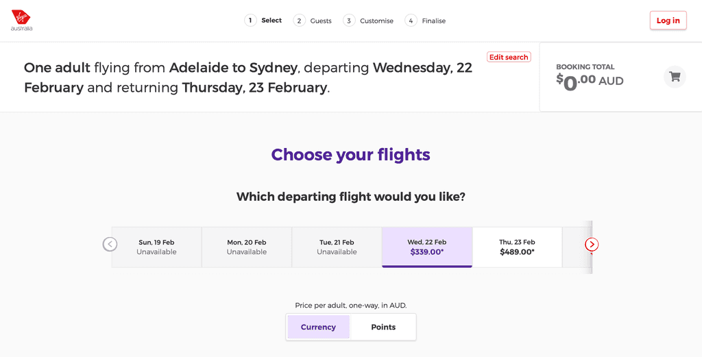
Figure: Good example - Virgin Australia uses a more subtle but also effective approach When redirecting users to another page, make sure that the text is consistent between the two pages.
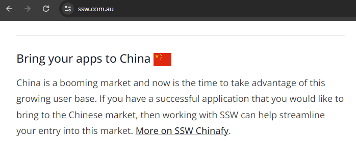
Figure: Good example - The text is taken from where the "More on SSW Chinafy" link at the end goes 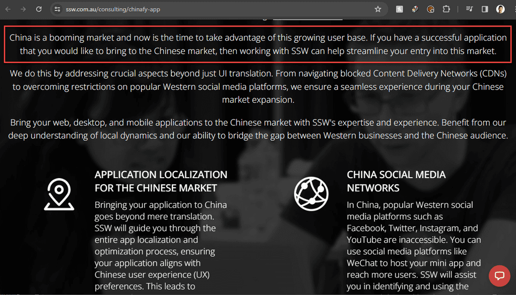
Figure: Good example - You can see the text again here, at the link's destination When we want to point users to a page, we simply use the summary part of that page as narrative on the other page. As a result, the user will have a nice flow between pages when navigating around the site.
As an example, the SSW website follows a consistent order: a summary of the product/service and its benefit, followed by a link for more information on that topic.
Tip: In this scenario where the summary serves as a teaser for more detailed content, have the link at the end of the section, so it's the natural next step for someone who has read it and wants to know more.
It's a good idea to make sure your page names are consistent between:
- URL
- Page Title
- Navigation
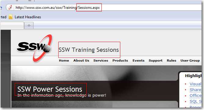
Figure: Bad example - Inconsistency everywhere! 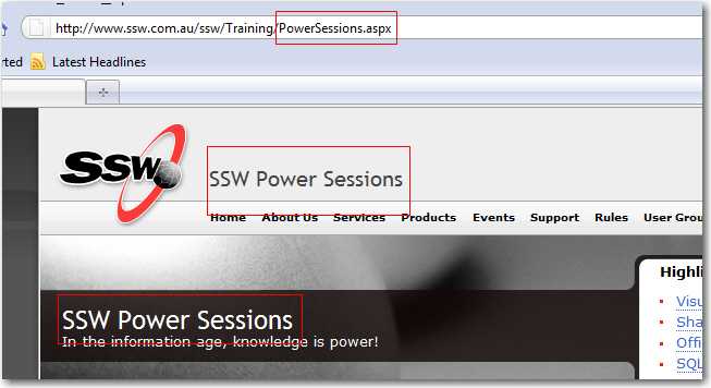
Figure: Good example - Title, Header and Navigation Menu item have the same text. When a user clicks a hyperlink, they expect a webpage to open. If they click on a link that is actually a .doc/.docx file, they might encounter the unexpected experience of having Microsoft Word open in the background.
Don't surprise users! Use icons next to links to show different types of links/files.
Link/file type Option A - Font icons (e.g. FontAwesome) Option B - Image icons (e.g. SharePoint) Regular link This is a normal link ... External link This is an external link ... YouTube This is a link to a YouTube video ... Email (mailto:) This link will send an email ... PDF This is a PDF file 
DOC This is a Word Document file 
XLS This is an Excel Spreadsheet file 
PPT This is a PowerPoint file 
TXT This is a text file 
AVI, MOV, MPG, etc. This is a video file 
WAV, WMA, MP3, etc. This is an audio file 
ICS or VCS This is a calendar file 
ZIP This is a zip file 
Google Maps This is a Google Map link 
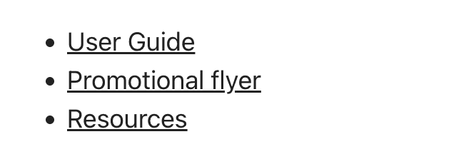
Figure: Bad example - Users would expect all these hyperlinks to work the same way 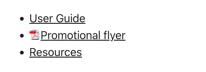
Figure: Good example - The PDF icon indicates one of the links is not a webpage How to add icons to links via CSS
Use CSS to match the extension at the end of the
<a>tag. Don't forget to add some padding to give it some space before the text (where the icon will be).Option A: Using font icons, like FontAwesome (Recommended)
Using icon fonts saves time and hassle during the development process. It replaces the need to create/buy images, and upload them to the server.They will also look good on any screen resolution or display.
✅ UI - Consistent icons
✅ Fast to load (lightweight as no image)
✅ Free $
✅ Can be used in any size
✅ Large choice of icons (even more than UI Fabric!)
❌ Requires code (Inject CSS)To implement use one of the different ways to set up Font Awesome. Then find the icon unicode at FontAwesome icons page and replace on the CSS "content" value.
a[href$='.pdf']:before
    content: "\F08B ";
    font-family: FontAwesome;
    padding-right: 4px;
    display: inline-block;
}
Figure: Replace the content string with the Unicode value from the Font Awesome site
Option B: Using images
Create or buy a collection of icons that match your website style. The benefit is the ability to have custom and multi-colored icons, that can look exactly like a software logo for example. But it's usually not worth the hassle.
You will add each icon image to your server, and then add the path as background URL in the CSS file.
❌ UI - Hard to get all icons consistent
❌ Slow (injecting images)
❌ Paid $ (icon collection required if you want them to have a nice and consistent UI)
❌ Maintenance of needing to upload to server
❌ Requires code (Inject CSS)a[href$='.pdf'] { background: transparent url(/images/icon_pdf.gif) center left no-repeat; padding-left: 20 px; }Figure: Replace the path in background URL with each icon image
When creating links, you should follow a few basic rules:
- If your link is an internal link, then it should keep the default behaviour, navigating within the same tab
-
If the link is external, it should:
- Open in a new tab
- Be visually clear to the user that it will lead them away from the current site, that way it is not a surprise.
Google is by far the best but try other search engines as well.
Figure: Bad example - Without visual indication
Google is by far the best but try other search engines as well.
Figure: Good example - With visual indication
How to add the external link indicator?
It should be inserted by CSS as following:
a[href*="//"]:not([href*="mysite.com"]):after {
content: url(https://www.ssw.com.au/ssw/images/external.gif);
padding-left: 4px;
}
Figure: Icon can be added via CSS using a simple declaration
External links should open in a new tab (by using HTML's target="_blank"). Since browsers implemented tabs (replacing new window), it's considered a good practice to open external links in a different tab.
Main reasons are:
- Avoiding 'Back-Button Fatigue';
- Keeping 'User Flow';
- Keeping a good track of Analytics
<a href="http://support.microsoft.com/support">Support</a>Figure: Bad example - External link opening on the same tab
<a href="http://support.microsoft.com/support" target="_blank">Support</a>Figure: Good example - External link opening in a new tab
It is generally advisable to avoid using absolute internal links whenever possible. Absolute links include the full URL, including the domain name, when linking to internal pages within the same website.
Using absolute internal links can lead to challenges during website migration or domain name changes. If the website's domain or URL structure is modified, all absolute links within the website would require updating. This can be a time-consuming and error-prone process, potentially resulting in broken links and a negative user experience.
Using relative internal links, which specify the path to the linked page relative to the current page, is often preferred as it offers more flexibility and can prevent issues when migrating or changing domain names. Relative links are less prone to breaking and make it easier to maintain the website's structure and navigation.
When using absolute URLs for internal links, the browser needs to make additional requests to the server, even when navigating between pages within the same site. These requests involve fetching the entire HTML document specified in the absolute URL, including unnecessary data such as headers and footers.
On the other hand, when employing relative URLs, the browser can navigate directly to the linked page by adjusting the path relative to the current page. This eliminates the need for additional server requests and results in faster page loads. In the context of static site hosting, where every aspect of the website is pre-rendered and served as static files, optimizing internal links with relative URLs can significantly enhance the overall performance and user experience.
<a href="https://ssw.com.au/Company/ContactUs/">Contact us</a>Figure: Bad example - Using absolute paths for internal links
<a href="/Company/ContactUs/">Contact us</a>Figure: Good example - Using relative paths for internal links
While there may be some scenarios where absolute internal links are necessary, like on newsletters, it is generally advisable for website developers to prioritize the use of relative links. Relative links offer greater flexibility, ease of maintenance, and scalability, ultimately contributing to a more robust and user-friendly website.
There are certain links on a website which you want to make VERY simple for users to find. I hate hunting around on a site for a phone numbers. These are the basics which should be easily accessible from every page:
- Home page (top left corner)
- Contact Us (with a phone number, not a form.submit!)
- News (especially for journalists)
- Directions (so prospects and clients can come and visit!)
A web page should not be more than 4 levels deep. Use a drop-down menu to help users get to these pages quicker. For larger site, you may want to consider mega dropdown menu.
There is no point of having a web page if it is too hard for the user to access from the main menu or from multiple links on your site.

Figure: Have a useful navigation system It is important to remember that Menu links are intended as shortcuts to pages, while Breadcrumbs are "where am I?"
Often a page has duplicated links pointing to the same page - all fairly close to each other, like in 1 or 2 paragraphs. It is a good idea to avoid having multiple links to the exact same page section, because they:
- Distract users from reading the main text content
- Confuse users as they have to decide which link to click first (and then end up to the same place anyway)
- Annoy users when they are repeatedly directed to the same page
Note: The exception is when you find useful to users to have a second link in a different section of the page (e.g. 1 in the content, 1 in the "Related" section).
SSW Web Hosting offers competitive, high performance hosting plans. We use Windows Servers with the latest security patches and SQL Server 2005 SP1. Our Data center has multiple connections to major backbones, and our support staff are Microsoft Certified. View more about our hosting plans
Figure: Bad example - Redundant links nearby pointing to the same page
SSW Web Hosting offers competitive, high performance hosting plans. We use Windows 2003 Servers with the latest security patches and SQL Server 2005 SP1. Our Data center has multiple connections to major backbones, and our support staff are Microsoft Certified.
Figure: Good example - Single link makes text more clear and readable
A link on a page that takes you to the very same page is a weird experience. Don't include a link to the page you are on.
Exceptions can be:
- Permalinks – Because it enables a user to get a link to the current page or bookmark.
- The logo on the homepage – It’s widely known that clicking on the logo will take you to the homepage and it shouldn’t change if you are already on the homepage. People often click on it to reload the page.
- Menu items – However you should visually indicate on what page you are on.
The attribute "name" allows you to link to specific places within the page, via the
<a>tag.This is especially useful in long pages that can be separated into sections. You can create a named anchor in each of these section headings to provide "jump-to" functionality. In other words, you can have a different URL for each piece of content on the same page.
<h2><a name="get-started"></a>Get Started</h2>Figure: This is how you add an anchor name to an specific section of your page. Note it doesn't have the hash mark and the anchor tag is empty
You now have a custom URL that points to the specific section of the page. It is the page URL followed by the hashtag plus the name you chose:
yourpage.com#get-started
Figure: This is how your custom URL will look like
You can use this new URL to point users to that specific section of your page.
To create a link to your anchor named section inside the same page, simply add a new "href" anchor tag - now with a hash mark followed by the name you chose:
<a href="#get-started">Go to Get Started section</a>Figure: This is how you add a link to that anchor name you created inside the same page. Remember to add the hashtag
Tip: Use a hashtag alone to link to the top of a page. E.g.
<a href="#">&Go to top</a>It is often that developers find themselves using the incorrect/inefficient anchor names.
According to W3C, anchor names must observe the following rules:
- Anchor names must be unique within a document
- Begin with a letter (A-Z, a-z) and may be followed by any number of letters, digits (0-9), hyphens ("-"), underscores ("_"), colons (":"), and periods (".")
- Don't add spacings - When you are defining an anchor name, make sure there are no spaces within the name
- Anchor name cannot start with
#
These are the things you should consider when creating an anchor link:
- Make it meaningful - When you are sending the URL by email it helps indicate what you are talking about
- Avoid list numbers - They often change. An anchor like
#13becomes incorrect when the order changes - Know they are case sensitive -
#usergroupsis not the same as#UserGroups. Always check your links and anchor names are identical, matching the capitalization
<a name="1st section"></a>Bad example - Beginning with a number, spaces within, and meaningless anchor name
<a name="get-started"></a>Good example - Beginning with a letter, no spaces, and a meaningful anchor name
Mobile device usage has been on the rise for years, driven by the increasing popularity and capabilities of smartphones and tablets. It's safe to say that, in the past years, the majority of internet users globally were accessing websites through mobile devices.
Note: The exact percentage of mobile device users can vary based on geographic regions and demographics.
Therefore, it is very important to hyperlink your phone number to increase the rate of conversion and improve the mobile user experience. This enables click and call, and eliminates the need to copy and paste phone numbers.
Devices and computers that don’t have phone functionality will either open a phone app or add the number to a contact list.
<a href="tel:+61299533000">+61 2 9953 3000</a>Figure: Good example – To make a telephone number clickable, use add a link with "tel:" inside the href attribute
In today's fast-paced digital world, customers expect to reach you quickly and efficiently. Adding a 'call-able' link to your website enhances user experience by providing a direct and convenient way to contact you via phone. This small addition can significantly impact customer satisfaction and engagement by removing that extra step of having to copy the number in order to call.
Why add a 'call-able' link?
- Improved Customer Experience: Customers can reach you with a single click, reducing the hassle of manually dialing numbers
- Increased Accessibility: Particularly beneficial for mobile users who make up a large percentage of web traffic
- Enhanced Professionalism: Demonstrates a commitment to making communication easy for your clients
Call Us on 02 1234 5678
Figure: Bad example - Contact number is not a 'call-able' link
Call Us on +61 2 1234 5678
Figure: Good example - Contact number is a 'call-able' link
How to implement a 'call-able' link
To add a 'call-able' link, you use the
tel:protocol in your HTML. Here’s how to do it:Example Code
<a href="tel:+61212345678">Call Us Now</a>Figure: HTML code to create a clickable link that will initiate a phone call to the specified number when clicked on a mobile device
When adding a 'call-able' link to your website, it is best practice to:
- Use International Format: Ensure the phone number is in international format to avoid issues with country codes
- Ensure the 'Call-able' Link is Visible and Accessible: Place the 'call-able' link in prominent locations on your website such as the header, footer, or contact page
- Test on Multiple Devices: Verify that the link works on various devices and browsers to ensure universal accessibility
You should always avoid forcing users to click to another page if possible. Additional information can be shown on hover as a tooltip, or applications allow for inline editing.
Figure: Good example - Information is shown on hover, not an additional link Don't surprise users! Put a lock icon to indicate the link is a password protected page and login required.
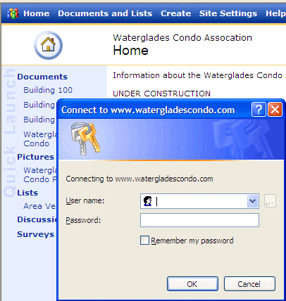
Figure: Bad Example - because when you click "Building 100" you get a password prompt as a surprise Make sure you have a 'Related Links' section at the bottom of each page. This helps avoiding:
- Orphan pages - You should always give your visitors somewhere to go on each page and never leave them at a "dead end." Some people will actually bookmark certain pages in your site and return directly there, rather than go through the home page. If that page is an "orphan" and not linked to another page in your site, your visitor will leave thinking you have nothing else to offer and nowhere to get there if you do and you may have missed out on a sale.
- Long Pages - Users don't want to scroll too much. If you have all your information in one page, visitors will have to continually scroll down, they may get bored and go elsewhere. As a result, they could miss vital information. All important content should be at the top of the page, and if you have a lot of information, link it to another page so visitors can see at a glance the information available.
When you are adding a hyperlink which links to a web application that requires a login, do not use the login page (login.asp or login.aspx or login.php) for the value of the "href" attribute, use the default page (or other pages) instead.
Thus, if a user is already logged in, they will go to the default page.If not, the page will redirect them to the login page.But if you use the sign in page, the user has to sign in again though they're already logged in.
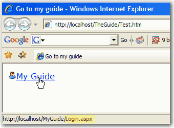
Figure: Bad Example - Linked to the login page. 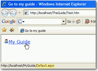
Figure: Good Example - Linked to the default page. Too many sites expect the user to hover and wait to 'discover' if there are sub menus. Use an icon and avoid the surprises.
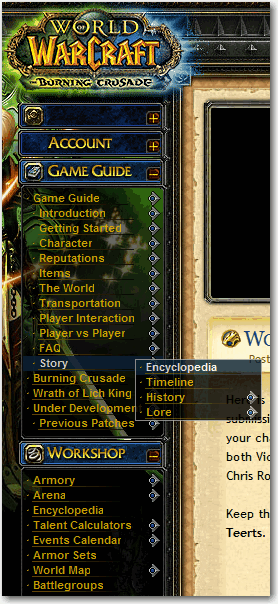
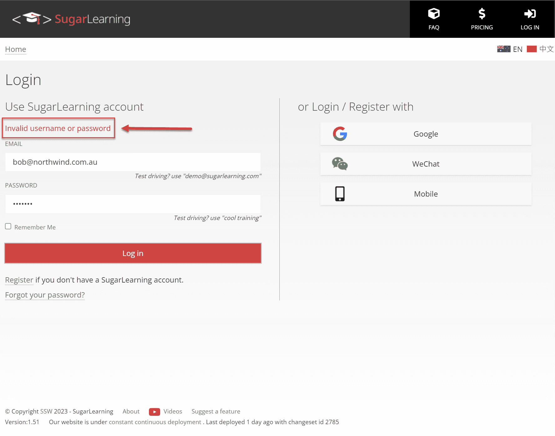
Figure: Good example - This menu clearly shows which items have submenus When a user fails to sign in due to an invalid email or password, you might have the well intention of letting them know by telling them exactly which one is invalid.
However, this is not secure. It makes it easier for bad guys (hackers) to get access to your account and do malicious things using your information.
A more secure and prudent approach involves delivering a message that simply states 'Invalid email or password.' This intentionally avoids disclosing which specific credential is incorrect, thereby enhancing security by limiting the information exposed to potential threats.

Figure: Good example - For security reasons, leave it open if it was an invalid username or password Use jQuery or Ajax controls whenever possible to send requests without feedback on the process. This is to avoid a "white" blank page, while the page reloads. Similar ideas are like a save button that disables after the first click so it can't be hit multiple times.
Figure: Bad example - An Ajax control which automatically disables the save button would make this message unnecessary. You must be careful when combining search and filtering functionality as this can lead to unexpected search results, which can easily confuse if not infuriate your users. Therefore you should always, give the option to widen the search when a filter is applied.
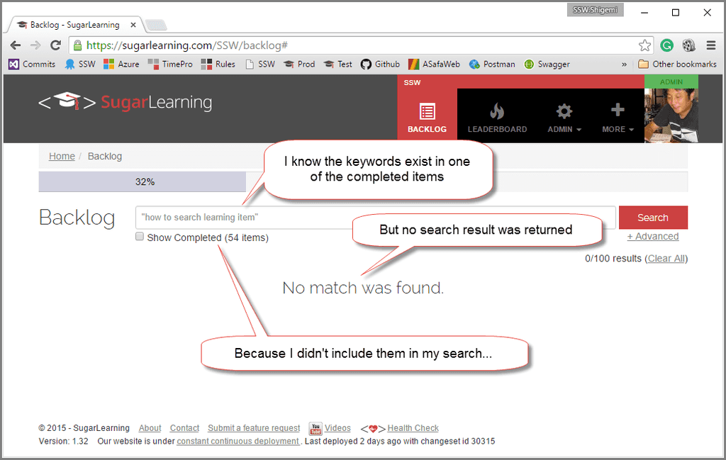
Figure: Bad example - Search is not reminding the user about the fact that a built-in filter is applied to the search result 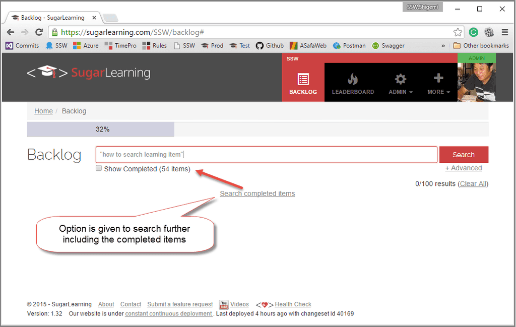
Figure: Good example - Search reminds the user that the search criteria can be widen to show more result If you have a date for any event appearing on your website, you should make it as easy as possible for the user to add it to their Outlook calendar. This is why we use ICS links for all dates on our site.
Next User Group Meeting:
Wednesday, 15 February 2024 5:45 PM
Figure: Bad example - User cannot add a reminder
Next User Group Meeting:
Wednesday, 15 February 2024 5:45 PM📅 Add Outlook reminder
Figure: Good example - User can click and add a reminder
By clicking the calendar link, users can easily add the event to their own calendars.
You have 2 options - VCS and ICS. Both let you add appointments to your calendar. We use ICS because it allows collaborating information between personal information management programs like Microsoft Outlook, Mozilla Calendar, Mac OS, etc. over the Internet, independently of differences between program vendors or operating systems, which is not allowed with VCS.
It is always preferred to use icons to give users a proper idea about the file. Users can quickly get the idea by just looking at the icon.
UNC (Uniform Naming Convention) is a naming system used in Microsoft Windows operating systems to specify the location of a file or folder on a shared network resource. However, UNC paths should not be used in URLs as they are typically used to specify file paths on a local network rather than web resources.
In a URL, the path component specifies the path to the resource on the web server, and it is relative to the server's document root directory. While it may be possible to include a UNC path in a URL, doing so would likely result in an error, as web servers are not designed to handle UNC paths.
An example of a UNC path is:
\\server\share\folder\file.txtAdditionally, including a UNC path in a URL could be a security risk, as it could potentially expose sensitive information about the server's network configuration. Therefore, you should not include UNC paths in URLs.
Including a full stop or slash at the end of a URL does not necessarily make it invalid or non-functional. However, it's worth noting that different web servers and applications may interpret URLs differently, and some implementations might treat a full stop or slash at the end differently or consider it as part of the URL.
In general, it is good practice to avoid including unnecessary characters at the end of URLs to ensure compatibility across different systems and prevent any potential confusion or misinterpretation.
It's recommended to follow the standard URL conventions and structure URLs without trailing periods or slashes unless they serve a specific purpose or are required for a particular system or application.
Your site visitors should never see Untitled Page on their browser. When creating a new page, remember to change the default page title. This rule applies whether you are using a Master Page or not.
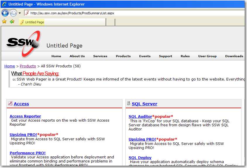
Figure: Bad example - A page with the default title 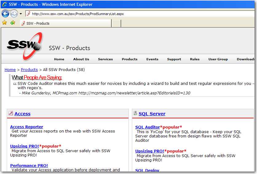
Figure: Good example - A page with a good title